Model Explainability
H2O Explainability Interface is a convenient wrapper to a number of explainabilty methods and visualizations in H2O. The main functions, h2o.explain() (global explanation) and h2o.explain_row() (local explanation) work for individual H2O models, as well a list of models or an H2O AutoML object. The h2o.explain() function generates a list of explanations -- individual units of explanation such as a Partial Dependence plot or a Variable Importance plot. Most of the explanations are visual -- these plots can also be created by individual utility functions outside the h2o.explain() function. The visualization engine used in the R interface is the ggplot2 package and in Python, we use matplotlib. Skip to the Explanation Plotting Functions section to examples of all the visual explanations.
Model Explainability Interface
The interface is designed to be simple and automatic -- all of the explanations are generated with a single function, h2o.explain(). The input can be any of the following: an H2O model, a list of H2O models, an H2OAutoML object or an H2OFrame with a 'model_id' column (for example, H2OAutoML leaderboard), and a holdout frame. If you provide a list of models or an AutoML object, additional multi-model comparison plots are generated.
- R
- Python
# Explain a model
exm <- h2o.explain(model, test)
exm

# Explain an AutoML object
exa <- h2o.explain(aml, test)
exa
# Explain a model
exm = model.explain(test)

# Explain an AutoML object
exa = aml.explain(test)
Parameters
-
object: (R only) A list of H2O models, an H2O AutoML instance, or an H2OFrame with a 'model_id' column (for example, H2OAutoML leaderboard).
-
newdata (R API) / frame (Python API): An H2OFrame used in Residual Analysis, Shapley contributions and a number of other explanation functions.
-
columns: A vector of column names specifying the columns to use in column-based explanations (for example, PDP, ICE, SHAP). If specified, the
top_n_featuresparameter will be ignored. Optional. -
top_n_features: An integer specifying the number of columns to use in column-based explanations (for example, PDP, ICE, SHAP). The columns are ranked by variable importance (where applicable), and the top N are chosen for explainability. Defaults to 5.
-
include_explanations: If specified, do only the specified explanations. Mutually exclusive with
exclude_explanations. Optional. See below for the possible explanations. -
exclude_explanations: Exclude specified explanations. Optional. The available options (explanations) for
include_explanationsandexclude_explanationsare:"leaderboard"(AutoML and list of models only)"residual_analysis"(regression only)"confusion_matrix"(classification only)"varimp"(not currently available for Stacked Ensembles)"varimp_heatmap""model_correlation_heatmap""shap_summary"(single models only)"pdp""ice"
-
plot_overrides: Overrides for the individual explanation plots, for example
list(shap_summary_plot = list(top_n_features = 50)). Optional.
Code Examples
The R and Python code below is the quickest way to get started.
Explain Models
Here's an example showing basic usage of the h2o.explain() function in R and the .explain() method in Python. Keep in mind that this code should be run in an environment that can support plots. We recommend Jupyter notebooks for Python and R notebooks or Rmd files in R. Running the code in the RStudio IDE console is also supported, though the visualizations are optimzed for notebook viewing. Support is also available for IRkernel, the kernel for Jupyter.
The example below uses a version of the Wine Quality dataset, which associates wine quality (a score between 0-10) with a number of measurable attributes about wine such as alcohol content, citric acid content and pH.
- R
- Python
library(h2o)

h2o.init()

# Import wine quality dataset
f <- "https://h2o-public-test-data.s3.amazonaws.com/smalldata/wine/winequality-redwhite-no-BOM.csv"
df <- h2o.importFile(f)

# Response column
y <- "quality"

# Split into train & test
splits <- h2o.splitFrame(df, ratios = 0.8, seed = 1)
train <- splits[[1]]
test <- splits[[2]]

# Run AutoML for 1 minute
aml <- h2o.automl(y = y, training_frame = train, max_runtime_secs = 60, seed = 1)

# Explain leader model & compare with all AutoML models
exa <- h2o.explain(aml, test)
exa

# Explain a single H2O model (e.g. leader model from AutoML)
exm <- h2o.explain(aml@leader, test)
exm
import h2o
from h2o.automl import H2OAutoML

h2o.init()

# Import wine quality dataset
f = "https://h2o-public-test-data.s3.amazonaws.com/smalldata/wine/winequality-redwhite-no-BOM.csv"
df = h2o.import_file(f)

# Reponse column
y = "quality"

# Split into train & test
splits = df.split_frame(ratios = [0.8], seed = 1)
train = splits[0]
test = splits[1]

# Run AutoML for 1 minute
aml = H2OAutoML(max_runtime_secs=60, seed=1)
aml.train(y=y, training_frame=train)

# Explain leader model & compare with all AutoML models
exa = aml.explain(test)

# Explain a single H2O model (e.g. leader model from AutoML)
exm = aml.leader.explain(test)

# Explain a generic list of models
# use h2o.explain as follows:
# exl = h2o.explain(model_list, test)
Notes:
In R, the H2OExplanation object will not be printed if you save it to an object. If you save the object to a variable, you will be able to access the plots and associated metadata by inspecting the object. Then you can print(exa) to print the explanation, or simply type exa and it will print as well.
In Python, the H2OExplanation will always be printed, even if you save it to an object. Once you save it to an object, however, if you want to print it again, you must do: from IPython.core.display import display and display(exa).
Explain a single row prediction
The h2o.explain_row() function provides model explanations for a single row of test data. Using the previous code example, you can evaluate row-level behavior by specifying the row_index.
As usual in H2O, indexes in R are 1-based and 0-based in Python.
- R
- Python
# Explain first row with all AutoML models
h2o.explain_row(aml, test, row_index = 1)

# Explain first row with a single H2O model (e.g. leader model from AutoML)
h2o.explain_row(aml@leader, test, row_index = 1)
# Explain first row with all AutoML models
aml.explain_row(test, row_index=0)

# Explain first row with a single H2O model (e.g. leader model from AutoML)
aml.leader.explain_row(test, row_index=0)

# Explain a generic list of models
# use h2o.explain as follows:
# exl = h2o.explain(model_list, test, row_index=0)
Output: Explanations
The output from these functions is an H2OExplanation object, which is simply a dictionary (Python API) / named list (R API) of explanations. Therefore, an H2OExplanation object can be indexed by the individual explanation names (using same names as specified in include_explanations and exclude_explanations).
Most individual explanations are plots with some associated metadata that can be extracted. The plots are ggplot2 objects in R and matplotlib figures in Python. You can customize the plot objects before they are generated by utilizing the plot_overrides argument, or afterwards by adding custom R/Python code to modify the returned objects.
Explain multiple models
When h2o.explain() is provided a list of models, the following global explanations will be generated by default:
- Leaderboard (compare all models)
- Confusion Matrix for Leader Model (classification only)
- Residual Analysis for Leader Model (regression only)
- Variable Importance of Top Base (non-Stacked) Model
- Variable Importance Heatmap (compare all non-Stacked models)
- Model Correlation Heatmap (compare all models)
- SHAP Summary of Top Tree-based Model (TreeSHAP)
- Partial Dependence (PD) Multi Plots (compare all models)
- Individual Conditional Expectation (ICE) Plots
Explain a single model
When h2o.explain() is provided a single model, we get the following global explanations:
- Confusion Matrix (classification only)
- Residual Analysis (regression only)
- Variable Importance
- Partial Dependence (PD) Plots
- Individual Conditional Expectation (ICE) Plots
Local explanations
When you provide a row_index to h2o.explain_row(), for a group of models, the following local explanations will be generated:
- SHAP Contribution Plot (for the top tree-based model in AutoML)
- Individual Conditional Expectation (ICE) Plots
For a single model, the local explanations that will be returned are:
- SHAP Contribution Plot (only for tree-based models)
- Individual Conditional Expectation (ICE) Plots
Model Metrics
One of the most basic and straight-forward ways to evaluate and explain models is the model metrics. To help keep model performance in context, we provide a Leaderboard with model performance summarized across a number of metrics. The Leaderboard is a central object in H2O AutoML; more information about the Leaderboard structure and metrics is available here.
Based on the task at hand (regression, binary classification, multi-class classification), the Leaderboard returns different model performance metrics. More information about H2O model metrics is available here. For all tasks, the Leaderboard includes the following extra columns which can help provide context in terms of model selection: training_time_ms, predict_time_per_row_ms. Lastly, when using the h2o.explain_row() functions with a group of models, the actual predictions (predicted values + predicted class for classification problems) for that row are appended to the end of the leaderboard, so you can easily see where the models disagree.
For classification models, we also display the Confusion Matrix of a single H2O model (or the leader model, when given an AutoML object), as part of the output.
Explanation Plotting Functions
Individual plotting functions are used inside the explain() function. Some take a group of models as input and others evaluate a single model at a time. The following functions take a list of models (including an AutoML object or an H2OFrame with model_id column, for example, the Leaderboard) as input:
- R
- Python
# Methods for an AutoML object
h2o.varimp_heatmap()
h2o.model_correlation_heatmap()
h2o.pd_multi_plot()
# These are methods for an AutoML object
# Use h2o.method_name(model_list, test) for a list of models
.varimp_heatmap()
.model_correlation_heatmap()
.pd_multi_plot()
These functions take a single H2O model as input:
- R
- Python
# Methods for an H2O model
h2o.residual_analysis_plot()
h2o.varimp_plot()
h2o.shap_explain_row_plot()
h2o.shap_summary_plot()
h2o.pd_plot()
h2o.ice_plot()
# Methods for an H2O model
.residual_analysis_plot()
.varimp_plot()
.shap_explain_row_plot()
.shap_summary_plot()
.pd_plot()
.ice_plot()
Note for Python users: For a list of models, use the functions exported to the h2o.* namespace, for example h2o.residual_analysis_plot(model_list, test).
To run the code in any single-model function below using the Wine data AutoML example, you will just need to set model <- aml@leader in R and model = aml.leader in Python.
Residual Analysis
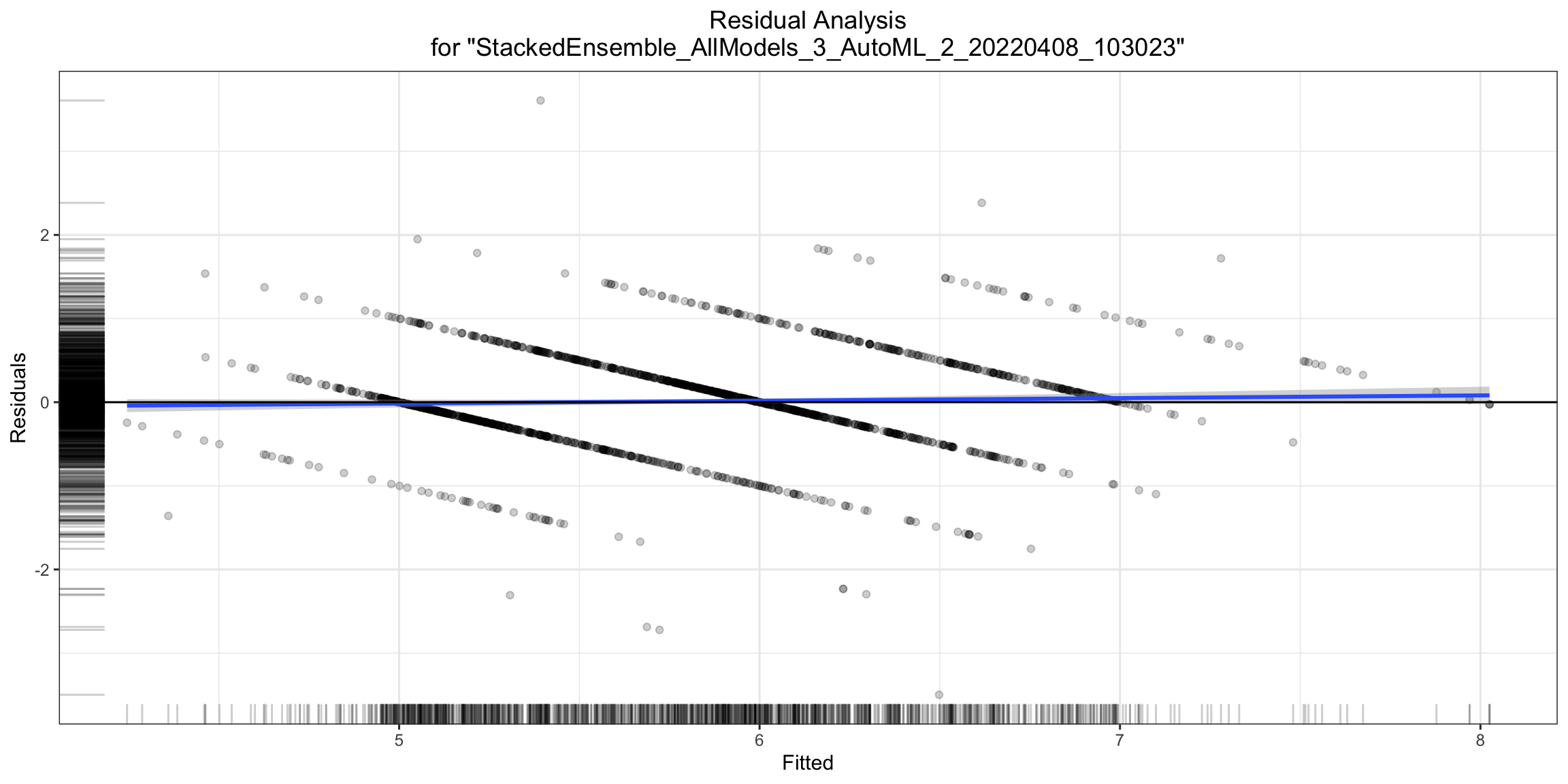
Residual Analysis plots the fitted values vs residuals on a test dataset. Ideally, residuals should be randomly distributed. Patterns in this plot can indicate potential problems with the model selection, for example, using a simpler model than necessary, not accounting for heteroscedasticity, autocorrelation, etc. Note that if you see "striped" lines of residuals, that is an artifact of having an integer valued (vs a real valued) response variable.
- R
- Python
ra_plot <- h2o.residual_analysis_plot(model, test)
ra_plot
ra_plot = model.residual_analysis_plot(test)
Variable Importance
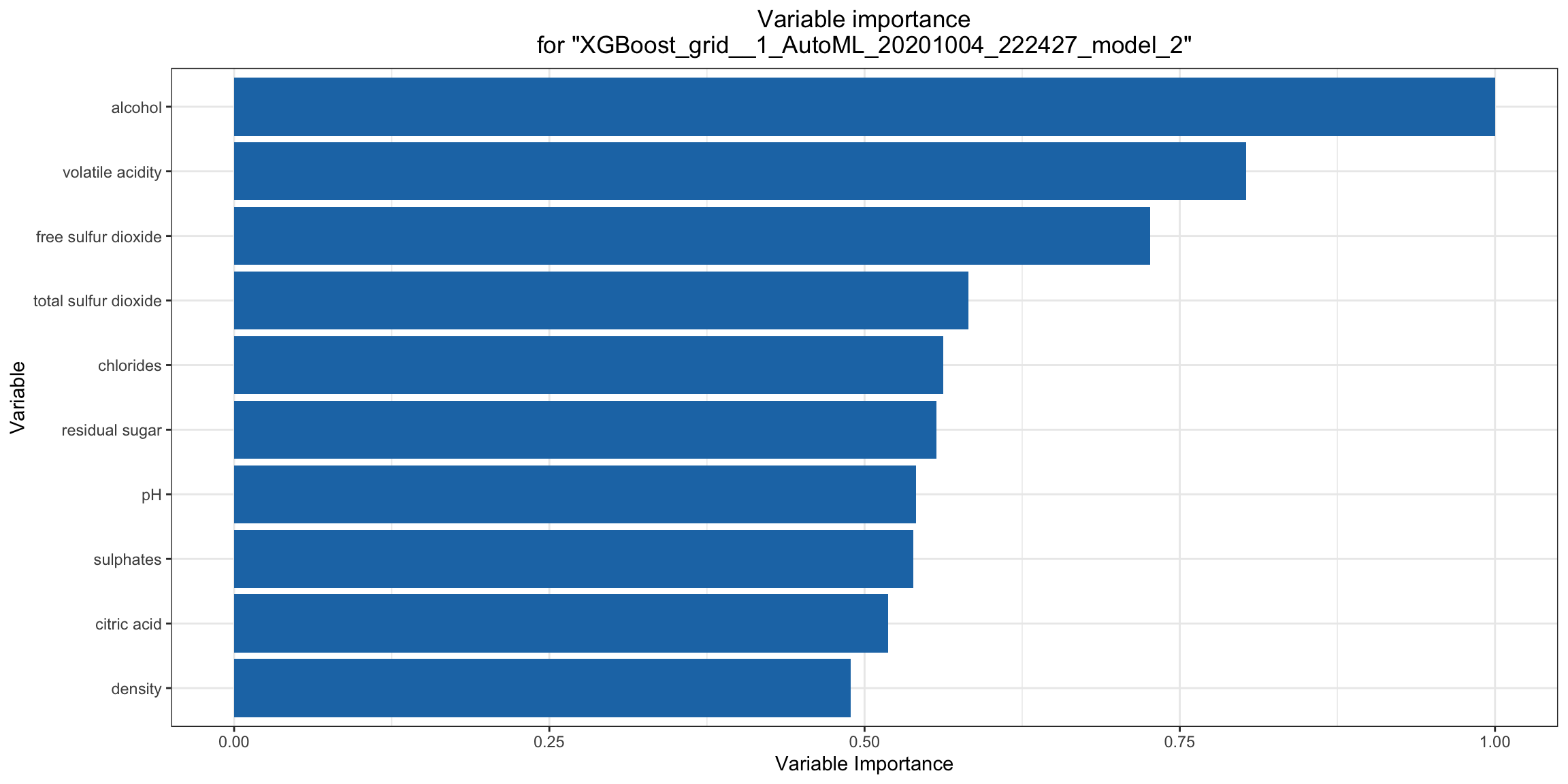
The variable importance plot shows the relative importance of the most important variables in the model. Variable importance is currently available in for all H2O models except Stacked Ensembles (planned for a future release), so if you happen to use h2o.explain() on an AutoML object with a Stacked Ensemble at the top of the leaderboard, it will instead show the variable importance for the top "base model" (non-stacked model). Note for R users: The variable importance plot shown in the h2o.explain() output in R is rendered in ggplot2 instead of base R (the h2o.varimp_plot() utility function currently only uses base R). We will add a switch to generate the ggplot2 version in a future release.
- R
- Python
va_plot <- h2o.varimp_plot(model)
va_plot
ra_plot = model.varimp_plot()
Variable Importance Heatmap
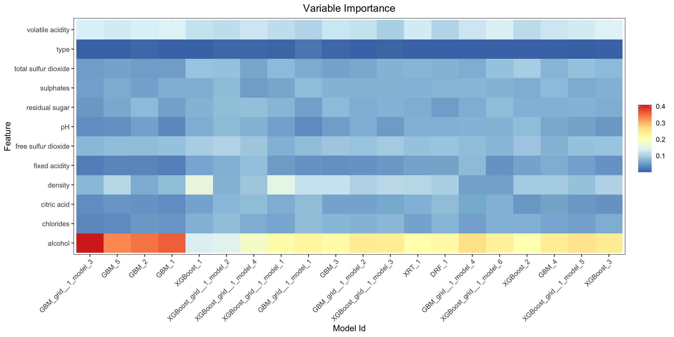
Variable importance heatmap shows variable importance across multiple models. Some models in H2O return variable importance for one-hot (binary indicator) encoded versions of categorical columns (for example, Deep Learning, XGBoost). In order for the variable importance of categorical columns to be compared across all model types we compute a summarization of the the variable importance across all one-hot encoded features and return a single variable importance for the original categorical feature. By default, the models and variables are ordered by their similarity.
- R
- Python
va_plot <- h2o.varimp_heatmap(aml)
va_plot

# or if some subset of the models is needed a slice of leaderboard can be used, e.g., using MAE as the sorting metric
va_plot <- h2o.varimp_heatmap(h2o.head(h2o.arrange(aml@leaderboard, mae), n = 10))

# or even extended leaderboard can be used
h2o.varimp_heatmap(h2o.head(h2o.arrange(h2o.get_leaderboard(aml, extra_columns = "training_time_ms"), training_time_ms), n = 10))
va_plot = aml.varimp_heatmap()

# or if some subset of the models is needed a slice of leaderboard can be used, e.g., using MAE as the sorting metric
va_plot = h2o.varimp_heatmap(aml.leaderboard.sort("mae").head(10))

# or even extended leaderboard can be used
va_plot = h2o.varimp_heatmap(h2o.automl.get_leaderboard(aml, extra_columns="training_time_ms").sort("training_time_ms").head(10))
Model Correlation Heatmap
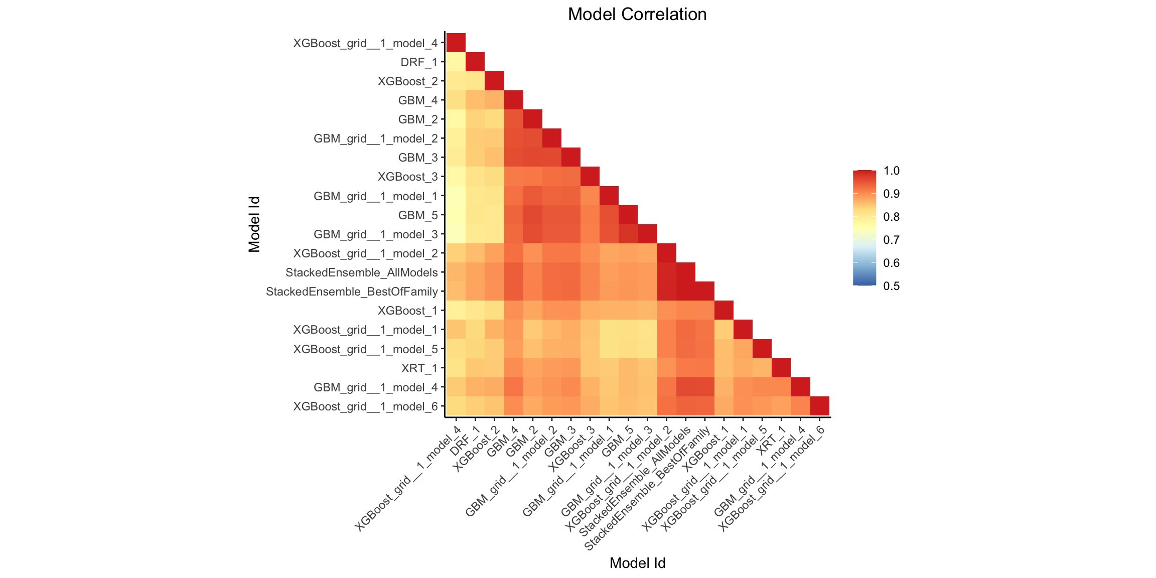
This plot shows the correlation between the predictions of the models. For classification, frequency of identical predictions is used. By default, models are ordered by their similarity (as computed by hierarchical clustering).
- R
- Python
mc_plot <- h2o.model_correlation_heatmap(aml, test)
mc_plot

# or if some subset of the models is needed a slice of leaderboard can be used, e.g., using MAE as the sorting metric
mc_plot <- h2o.model_correlation_heatmap(h2o.head(h2o.arrange(aml@leaderboard, mae), n = 10), test)
mc_plot

# or even extended leaderboard can be used
mc_plot <- h2o.model_correlation_heatmap(h2o.head(h2o.arrange(h2o.get_leaderboard(aml, extra_columns = "training_time_ms"), training_time_ms), n = 10), test)
mc_plot

# also more complicated queries on leaderboard can be used, e.g., model correlation between 5 fastest models to train and Stacked Ensembles
leaderboard <- as.data.frame(h2o.arrange(h2o.get_leaderboard(aml, extra_columns = "training_time_ms"), training_time_ms))
mc_plot <- h2o.model_correlation_heatmap(rbind(head(leaderboard, n = 5), leaderboard[grep("StackedEnsemble", leaderboard$model_id),]), test)
mc_plot = aml.model_correlation_heatmap(test)

# or if some subset of the models is needed a slice of leaderboard can be used, e.g., using MAE as the sorting metric
mc_plot = h2o.model_correlation_heatmap(aml.leaderboard.sort("mae").head(10), test)

# or even extended leaderboard can be used
mc_plot = h2o.model_correlation_heatmap(h2o.automl.get_leaderboard(aml, extra_columns="training_time_ms").sort("training_time_ms").head(10), test)

# also more complicated queries on leaderboard can be used, e.g., model correlation between 5 fastest models to train and Stacked Ensembles
leaderboard = h2o.automl.get_leaderboard(aml, extra_columns="training_time_ms").sort("training_time_ms")
mc_plot = h2o.model_correlation_heatmap(leaderboard.head(5).rbind(leaderboard[leaderboard["model_id"].grep("StackedEnsemble", output_logical=True)]), test)
SHAP Summary
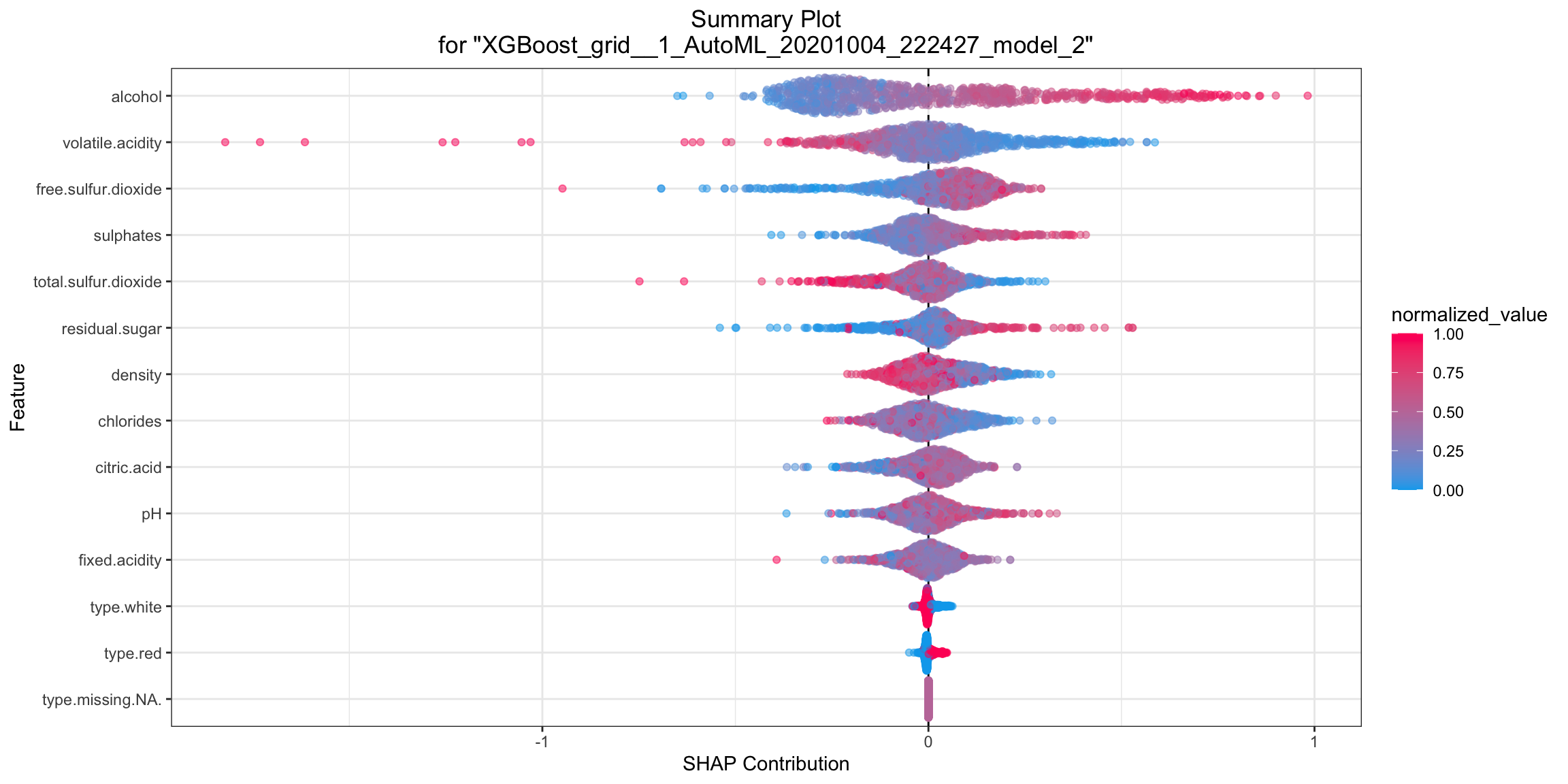
SHAP summary plot shows the contribution of the features for each instance (row of data). The sum of the feature contributions and the bias term is equal to the raw prediction of the model, that is, the prediction before applying the inverse link function.
- R
- Python
shap_plot <- h2o.shap_summary_plot(model, test)
shap_plot
shap_plot = model.shap_summary_plot(test)
SHAP Local Explanation
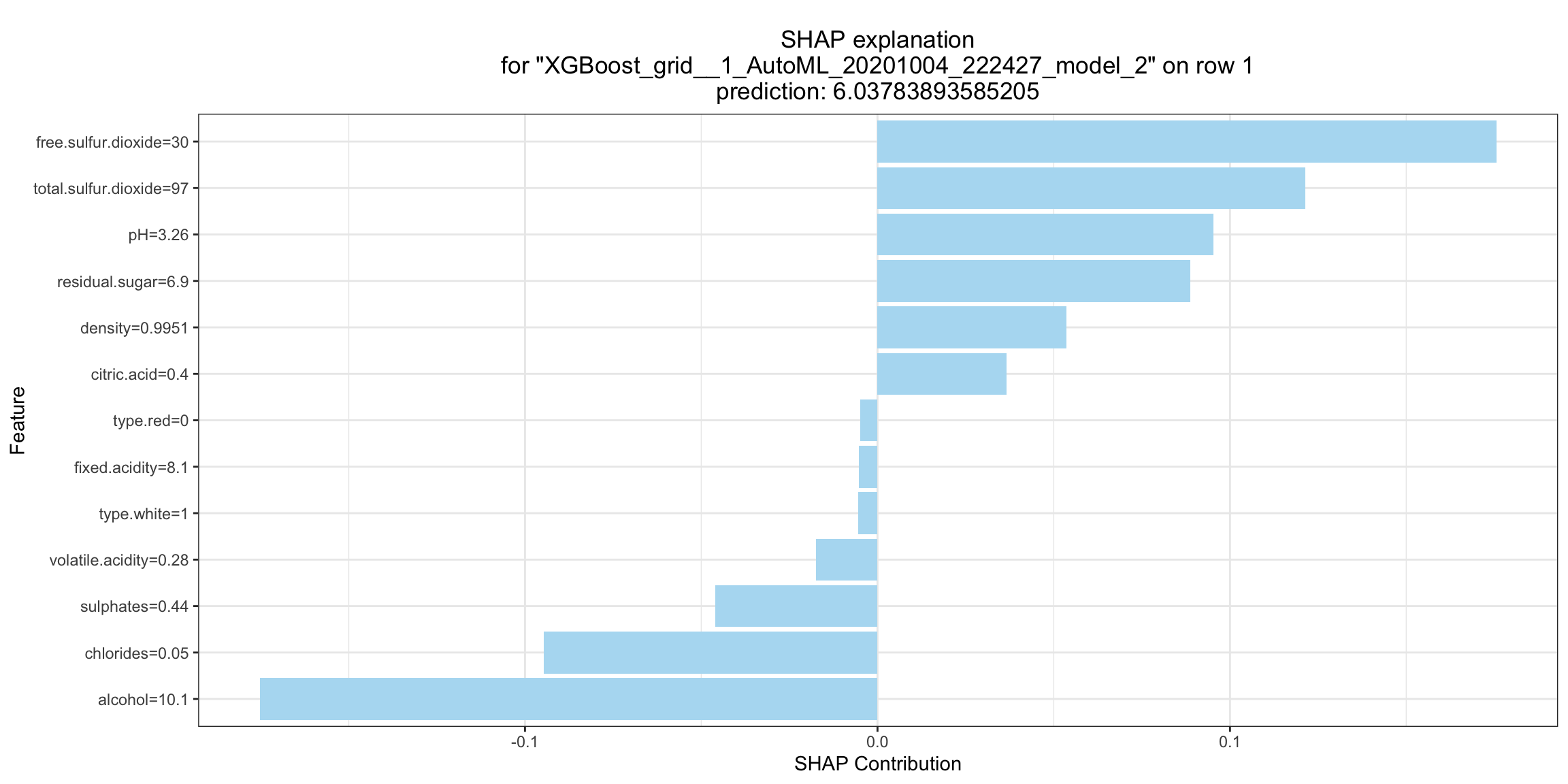
SHAP explanation shows contribution of features for a given instance. The sum of the feature contributions and the bias term is equal to the raw prediction of the model, that is, the prediction before applying the inverse link function. H2O implements TreeSHAP which when the features are correlated, can increase contribution of a feature that had no influence on the prediction.
- R
- Python
shapr_plot <- h2o.shap_explain_row_plot(model, test, row_index = 1)
shapr_plot
shapr_plot = model.shap_explain_row_plot(test, row_index=0)
Partial Dependence (PD) Plots
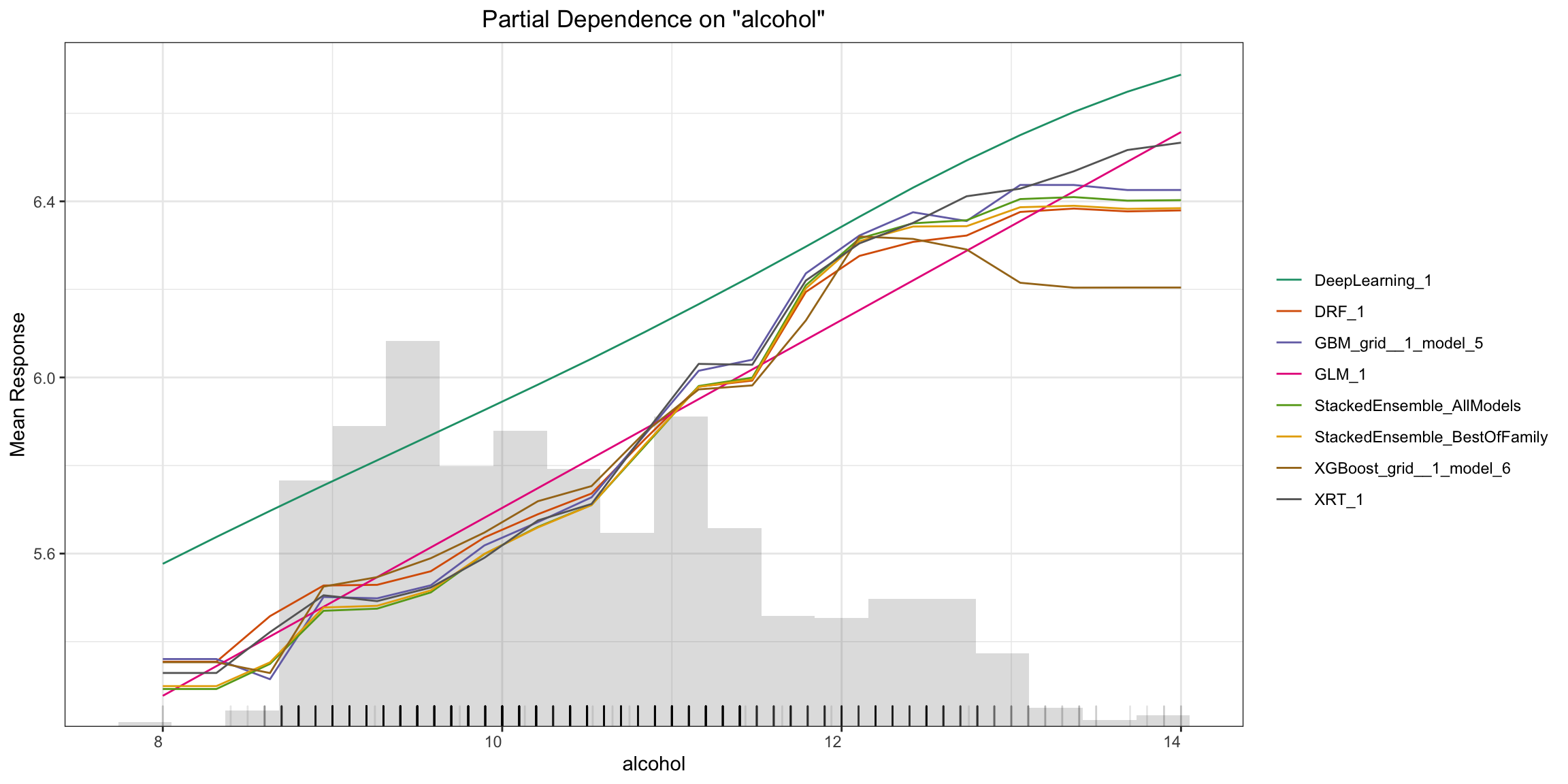
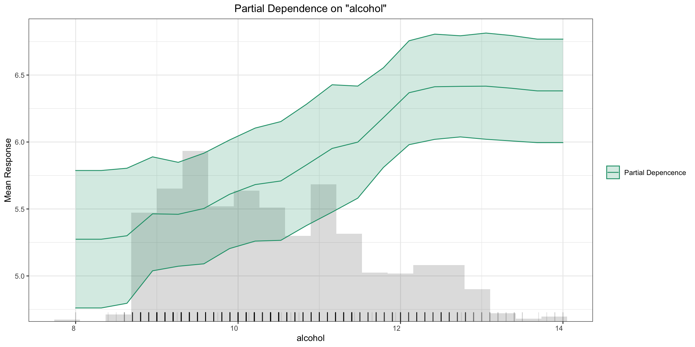
Partial dependence plot (PDP) gives a graphical depiction of the marginal effect of a variable on the response. The effect of a variable is measured in change in the mean response. PDP assumes independence between the feature for which is the PDP computed and the rest.
Partial Dependence Multi-model Plot:
- R
- Python
pd_plot <- h2o.pd_multi_plot(aml, test, column)
pd_plot

# or if some subset of the models is needed a slice of leaderboard can be used, e.g., using MAE as the sorting metric
pd_plot <- h2o.pd_multi_plot(h2o.arrange(aml@leaderboard, mae), test, column)
pd_plot
pd_plot = aml.pd_multi_plot(test, column)

# or if some subset of the models is needed a slice of leaderboard can be used, e.g., using MAE as the sorting metric
pd_plot = h2o.pd_multi_plot(aml.leaderboard.sort("mae"), test, column)
Partial Dependence Single-model Plot:
- R
- Python
pd_plot <- h2o.pd_plot(model, test, column)
pd_plot
pd_plot = model.pd_plot(test, column)
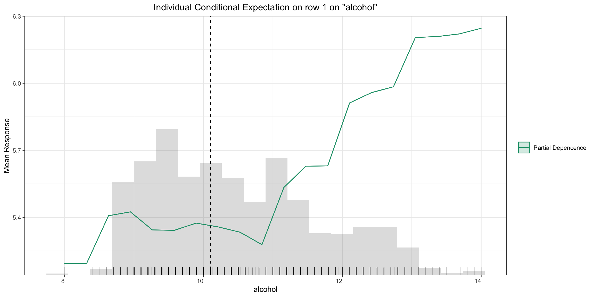
A single-model, single-row, PD Plot simply becomes an ICE Plot (see more below):
- R
- Python
pd_plot <- h2o.pd_plot(model, test, column, row_index = 1)
pd_plot
pd_plot = model.pd_plot(test, column, row_index=0)
Individual Conditional Expectation (ICE) Plots
An Individual Conditional Expectation (ICE) plot gives a graphical depiction of the marginal effect of a variable on the response. ICE plots are similar to partial dependence plots (PDP); PDP shows the average effect of a feature while ICE plot shows the effect for a single instance. This function will plot the effect for each decile. In contrast to the PDP, ICE plots can provide more insight, especially when there is stronger feature interaction.
- R
- Python
ice_plot <- h2o.ice_plot(model, test, column)
ice_plot
ice_plot = model.ice_plot(test, column)

Learning Curve Plot
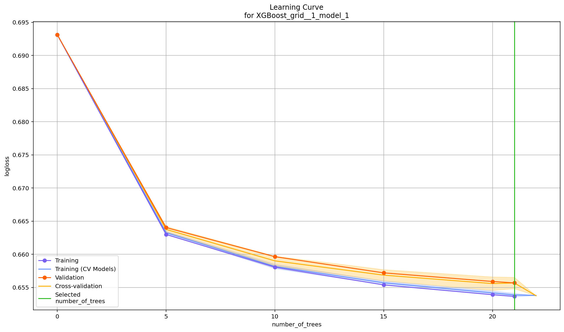
The learning curve plot shows error metric dependence on learning progress (for example, RMSE vs. number of trees trained so far in GBM). This plot can help to diagnose whether the model is overfitting or underfitting -- in an ideal situation, the training and validation curves converge. There can be up to 4 curves showing the error, and all available metrics will be plotted:
- Training
- Validation (available when
validation_frameis set) - Training on CV Models (available when
nfolds>1) - Cross-validation (available when
nfolds>1)
If one of these is missing, that means those particular scoring metrics were not available in the model. Learning curve plots will be included in the Explain function in a future release, but for now, this is offered as a stand-alone utility.
- R
- Python
learning_curve_plot <- h2o.learning_curve_plot(model)
learning_curve_plot
learning_curve_plot = model.learning_curve_plot()
Pareto Front Plot
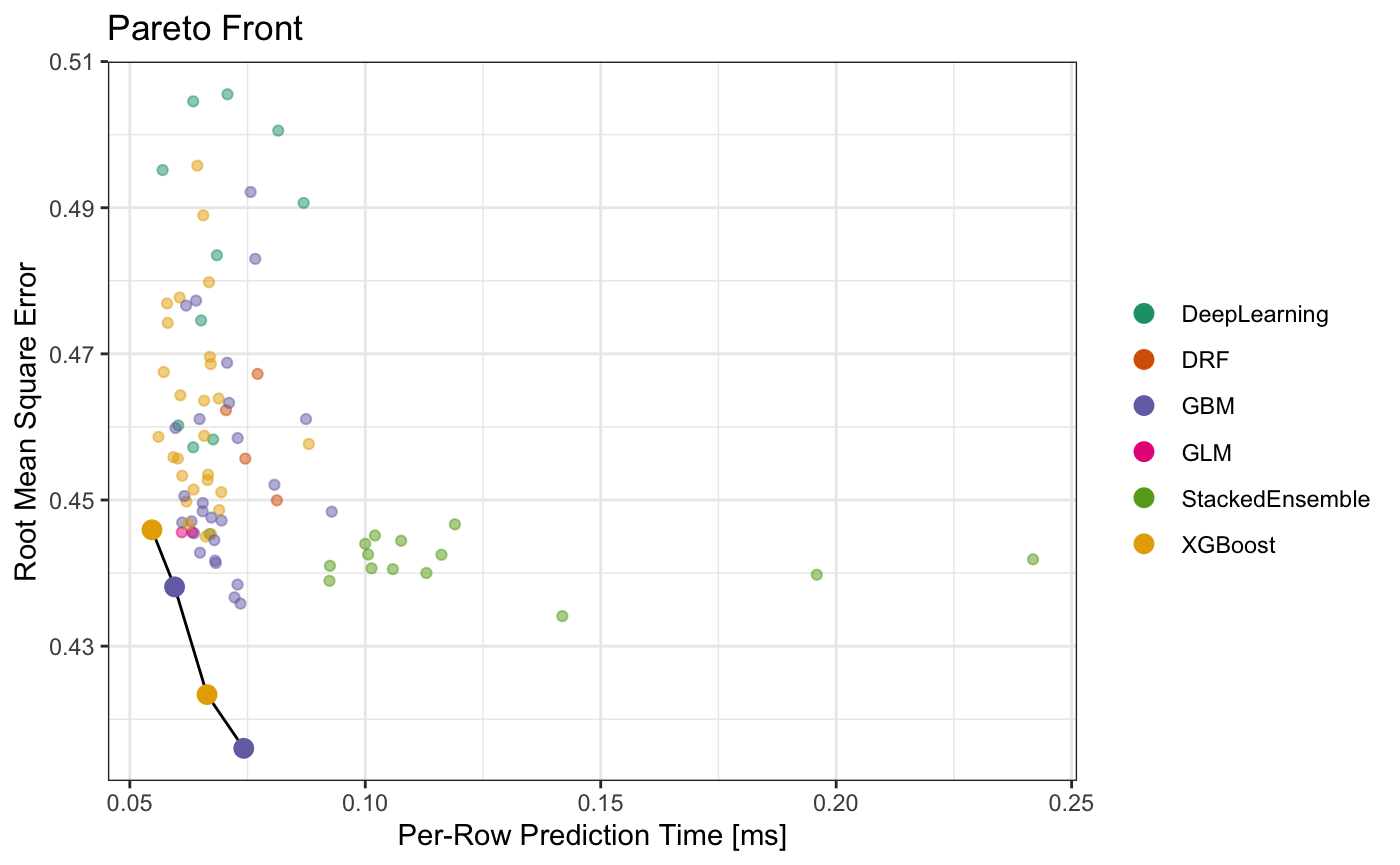
Pareto front plot shows a Pareto front for any given dataframe, but it can be also used with AutoMLs and Grids. Pareto front is used to determine an optimal subset with regards to multiple criteria, currently our implementation supports 2 criteria/metrics. The pareto_front function returns a subset of the input frame/leaderboard and a plot depicting the Pareto front as shown below.
- R
- Python
pf <- h2o.pareto_front(aml)
plot(pf)
pf@pareto_front # to retrieve the Pareto front subset of the leaderboard

combined_leaderboard <- h2o.make_leaderboard(list(aml, grid, single_model), test, extra_columns = "ALL")
pf_combined <- h2o.pareto_front(combined_leaderboard, x_metric = "predict_time_per_row_ms", y_metric = "rmse", optimum = "bottom left")
plot(pf_combined)
pf_combined@pareto_front # to retrieve the Pareto front subset of the leaderboard
pf = aml.pareto_front()
pf.figure() # get the Pareto front plot
pf # H2OFrame containing the Pareto front subset of the leaderboard

combined_leaderboard = h2o.make_leaderboard([aml, grid, single_model], test, extra_columns="ALL")
pf = h2o.explanation.pareto_front(combined_leaderboard, x_metric="predict_time_per_row_ms", y_metric="rmse", optimum="bottom left")
pf.figure() # get the Pareto front plot
pf # H2OFrame containing the Pareto front subset of the leaderboard
Additional Information
The H2O Explainability interface is newly released and currently experimental. From the initial release, we may evolve (and potentially break) the API, as we collect collect feedback from users and work to improve and expand the functionality. We welcome feedback. If you find bugs, or if you have any feature requests or suggested improvements, please create a ticket on the GitHub issues.
Our roadmap for improving the the interface is here.
- Submit and view feedback for this page
- Send feedback about H2O-3 Secure to cloud-feedback@h2o.ai