Experiment Graphs
This section describes the dashboard graphs that display for running and completed experiments. These graphs are interactive. Hover over a point on the graph for more details about the point.
Binary Classfication Experiments
For Binary Classification experiments, Driverless AI shows a ROC Curve, a Precision-Recall graph, a Lift chart, a Kolmogorov-Smirnov chart, and a Gains chart.
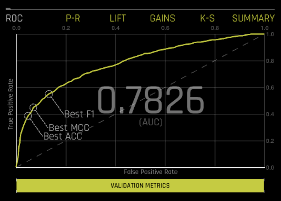
ROC: This shows Receiver-Operator Characteristics curve stats on validation data along with the best Accuracy, MCC, and F1 values. An ROC curve is a useful tool because it only focuses on how well the model was able to distinguish between classes. Keep in mind, though, that for models where one of the classes happens rarely, a high AUC could provide a false sense that the model is correctly predicting the results. This is where the notion of precision and recall become important.
The area under this curve is called AUC. The True Positive Rate (TPR) is the relative fraction of correct positive predictions, and the False Positive Rate (FPR) is the relative fraction of incorrect positive corrections. Each point corresponds to a classification threshold (e.g., YES if probability >= 0.3 else NO). For each threshold, there is a unique confusion matrix that represents the balance between TPR and FPR. Most useful operating points are in the top left corner in general.
Hover over a point in the ROC curve to see the True Negative, False Positive, False Negative, True Positive, Threshold, FPR, TPR, Accuracy, F1, and MCC values for that point in the form of a confusion matrix.
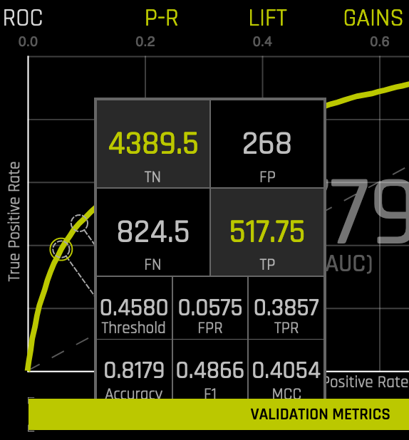
If a test set was provided for the experiment, then click on the Validation Metrics button below the graph to view these stats on test data.
Precision-Recall: This shows the Precision-Recall curve on validation data along with the best Accuracy, MCC, and F1 values. The area under this curve is called AUCPR. Prec-Recall is a complementary tool to ROC curves, especially when the dataset has a significant skew. The Prec-Recall curve plots the precision or positive predictive value (y-axis) versus sensitivity or true positive rate (x-axis) for every possible classification threshold. At a high level, you can think of precision as a measure of exactness or quality of the results and recall as a measure of completeness or quantity of the results obtained by the model. Prec-Recall measures the relevance of the results obtained by the model.
Precision: correct positive predictions (TP) / all positives (TP + FP).
Recall: correct positive predictions (TP) / positive predictions (TP + FN).
Each point corresponds to a classification threshold (e.g., YES if probability >= 0.3 else NO). For each threshold, there is a unique confusion matrix that represents the balance between Recall and Precision. This ROCPR curve can be more insightful than the ROC curve for highly imbalanced datasets.
Hover over a point in this graph to see the True Positive, True Negative, False Positive, False Negative, Threshold, Recall, Precision, Accuracy, F1, and MCC value for that point.
If a test set was provided for the experiment, then click on the Validation Metrics button below the graph to view these stats on test data.
Lift: This chart shows lift stats on validation data. For example, “How many times more observations of the positive target class are in the top predicted 1%, 2%, 10%, etc. (cumulative) compared to selecting observations randomly?” By definition, the Lift at 100% is 1.0. Lift can help answer the question of how much better you can expect to do with the predictive model compared to a random model (or no model). Lift is a measure of the effectiveness of a predictive model calculated as the ratio between the results obtained with a model and with a random model(or no model). In other words, the ratio of gain % to the random expectation % at a given quantile. The random expectation of the xth quantile is x%.
Hover over a point in the Lift chart to view the quantile percentage and cumulative lift value for that point.
If a test set was provided for the experiment, then click on the Validation Metrics button below the graph to view these stats on test data.
Kolmogorov-Smirnov: This chart measures the degree of separation between positives and negatives for validation or test data.
Hover over a point in the chart to view the quantile percentage and Kolmogorov-Smirnov value for that point.
If a test set was provided for the experiment, then click on the Validation Metrics button below the graph to view these stats on test data.
Gains: This shows Gains stats on validation data. For example, “What fraction of all observations of the positive target class are in the top predicted 1%, 2%, 10%, etc. (cumulative)?” By definition, the Gains at 100% are 1.0.
Hover over a point in the Gains chart to view the quantile percentage and cumulative gain value for that point.
If a test set was provided for the experiment, then click on the Validation Metrics button below the graph to view these stats on test data.
Multiclass Classification Experiments
For multiclass classification experiments, a Confusion Matrix is available in addition to the ROC Curve, Precision-Recall graph, Lift chart, Kolmogorov-Smirnov chart, and Gains chart. Driverless AI generates these graphs by considering the multiclass problem as multiple one-vs-all problems. These graphs and charts (Confusion Matrix excepted) are based on a method known as micro-averaging (reference: http://scikit-learn.org/stable/auto_examples/model_selection/plot_roc.html#multiclass-settings).
For example, you may want to predict the species in the iris data. The predictions would look something like this:
class.Iris-setosa |
class.Iris-versicolor |
class.Iris-virginica |
0.9628 |
0.021 |
0.0158 |
0.0182 |
0.3172 |
0.6646 |
0.0191 |
0.9534 |
0.0276 |
To create these charts, Driverless AI converts the results to 3 one-vs-all problems:
prob-setosa |
actual-setosa |
prob-versicolor |
actual-versicolor |
prob-virginica |
actual-virginica |
||
0.9628 |
1 |
0.021 |
0 |
0.0158 |
0 |
||
0.0182 |
0 |
0.3172 |
1 |
0.6646 |
0 |
||
0.0191 |
0 |
0.9534 |
1 |
0.0276 |
0 |
The result is 3 vectors of predicted and actual values for binomial problems. Driverless AI concatenates these 3 vectors together to compute the charts.
predicted = [0.9628, 0.0182, 0.0191, 0.021, 0.3172, 0.9534, 0.0158, 0.6646, 0.0276]
actual = [1, 0, 0, 0, 1, 1, 0, 0, 0]
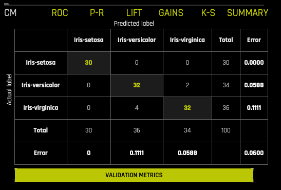
Multiclass Confusion Matrix
A confusion matrix shows experiment performance in terms of false positives, false negatives, true positives, and true negatives. For each threshold, the confusion matrix represents the balance between TPR and FPR (ROC) or Precision and Recall (Prec-Recall). In general, most useful operating points are in the top left corner.
In this graph, the actual results display in the columns and the predictions display in the rows; correct predictions are highlighted. In the example below, Iris-setosa was predicted correctly 30 times, while Iris-virginica was predicted correctly 32 times, and Iris-versicolor was predicted as Iris-virginica 2 times (against the validation set).
If a test set was provided for the experiment, then click on the Validation Metrics button below the graph to view these stats on test data.
Regression Experiments
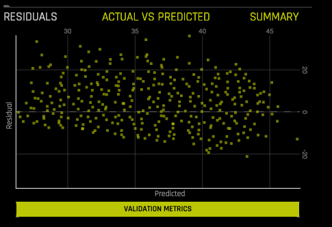
Residuals: Residuals are the differences between observed responses and those predicted by a model. Any pattern in the residuals is evidence of an inadequate model or of irregularities in the data, such as outliers, and suggests how the model may be improved. This chart shows Residuals (Actual-Predicted) vs Predicted values on validation or test data. Note that this plot preserves all outliers. For a perfect model, residuals are zero.
Hover over a point on the graph to view the Predicted and Residual values for that point.
If a test set was provided for the experiment, then click on the Validation Metrics button below the graph to view these stats on test data.
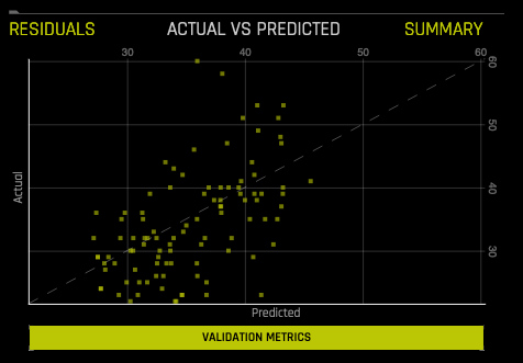
Actual vs. Predicted: This chart shows Actual vs Predicted values on validation data. A small sample of values are displayed. A perfect model has a diagonal line.
Hover over a point on the graph to view the Actual and Predicted values for that point.
If a test set was provided for the experiment, then click on the Validation Metrics button below the graph to view these stats on test data.