Creating Custom Plots
To create a custom plot, click the Add Graph button in the upper-right corner and select one of the available plot types. After selecting a plot, configure the available settings for that plot type and click Save. The custom plot appears on the Visualization page once it has been created.
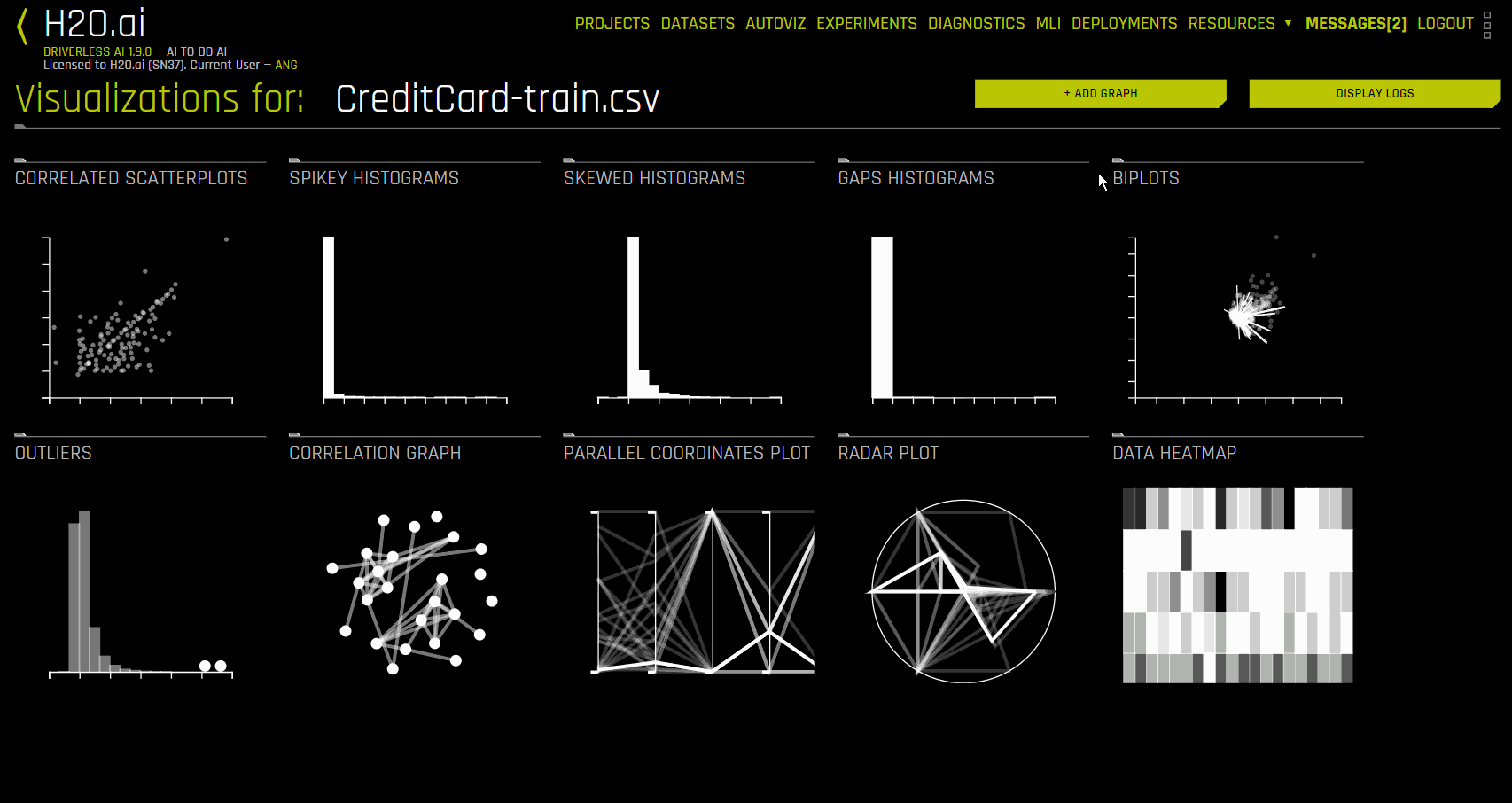
The following example creates a custom histogram plot for the CreditCard-Train dataset:
The following is a complete list of available graph types.
Bar chart
This plot presents categorical data with rectangular bars that are proportional to the values they represent. The type of marker used to represent bars determines the bar chart type. The most common marker is the bar marker, which ranges from a lower value (usually zero) to an upper value. Also available are the Cleveland dot plot (replaces the bar with a dot located at the upper value) and the area chart (covers the bars with a solid area marker). Bars are always plotted against the categories of a categorical variable. They may represent counts (if no y variable is specified) or the average value of the y variable per category (if the y variable is specified).
When creating a bar chart, specify the following options:
x variable name: Specify the name of the x variable
y variable name: Specify the name of the y variable
Transpose: Specify whether to switch the X-axis and Y-axis
Sort: Specify whether to sort bars alphabetically by x values
Mark: Specify a marker type. Select point to create a Cleveland dot plot
Boxplot
This plot presents the fractiles of a distribution. The center of the box represents the median, the edges of a box represent the lower and upper quartiles, and the ends of the “whiskers” represent that range of values. When outliers occur, the adjacent whisker is shortened to the next lower or upper value. For variables having only a few values, the boxes can be compressed.
When creating a boxplot, specify the following options:
Variable name: Specify the variable that you want the box to represent
Transpose: Specify whether to switch the X-axis and Y-axis
Dotplot
This plot represents individual data values with dots. When more than one value falls within a small neighborhood, the dots are stacked.
When creating a dotplot, specify the following options:
Variable name: Specify the name of the variable on which dots are calculated
Mark: Specify a marker type
Grouped Boxplot
This plot is a boxplot where categories are organized into groups and subgroups.
When creating a grouped boxplot, specify the following options:
Variable name: Specify the variable that you want the box to represent
Group variable name: Specify the name of the grouping variable
Transpose: Specify whether to switch the X-axis and Y-axis
Heatmap
See data heatmap. When creating a heatmap, specify the following options:
Variable names: Specify one or more variables to use. If none are specified, all the variables in the dataset are used
Permute: Specify whether to reorder variables using singular value decomposition (SVD)
Transpose: Specify whether to switch the X-axis and Y-axis
Matrix type: Specify a matrix type. Choose from rectangular and symmetric
Histogram
This plot is a graphical display of data that uses bars of differing height. Each bar groups numbers into ranges by its width, and taller bars show that more data falls within a specific range. This plot is often used to display the shape and spread of a continuous variable.
When creating a histogram, specify the following options:
Variable name: Specify the variable name
Transformation: Specify whether to use a transformation. Choose from log and square root
Number of bars: Specify the number of bars to use
Mark: Specify a marker type. Use area to create a density polygon
Linear Regression
This plot predicts a set of values on a variable y from values on a variable x by fitting a linear function (\(ax + b\)) so that for any value on the x variable, this function yields the most probable value on the y variable. The effectiveness of this prediction in a sample of values is represented by the discrepancies between the y values and their corresponding predicted values.
When creating a linear regression plot, specify the following options:
x variable name: Specify the name of the x variable
y variable name: Specify the name of the y variable
Mark: Specify a marker type. Choose from point and square
LOESS Regression
This plot predicts a set of values on a variable y from values on a variable x by fitting a locally linear function (\(ax + b\)) that determines the most probable y variable values based on the available x variable values. The effectiveness of this prediction in a sample of values is represented by the discrepancies between the y values and their corresponding predicted values.
When creating a LOESS regression plot, specify the following options:
x variable name: Specify the name of the x variable
y variable name: Specify the name of the y variable
Mark: Specify a marker type. Choose from point and square
Bandwidth: Specify the interval that represents the proportion of cases during the smoothing window. This is set to 0.5 by default
Parallel Coordinates Plot
This plot is used for comparing multiple variables. Each variable has its own vertical axis in the plot, and each profile connects the values on the axes for a single observation. If the data contains clusters, these profiles are color-coded by their cluster number.
When creating a parallel coordinates plot, specify the following options:
Variable names: Specify one or more variables to use. If none are specified, all the variables in the dataset are used
Permute: Specify whether to reorder variables using singular value decomposition (SVD)
Transpose: Specify whether to switch the X-axis and Y-axis
Cluster: Specify whether to include k-Means cluster variables. Unique colors are assigned for each cluster ID
Probability Plot
This plot evaluates the skewness of a distribution by plotting two cumulative distribution functions against each other.
When creating a probability plot, specify the following options:
x variable name: Specify the name of the x variable
Distribution: Specify a distribution type. Choose from normal and uniform
Mark: Specify a marker type. Choose from point and square
Transpose: Specify whether to switch the X-axis and Y-axis
Quantile Plot
This plot compares two probability distributions by plotting their quantiles against each other.
When creating a quantile plot, specify the following options:
x variable name: Specify the name of the x variable
y variable name: Specify the name of the y variable
Distribution: Specify a distribution type. Choose from normal and uniform
Mark: Specify a marker type. Choose from point and square
Transpose: Specify whether to switch the X-axis and Y-axis
Scatterplot
This plot represents the values of two variables (y and x) in a frame that contains one point for each row of the input sample data. They are useful for analyzing the joint distribution of two variables.
When creating a scatterplot, specify the following options:
x variable name: Specify the name of the x variable
y variable name: Specify the name of the y variable
Mark: Specify a marker type. Choose from point and square