The Datasets Page
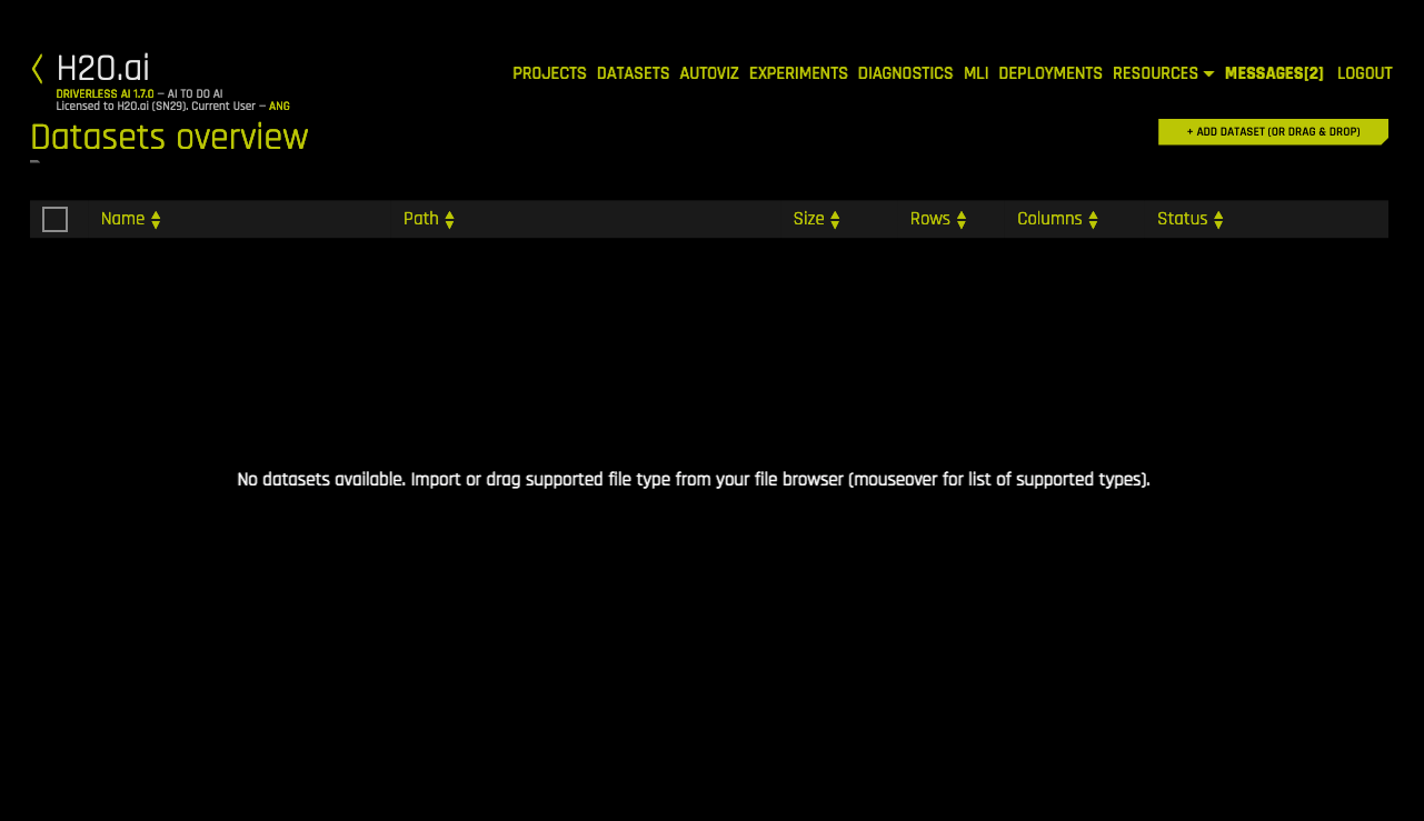
The Datasets Overview page is the Driverless AI Home page. This shows all datasets that have been imported. Note that the first time you log in, this list will be empty.
Supported File Types
Driverless AI supports the following dataset file formats:
arff
avro
bin
bz2
csv (See note below)
dat
feather
gz
jay (See note below)
orc (See notes below)
parquet (See notes below)
pickle / pkl (See note below)
tgz
tsv
txt
xls
xlsx
xz
zip
Notes:
Compressed Parquet files are typically the most efficient file type to use with Driverless AI.
By default, Driverless AI uses the file extension of a file to decide the file type of a file before importing it. If no file extension is provided when adding data, Driverless AI attempts to import that data according to the list of file types defined by the
files_without_extensions_expected_typesconfiguration setting. For example, if the list is specified as["parquet", "orc"](the default value), Driverless AI first attempts to import the data as a Parquet file. If this is unsuccessful, it then attempts to import the data as an ORC file. Driverless AI continues down the list until the data is successfully imported. This setting can be configured in the config.toml file. (See Using the config.toml File for more info.)CSV in UTF-16 encoding is only supported when implemented with a byte order mark (BOM). If a BOM is not present, the dataset is read as UTF-8.
For ORC and Parquet file formats, if you select to import multiple files, those files will be imported as multiple datasets. If you select a folder of ORC or Parquet files, the folder will be imported as a single dataset. Tools like Spark/Hive export data as multiple ORC or Parquet files that are stored in a directory with a user-defined name. For example, if you export with
Spark dataFrame.write.parquet("/data/big_parquet_dataset"), Spark creates a folder /data/big_parquet_dataset, which will contain multiple Parquet files (depending on the number of partitions in the input dataset) and metadata. Exporting ORC files produces a similar result.For ORC and Parquet file formats, you may receive a “Failed to ingest binary file with ORC / Parquet: lists with structs are not supported” error when ingesting an ORC or Parquet file that has a struct as an element of an array. This is because PyArrow cannot handle a struct that’s an element of an array.
A workaround to flatten Parquet files is provided in Sparkling Water. Refer to our Sparkling Water solution for more information.
You can create new datasets from Python script files (custom recipes) by selecting Data Recipe URL or Upload Data Recipe from the Add Dataset (or Drag & Drop) dropdown menu. If you select the Data Recipe URL option, the URL must point to either a raw file, a GitHub repository or tree, or a local file. In addition, you can create a new dataset by modifying an existing dataset with a custom recipe. Refer to Modify By Recipe for more information. Datasets created or added from recipes will be saved as .jay files.
To avoid potential errors, converting pickle files to CSV or .jay files is recommended. The following is an example of how to convert a pickle file to a CSV file using Datatable:
import datatable as dt
import pandas as pd

df = pd.read_pickle("test.pkl")
dt = dt.Frame(df)
dt.to_csv("test.csv")
Adding Datasets
You can add datasets using one of the following methods:
Drag and drop files from your local machine directly onto this page. Note that this method currently works for files that are less than 10 GB.
or
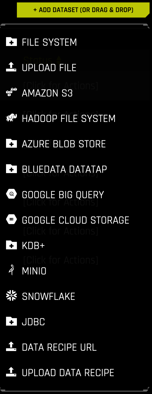
Click the Add Dataset (or Drag & Drop) button to upload or add a dataset.
Notes:
By default, Driverless AI uses the file extension of a file to decide the file type of a file before importing it. If no file extension is provided when adding data, Driverless AI attempts to import that data according to the list of file types defined by the
files_without_extensions_expected_typesconfiguration setting. (To see which file types are supported, refer to supported file types.) For example, if the list is specified as["parquet", "orc"](the default value), Driverless AI first attempts to import the data as a Parquet file. If this is unsuccessful, it then attempts to import the data as an ORC file. Driverless AI continues down the list until the data is successfully imported. This setting can be configured in the config.toml file. (See Using the config.toml File for more info.)Upload File, File System, HDFS, S3, Data Recipe URL, and Upload Data Recipe are enabled by default. These can be disabled by removing them from the
enabled_file_systemssetting in the config.toml file. (See Using the config.toml File for more info.)If File System is disabled, Driverless AI will open a local filebrowser by default.
If Driverless AI was started with data connectors enabled for Azure Blob Store, BlueData Datatap, Google Big Query, Google Cloud Storage, KDB+, Minio, Snowflake, Hive, or JDBC, then these options will appear in the Add Dataset (or Drag & Drop) dropdown menu. Refer to the Enabling Data Connectors section for more information.
When specifying to add a dataset using Data Recipe URL, the URL must point to either a raw file, a GitHub repository or tree, or a local file. When adding or uploading datasets via recipes, the dataset will be saved as a .jay file.
Datasets must be in delimited text format.
Driverless AI can detect the following separators: ,|;t
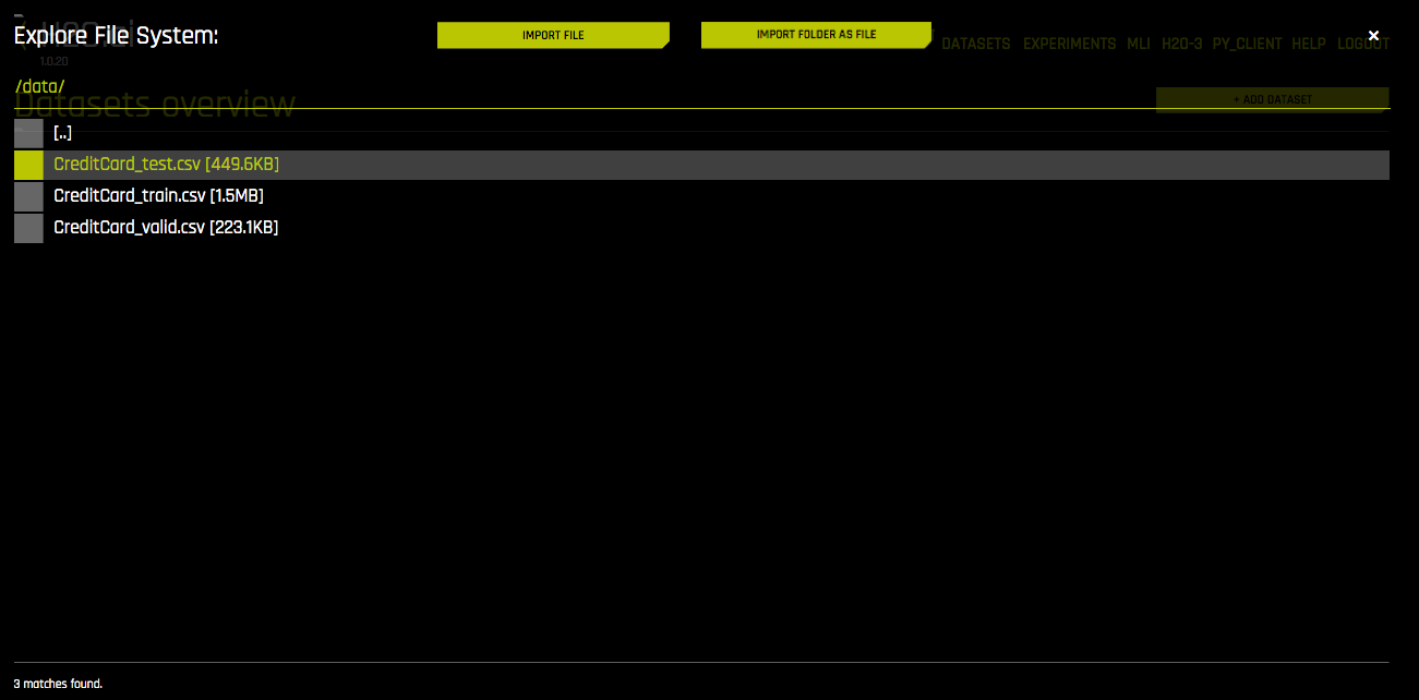
When importing a folder, the entire folder and all of its contents are read into Driverless AI as a single file.
When importing a folder, all of the files in the folder must have the same columns.
If you try to import a folder via a data connector on Windows, the import will fail if the folder contains files that do not have file extensions (the resulting error is usually related to the above note).
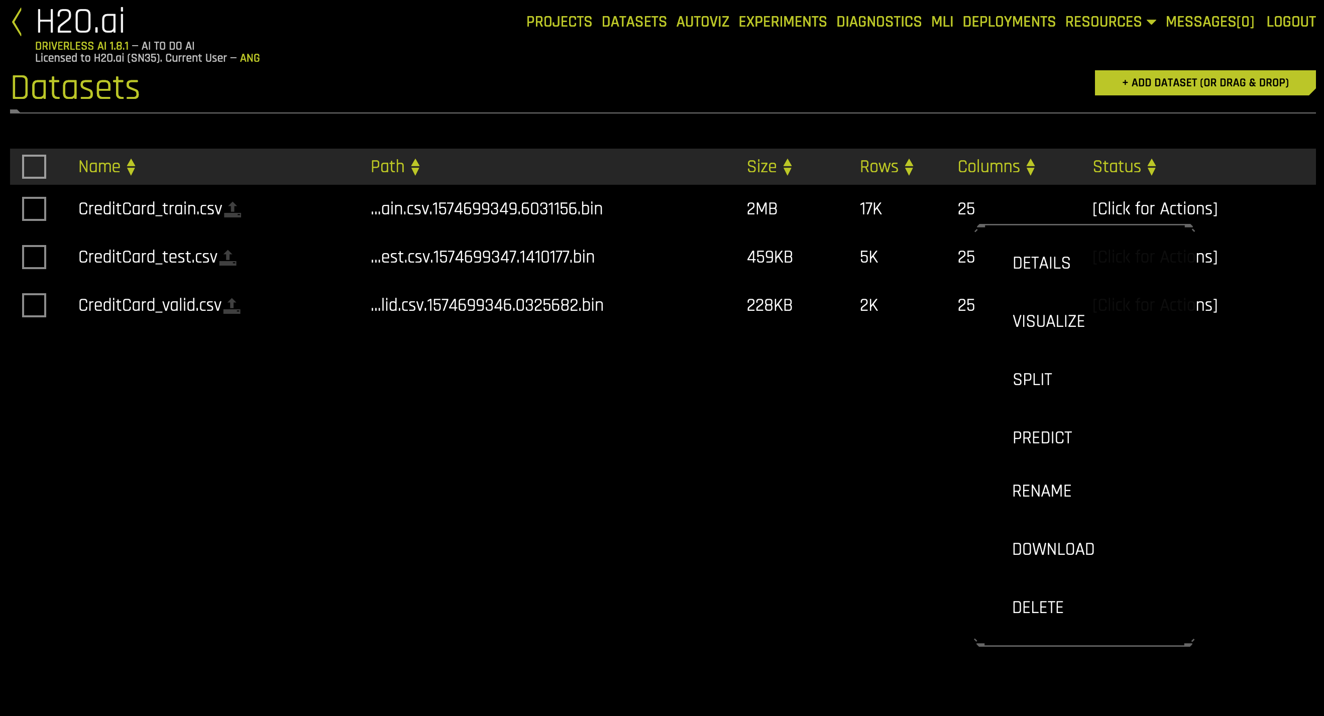
Upon completion, the datasets will appear in the Datasets Overview page. Click on a dataset to open a submenu. From this menu, you can specify to Rename, view Details of, Visualize, Split, Download, or Delete a dataset. Note: You cannot delete a dataset that was used in an active experiment. You have to delete the experiment first.
Renaming Datasets
In Driverless AI, you can rename datasets from the Datasets Overview page.
To rename a dataset, click on the dataset or select the [Click for Actions] button beside the dataset that you want to rename, and then select Rename from the submenu that appears.
Note: If the name of a dataset is changed, every instance of the dataset in Driverless AI will be changed to reflect the new name.
Dataset Details
To view a summary of a dataset or to preview the dataset, click on the dataset or select the [Click for Actions] button beside the dataset that you want to view, and then click Details from the submenu that appears. This opens the Dataset Details page.
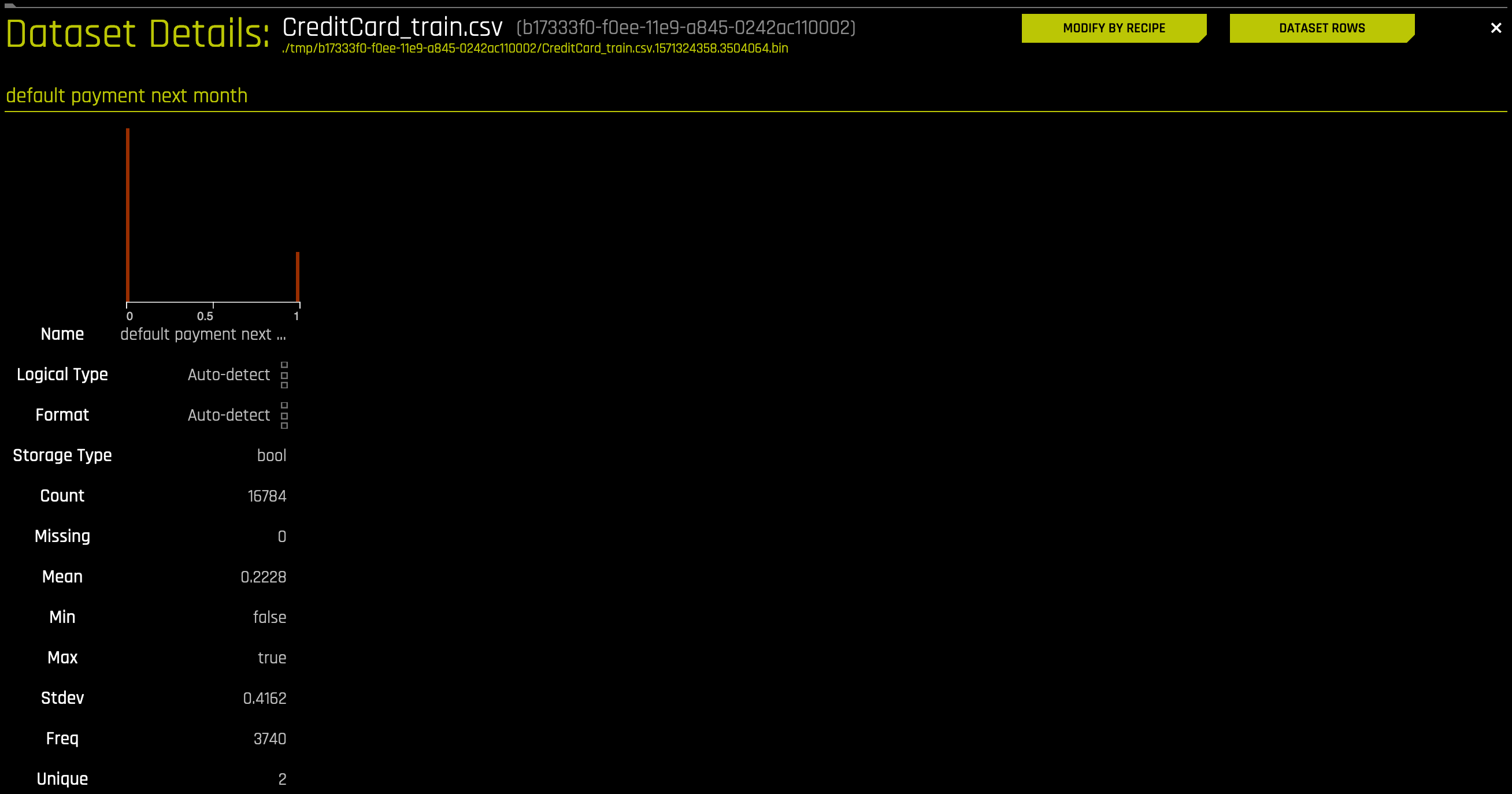
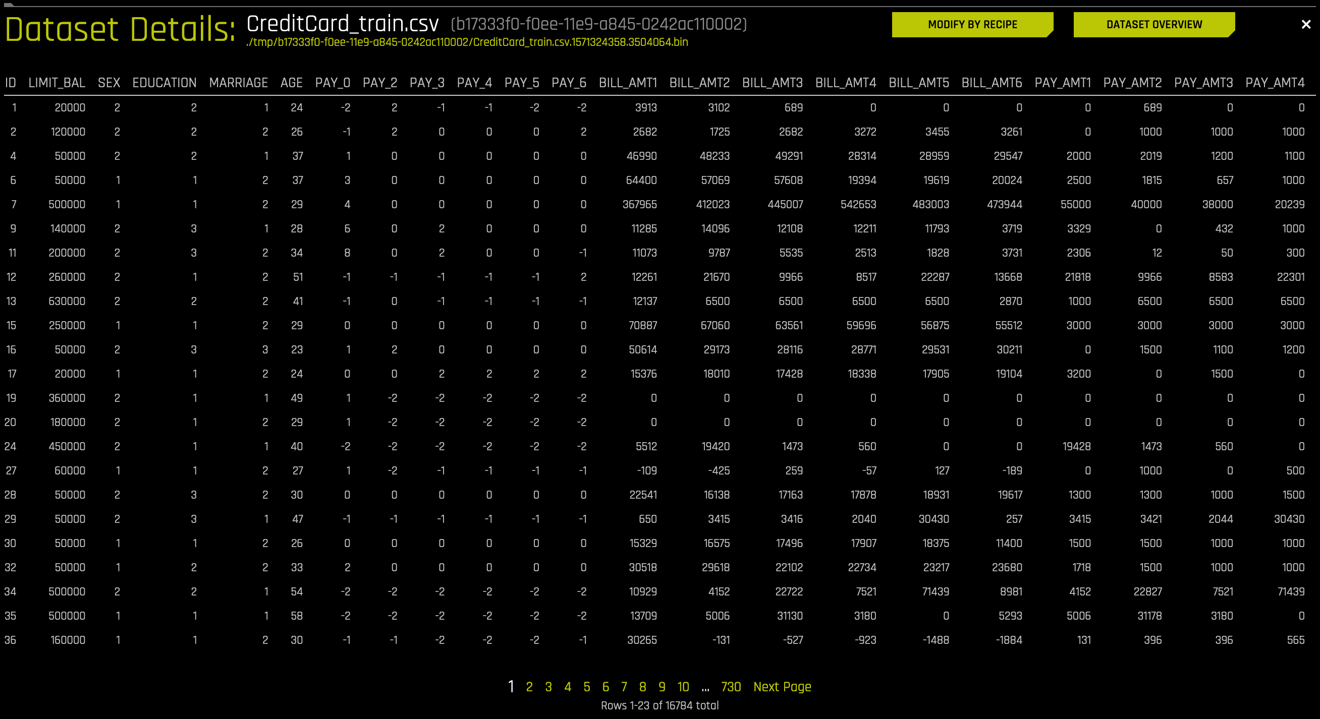
Dataset Details Page
The Dataset Details page provides a summary of the dataset. This summary lists each of the dataset’s columns and displays accompanying rows for logical type, format, storage type (see note below), count, number of missing values, mean, minimum, maximum, standard deviation, frequency, and number of unique values.
Note: Driverless AI recognizes the following storage types: integer, string, real, boolean, and time.
Hover over the top of a column to view a summary of the first 20 rows of that column.
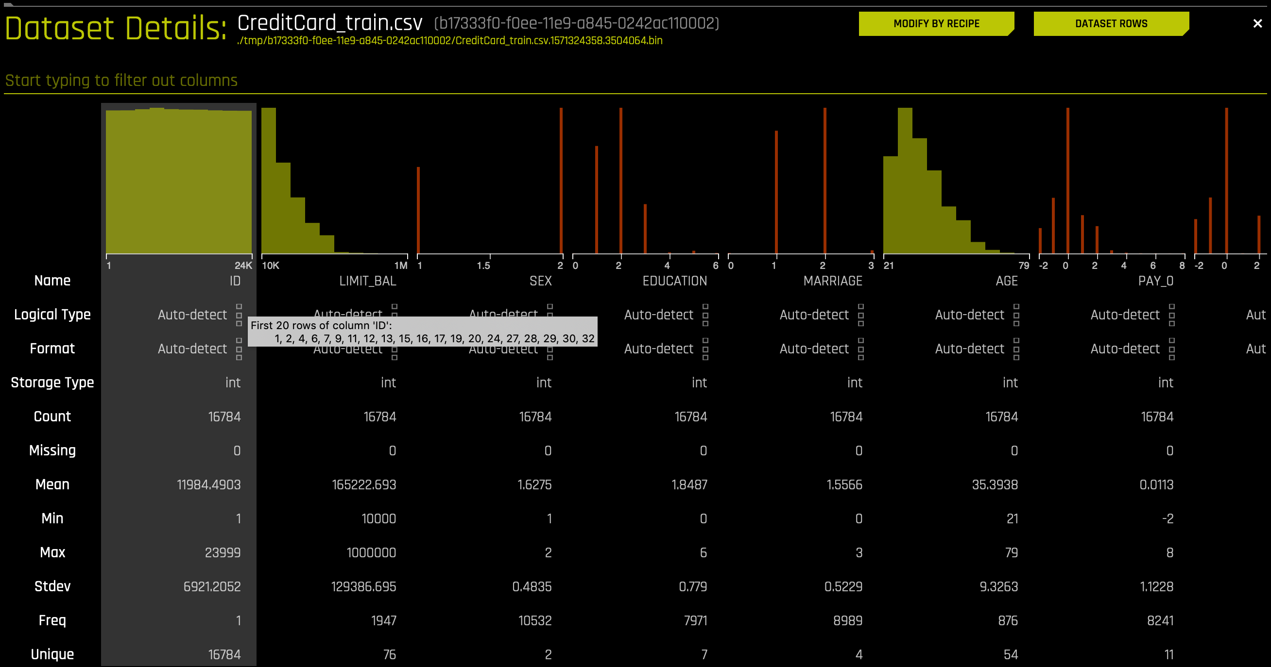
To view information for a specific column, type the column name in the field above the graph.
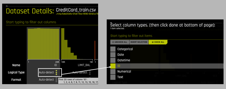
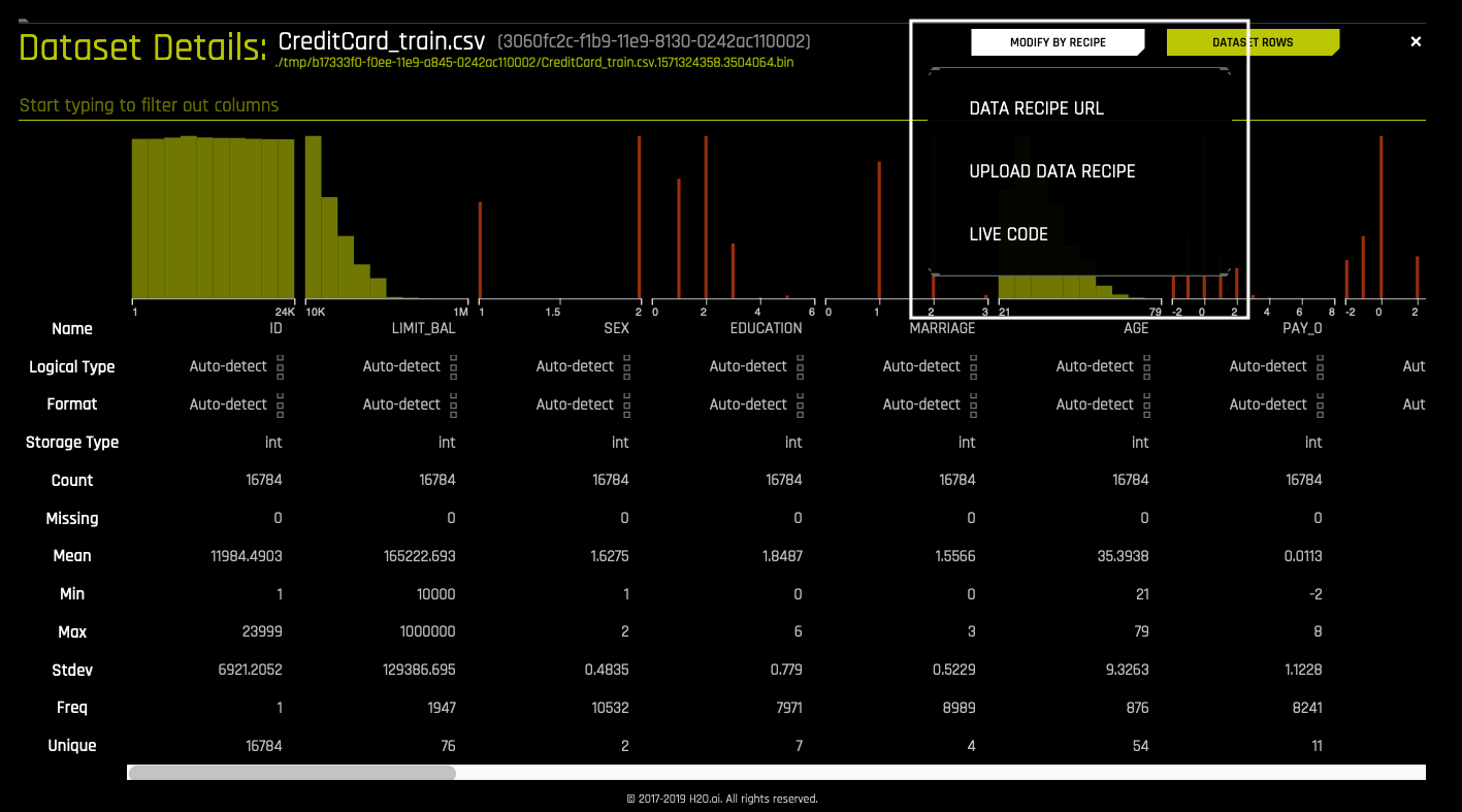
Changing a Column Type
Driverless AI also allows you to change a column type. If a column’s data type or distribution does not match the manner in which you want the column to be handled during an experiment, changing the Logical Type can help to make the column fit better. For example, an integer zip code can be changed into a categorical so that it is only used with categorical-related feature engineering. For Date and Datetime columns, use the Format option. To change the Logical Type or Format of a column, click on the group of square icons located to the right of the words Auto-detect. (The squares light up when you hover over them with your cursor.) Then select the new column type for that column.
Dataset Rows Page
To switch the view and preview the dataset, click the Dataset Rows button in the top right portion of the UI. Then click the Dataset Overview button to return to the original view.
Modify By Recipe
The option to create a new dataset by modifying an existing dataset with custom recipes is also available from this page. Scoring pipelines can be created on the new dataset by building an experiment. This feature is useful when you want to make changes to the training data that you would not need to make on the new data you are predicting on. For example, you can change the target column from regression to classification, add a weight column to mark specific training rows as being more important, or remove outliers that you do not want to model on. Refer to the Adding a Data Recipe section for more information.
Click the Modify by Recipe button in the top right portion of the UI and select from the following options:
Data Recipe URL: Load a custom recipe from a URL to use to modify the dataset. The URL must point to either a raw file, a GitHub repository or tree, or a local file. Sample custom data recipes are available in the https://github.com/h2oai/driverlessai-recipes/tree/rel-1.8.10/data repository.
Upload Data Recipe: If you have a custom recipe available on your local system, click this button to upload that recipe.
Live Code: Manually enter custom recipe code to use to modify the dataset. Click the Get Preview button to preview the code’s effect on the dataset, then click Save to create a new dataset.
Notes:
These options are enabled by default. You can disable them by removing
recipe_fileandrecipe_urlfrom theenabled_file_systemsconfiguration option.Modifying a dataset with a recipe will not overwrite the original dataset. The dataset that is selected for modification will remain in the list of available datasets in its original form, and the modified dataset will appear in this list as a new dataset.
Changes made to the original dataset through this feature will not be applied to new data that is scored.
Downloading Datasets
In Driverless AI, you can download datasets from the Datasets Overview page.
To download a dataset, click on the dataset or select the [Click for Actions] button beside the dataset that you want to download, and then select Download from the submenu that appears.
Note: The option to download datasets will not be available if the enable_dataset_downloading option is set to false when starting Driverless AI. This option can be specified in the config.toml file.
Splitting Datasets
In Driverless AI, you can split a training dataset into test and validation datasets.
Perform the following steps to split a dataset.
To split a dataset, click on the dataset or select the [Click for Actions] button beside the dataset that you want to split, and then select Split from the submenu that appears.
The Dataset Splitter form displays. Specify an Output Name 1 and an Output Name 2 for the first and second part of the split. (For example, you can name one test and one valid.)
Optionally specify a Target column (for stratified sampling), a Fold column (to keep rows belonging to the same group together), a Time column, and/or a Random Seed (defaults to 1234).
Use the slider to select a split ratio, or enter a value in the Train/Valid Split Ratio field.
Click Save when you are done.
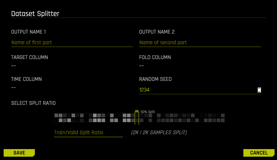
Upon completion, the split datasets will be available on the Datasets page.
Visualizing Datasets
Perform one of the following steps to visualize a dataset:
On the Datasets page, select the [Click for Actions] button beside the dataset that you want to view, and then click Visualize from the submenu that appears.
Click the Autoviz top menu link to go to the Visualizations list page, click the New Visualization button, then select or import the dataset that you want to visualize.
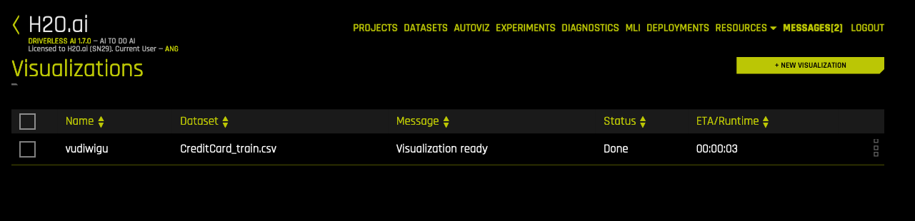
The Visualization Page
The Visualization page shows all available graphs for the selected dataset. Note that the graphs on the Visualization page can vary based on the information in your dataset. You can also view and download logs that were generated during the visualization.
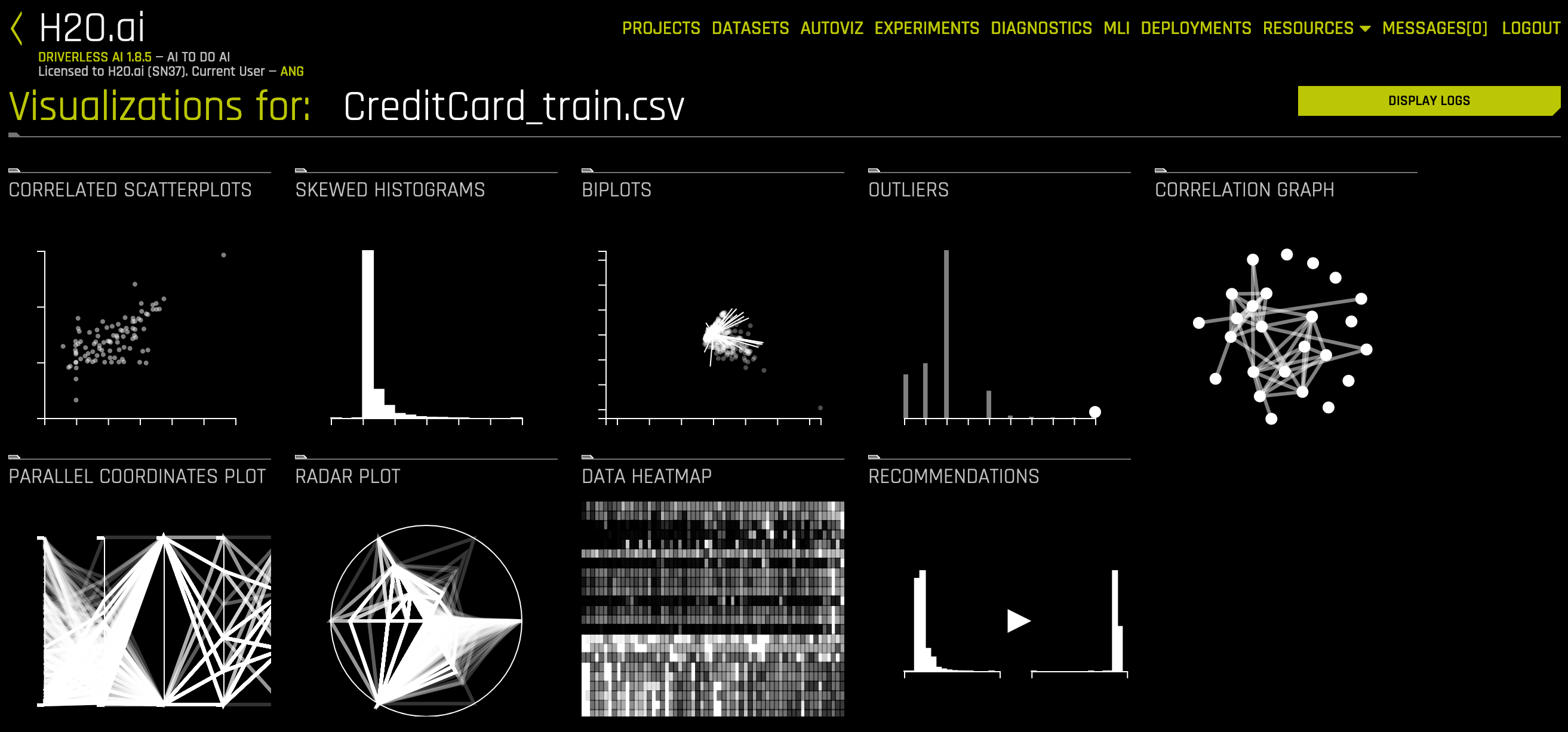
The following is a complete list of available graphs.
Correlated Scatterplots: Correlated scatterplots are 2D plots with large values of the squared Pearson correlation coefficient. All possible scatterplots based on pairs of features (variables) are examined for correlations. The displayed plots are ranked according to the correlation. Some of these plots may not look like textbook examples of correlation. The only criterion is that they have a large value of squared Pearson’s r (greater than .95). When modeling with these variables, you may want to leave out variables that are perfectly correlated with others.
Note that points in the scatterplot can have different sizes. Because Driverless AI aggregates the data and does not display all points, the bigger the point is, the bigger number of exemplars (aggregated points) the plot covers.
Spikey Histograms: Spikey histograms are histograms with huge spikes. This often indicates an inordinate number of single values (usually zeros) or highly similar values. The measure of “spikeyness” is a bin frequency that is ten times the average frequency of all the bins. You should be careful when modeling (particularly regression models) with spikey variables.
Skewed Histograms: Skewed histograms are ones with especially large skewness (asymmetry). The robust measure of skewness is derived from Groeneveld, R.A. and Meeden, G. (1984), “Measuring Skewness and Kurtosis.” The Statistician, 33, 391-399. Highly skewed variables are often candidates for a transformation (e.g., logging) before use in modeling. The histograms in the output are sorted in descending order of skewness.
Varying Boxplots: Varying boxplots reveal unusual variability in a feature across the categories of a categorical variable. The measure of variability is computed from a robust one-way analysis of variance (ANOVA). Sufficiently diverse variables are flagged in the ANOVA. A boxplot is a graphical display of the fractiles of a distribution. The center of the box denotes the median, the edges of a box denote the lower and upper quartiles, and the ends of the “whiskers” denote that range of values. Sometimes outliers occur, in which case the adjacent whisker is shortened to the next lower or upper value. For variables (features) having only a few values, the boxes can be compressed, sometimes into a single horizontal line at the median.
Heteroscedastic Boxplots: Heteroscedastic boxplots reveal unusual variability in a feature across the categories of a categorical variable. Heteroscedasticity is calculated with a Brown-Forsythe test: Brown, M. B. and Forsythe, A. B. (1974), “Robust tests for equality of variances. Journal of the American Statistical Association, 69, 364-367. Plots are ranked according to their heteroscedasticity values. A boxplot is a graphical display of the fractiles of a distribution. The center of the box denotes the median, the edges of a box denote the lower and upper quartiles, and the ends of the “whiskers” denote that range of values. Sometimes outliers occur, in which case the adjacent whisker is shortened to the next lower or upper value. For variables (features) having only a few values, the boxes can be compressed, sometimes into a single horizontal line at the median.
Biplots: A Biplot is an enhanced scatterplot that uses both points and vectors to represent structure simultaneously for rows and columns of a data matrix. Rows are represented as points (scores), and columns are represented as vectors (loadings). The plot is computed from the first two principal components of the correlation matrix of the variables (features). You should look for unusual (non-elliptical) shapes in the points that might reveal outliers or non-normal distributions. And you should look for purple vectors that are well-separated. Overlapping vectors can indicate a high degree of correlation between variables.
Outliers: Variables with anomalous or outlying values are displayed as red points in a dot plot. Dot plots are constructed using an algorithm in Wilkinson, L. (1999). “Dot plots.” The American Statistician, 53, 276–281. Not all anomalous points are outliers. Sometimes the algorithm will flag points that lie in an empty region (i.e., they are not near any other points). You should inspect outliers to see if they are miscodings or if they are due to some other mistake. Outliers should ordinarily be eliminated from models only when there is a reasonable explanation for their occurrence.
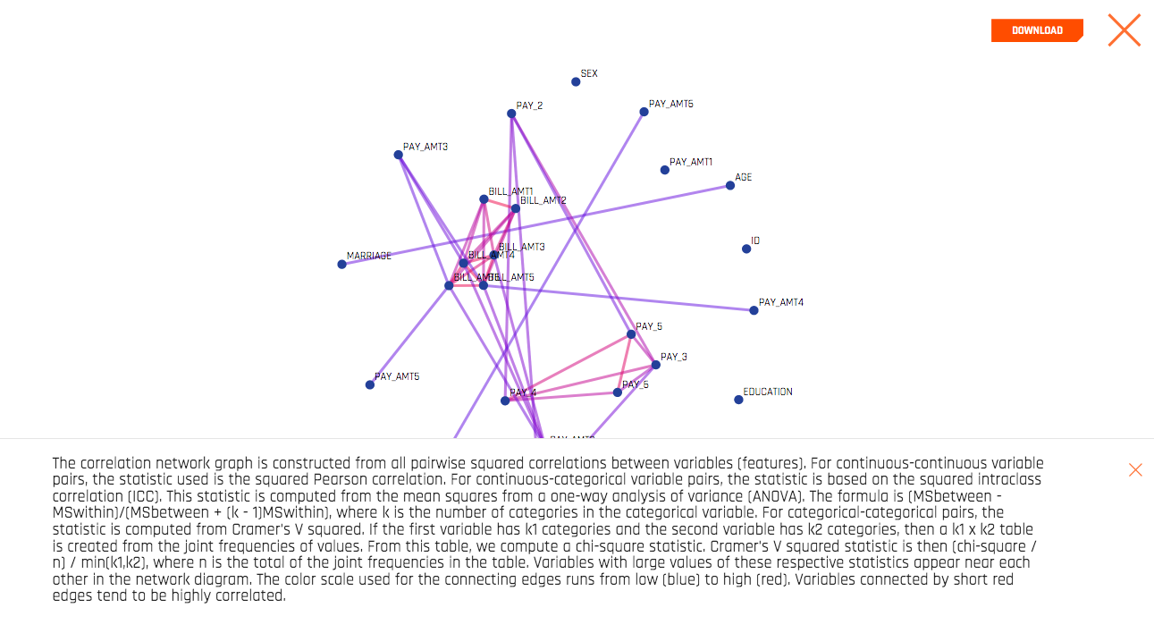
Correlation Graph: The correlation network graph is constructed from all pairwise squared correlations between variables (features). For continuous-continuous variable pairs, the statistic used is the squared Pearson correlation. For continuous-categorical variable pairs, the statistic is based on the squared intraclass correlation (ICC). This statistic is computed from the mean squares from a one-way analysis of variance (ANOVA). The formula is (MSbetween - MSwithin)/(MSbetween + (k - 1)MSwithin), where k is the number of categories in the categorical variable. For categorical-categorical pairs, the statistic is computed from Cramer’s V squared. If the first variable has k1 categories and the second variable has k2 categories, then a k1 x k2 table is created from the joint frequencies of values. From this table, we compute a chi-square statistic. Cramer’s V squared statistic is then (chi-square / n) / min(k1,k2), where n is the total of the joint frequencies in the table. Variables with large values of these respective statistics appear near each other in the network diagram. The color scale used for the connecting edges runs from low (blue) to high (red). Variables connected by short red edges tend to be highly correlated.
Parallel Coordinates Plot: A Parallel Coordinates Plot is a graph used for comparing multiple variables. Each variable has its own vertical axis in the plot. Each profile connects the values on the axes for a single observation. If the data contain clusters, these profiles will be colored by their cluster number.
Radar Plot: A Radar Plot is a two-dimensional graph that is used for comparing multiple variables. Each variable has its own axis that starts from the center of the graph. The data are standardized on each variable between 0 and 1 so that values can be compared across variables. Each profile, which usually appears in the form of a star, connects the values on the axes for a single observation. Multivariate outliers are represented by red profiles. The Radar Plot is the polar version of the popular Parallel Coordinates plot. The polar layout enables us to represent more variables in a single plot.
Data Heatmap: The heatmap graphic is constructed from the transposed data matrix. Rows of the heatmap represent variables, and columns represent cases (instances). The data are standardized before display so that small values are yellow and large values are red. The rows and columns are permuted via a singular value decomposition (SVD) of the data matrix so that similar rows and similar columns are near each other.
Recommendations: The recommendations graphic implements the Tukey ladder of powers collection of log, square root, and inverse data transformations described in Exploratory Data Analysis (Tukey, 1977). Also implemented are extensions of these three transformers that handle negative values, which are derived from I.K. Yeo and R.A. Johnson, “A new family of power transformations to improve normality or symmetry.” Biometrika, 87(4), (2000). For each transformer, transformations are selected by comparing the robust skewness of the transformed column with the robust skewness of the original raw column. When a transformation leads to a relatively low value of skewness, it is recommended.
Missing Values Heatmap: The missing values heatmap graphic is constructed from the transposed data matrix. Rows of the heatmap represent variables and columns represent cases (instances). The data are coded into the values 0 (missing) and 1 (nonmissing). Missing values are colored red and nonmissing values are left blank (white). The rows and columns are permuted via a singular value decomposition (SVD) of the data matrix so that similar rows and similar columns are near each other.
Gaps Histogram: The gaps index is computed using an algorithm of Wainer and Schacht based on work by John Tukey. (Wainer, H. and Schacht, Psychometrika, 43, 2, 203-12.) Histograms with gaps can indicate a mixture of two or more distributions based on possible subgroups not necessarily characterized in the dataset.
The images on this page are thumbnails. You can click on any of the graphs to view and download a full-scale image. You can also view an explanation for each graph by clicking the Help button in the lower-left corner of each expanded graph.