Task 6: Time series explainer
Let's further understand the time series model by observing the time series explainer for the model.
- Click the DAI MODEL tab.
- Click the following card: TIME SERIES EXPLAINER.
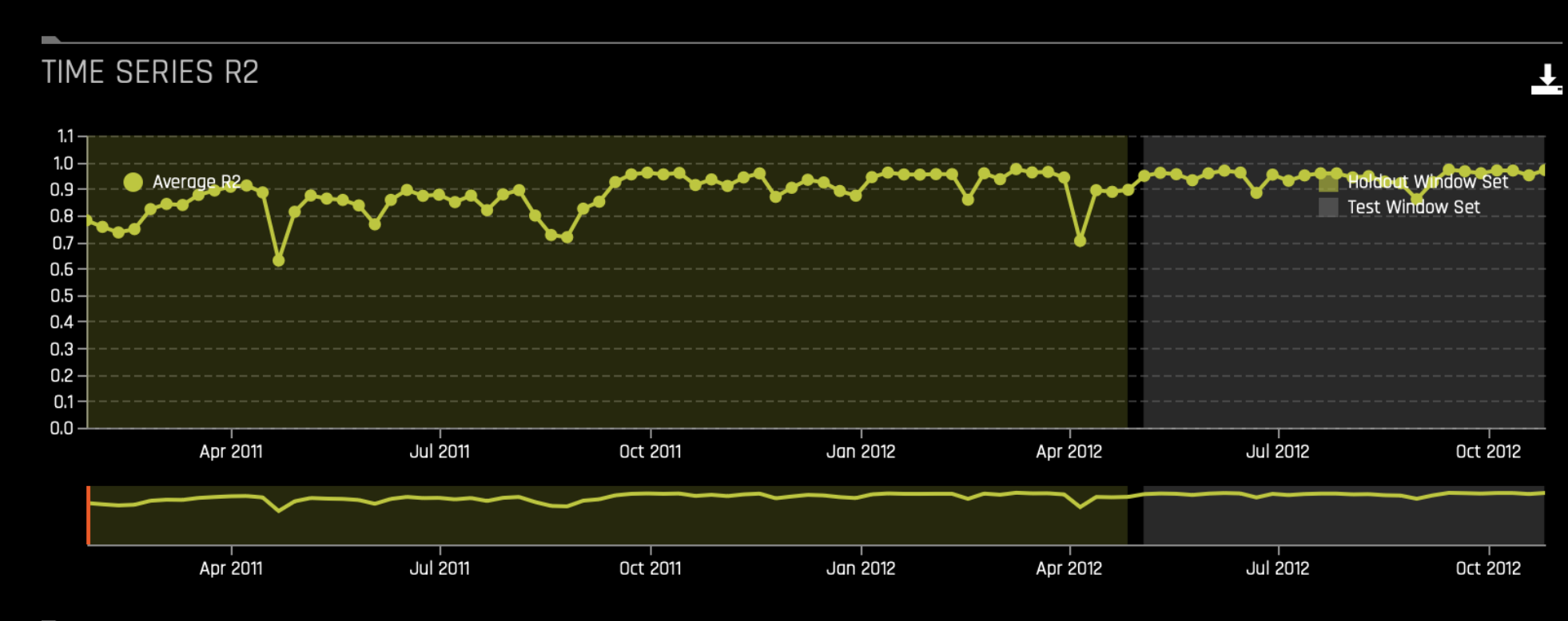
Time series R2
In the TIME SERIES R2 graph, we can observe the R2 values over time for the time series model. Notably, the model performs well overall, with most R2 values above 0.8. There are periods of lower performance, but these are relatively short-lived. Therefore, the model's performance remains strong in both the holdout and test window sets, suggesting it generalizes well to unseen data. The small standard deviation of the R2 values indicates that the model's performance is relatively consistent across different validation and test periods.
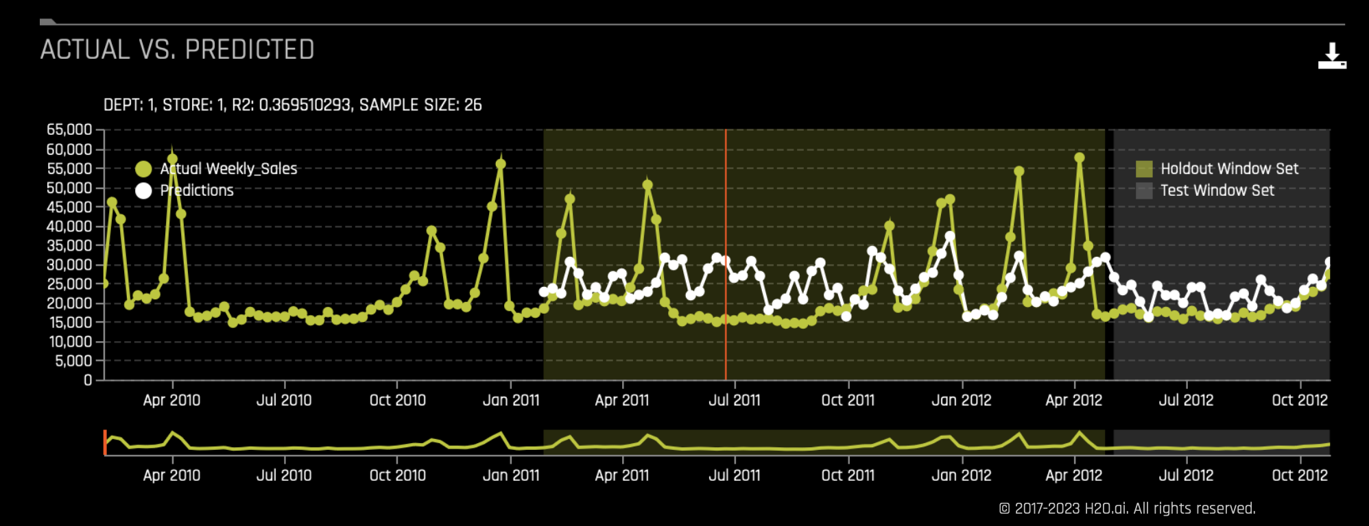
Actual vs. Predicted
The Actual vs. Predicted graph compares actual sales and predicted sales over time for a specific date (June 24, 2011), department (1), and store (2). Here's a detailed breakdown:
- Y-axis: Represents the sales values, ranging from 0 to 65,000.
- X-axis: Represents the timeline from April 2010 to October 2012.
- Red vertical line: Marks a specific date on the timeline.
- Yellow line with dots: Represents the actual weekly sales.
- White line with dots: Represents the model's predicted sales.
- Holdout window set: The yellow shaded area towards the end of the timeline indicates the holdout window set used for model validation.
- Test window set: The gray shaded area indicates the test window set used for evaluating the model on unseen data.
- R2 value: An R2 of 0.369510293 indicates how well the model's predictions match the actual sales for department 1 in store 2 on June 24, 2011.
- Sample size: The sample size is 26, indicating the number of data points used.
- Submit and view feedback for this page
- Send feedback about H2O Driverless AI | Tutorials to cloud-feedback@h2o.ai