Charts
You can understand a projection through several interactive and simple charts. The following charts are available when a simulation generates a simulation-based projection:
- New COVID Cases: 4-Weeks Projection (county-level)
- Occupancy and admissions, non-ICU
- Occupancy and net change, ICU
- Length of stay, non-ICU
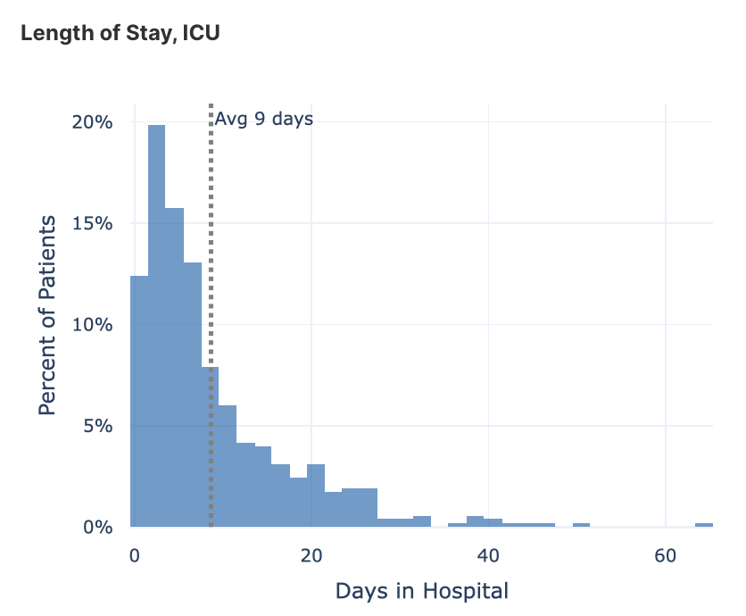
- Length of stay, ICU
In the below sections, each chart, in turn, is explained in detail.
New COVID Cases: 4-Weeks Projection (county-level)
This chart provides a county-level four-week projection of expected COVID-19 cases.
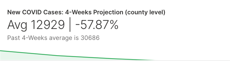
This county-level four-week projection of expected COVID-19 cases uses the CDC county-level ensemble model. To learn more, see CDC County-Level Ensemble Model.
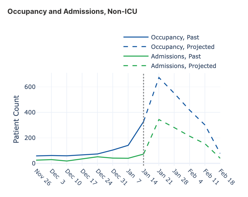
Occupancy and admissions, non-ICU
This chart provides a hospital-level four-week projection of expected occupancy and admissions for non-ICU COVID-19 patients. We can observe the hospital-level past 8-weeks occupancy and admissions rate to the left of the vertical dash line. And to the right of the dashed line, we can observe the hospital-level four-week projection.
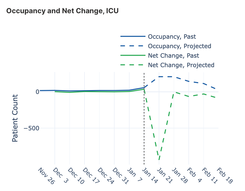
Occupancy and net change, ICU
This chart provides a hospital-level four-week projection of expected occupancy and net-change admissions for ICU COVID-19 patients. We can observe the hospital-level past 8-weeks occupancy and net-change admissions rate to the left of the vertical dash line. And to the right of the dashed line, we can observe the hospital-level four-week projection.
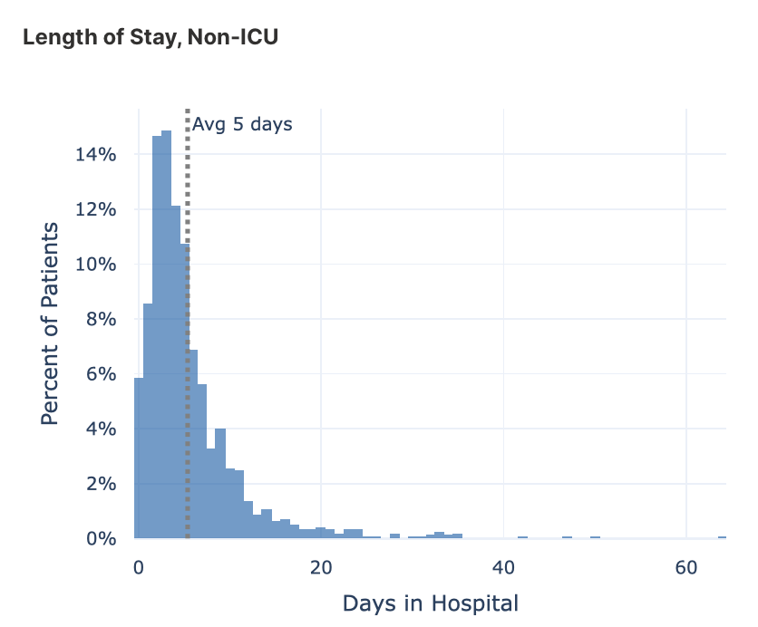
Length of stay, non-ICU
This histogram provides a nationwide (USA) random average sample of the length of stay (LOS) for non-ICU COVID-19 patients.
Length of stay, ICU
This histogram provides a nationwide (USA) random average sample of the length of stay (LOS) for ICU COVID-19 patients.
- Submit and view feedback for this page
- Send feedback about H2O Health to cloud-feedback@h2o.ai