Compare validation tests
Overview
H2O Model Validation enables you to compare validation tests of the same type to discover insights.
Instructions
To compare validation tests, consider the following instructions:
- In the H2O Model Validation navigation menu, click Tests.
- Click the Select tests toggle.
- In the Tests table, select at least two validation tests of the same type.
- Click Compare.
note
When comparing validation tests, H2O Model Validation displays specific metrics based on the compared validation tests. To learn more, see Comparison metrics: Validation tests.
You can select multiple validation tests of different types, but you must select at least two of the same type. H2O Model Validation compares validation tests of the same type (for example, backtesting); therefore, validation tests of different types are not compared. H2O Model Validation organizes comparisons into tabs, each containing validation tests of a certain type.
Comparison metrics: Validation tests
Overview
H2O Model Validation offers certain comparison metrics based on the compared validation tests.
Adversarial similarity
Overview
H2O Model Validation offers the following metrics to understand compared adversarial similarity tests:
Graph: AUC scores
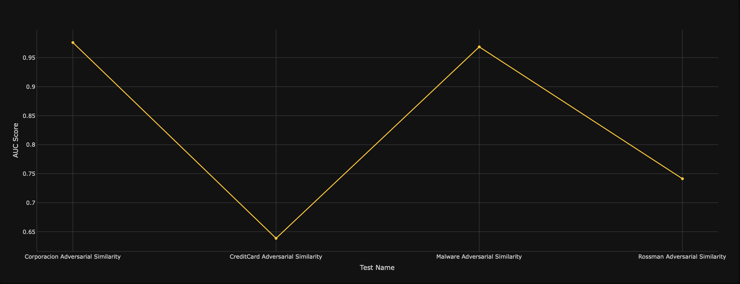
The AUC scores graph displays the area under the receiver operating characteristic (AUC) score given to each adversarial similarity test.
- X-axis: Test name of each adversarial similarity test
- Y-axis: AUC scores (given to each test)
Bar graph: Feature importance
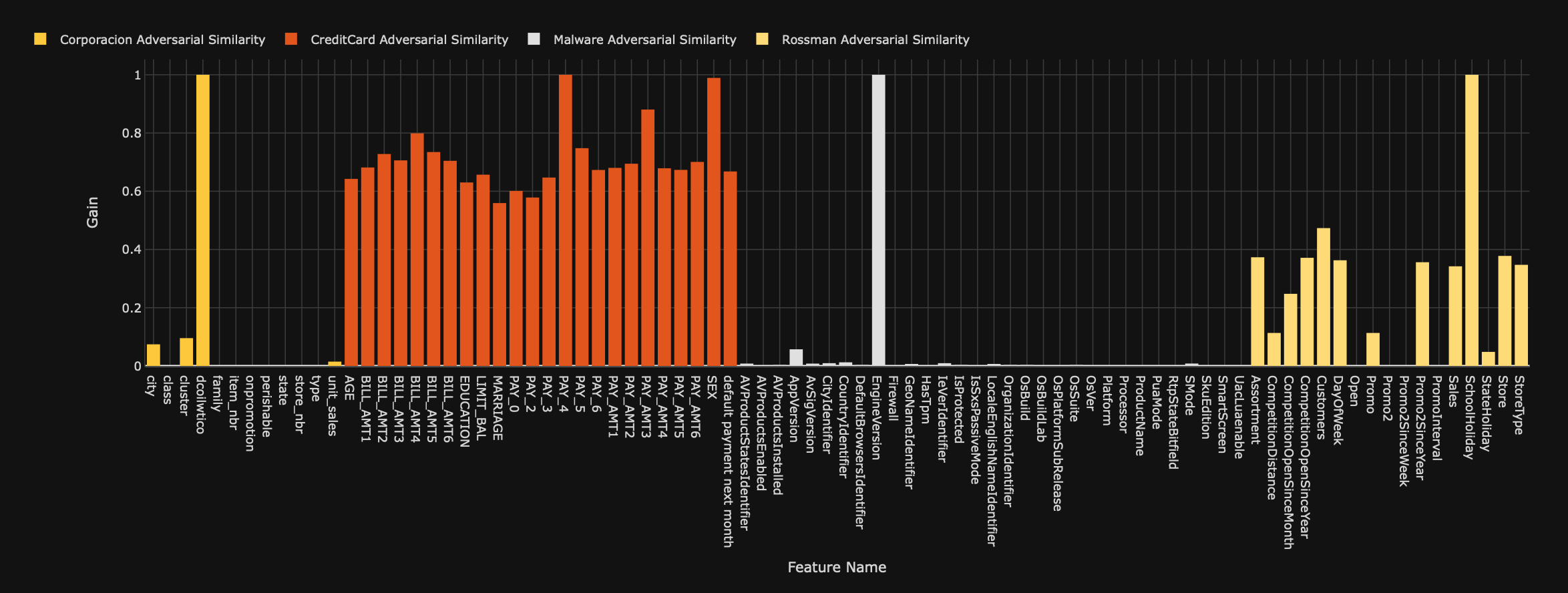
The feature importance bar graph displays the gain of the features in the adversarial similarity tests. Gain refers to the relative contribution of a feature towards the predictive values. A feature with a high gain value implies a higher impact on the process of generating predictions.
- X-axis: Feature name
- Y-axis: Gain
Backtesting
Overview
H2O Model Validation offers the following metrics to understand the backtesting validation tests you compare:
Graph: Test results
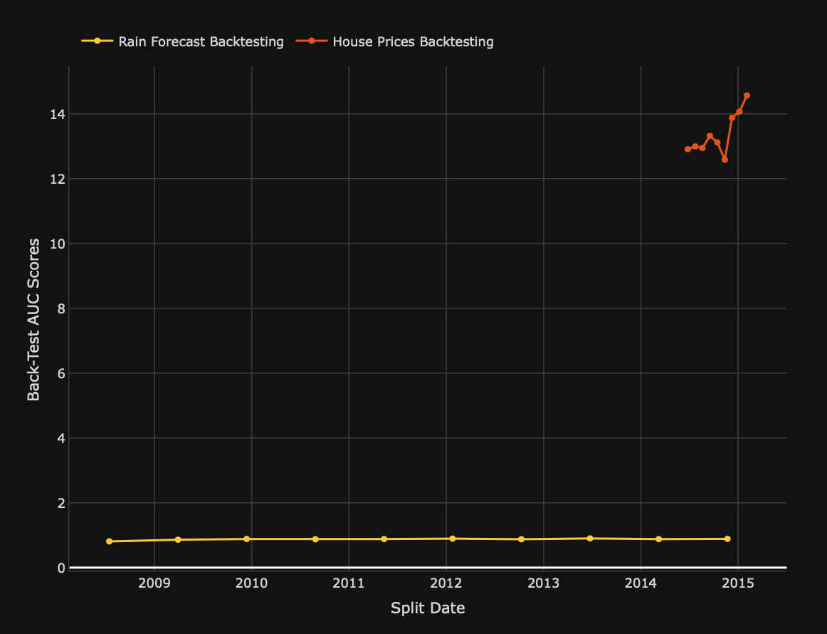
The test results graph displays the Back-test values for each split date of the backtesting tests, where Back-test refers to the target distribution values of the backtesting test dataset.
- X-axis: Split dates
- Y-axis: Back-test scores
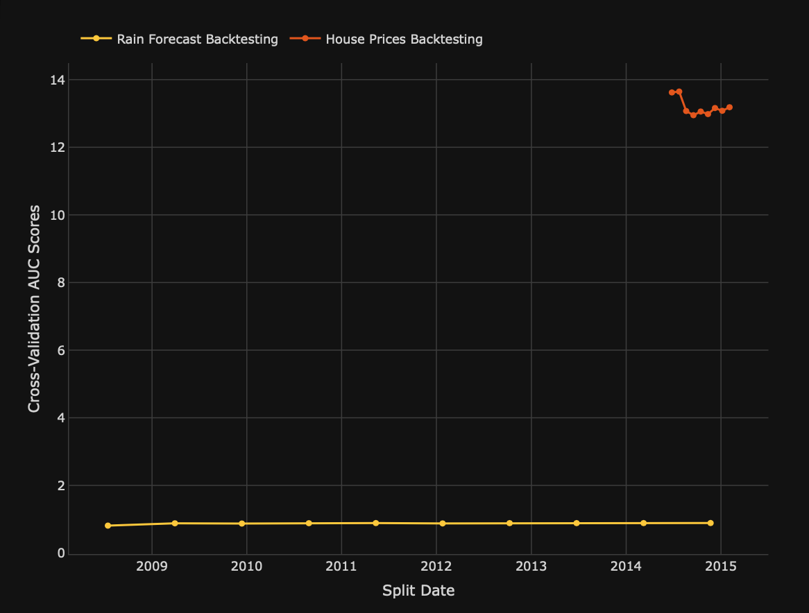
Graph: Validation results
The validation results graph displays the Cross-validation values for each split date for the backtesting models. This graph can be helpful when estimating a model's fitness level to a dataset not used when training the model.
- X-axis: Split dates
- Y-axis: Cross-validation scores
Drift detection
Overview
H2O Model Validation offers the following metrics to understand compared drift detection tests:
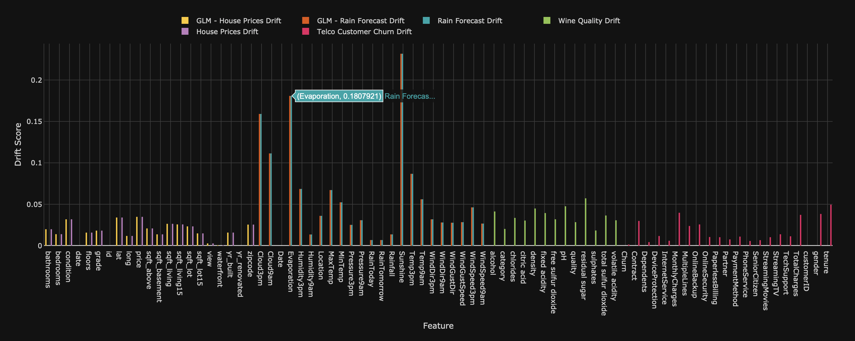
Bar graph: Drift scores
The drift scores bar graph displays the drift score each feature in the drift detection tests.
- X-axis: Features
- Y-axis: Drift scores
Bar graph: PSI scores
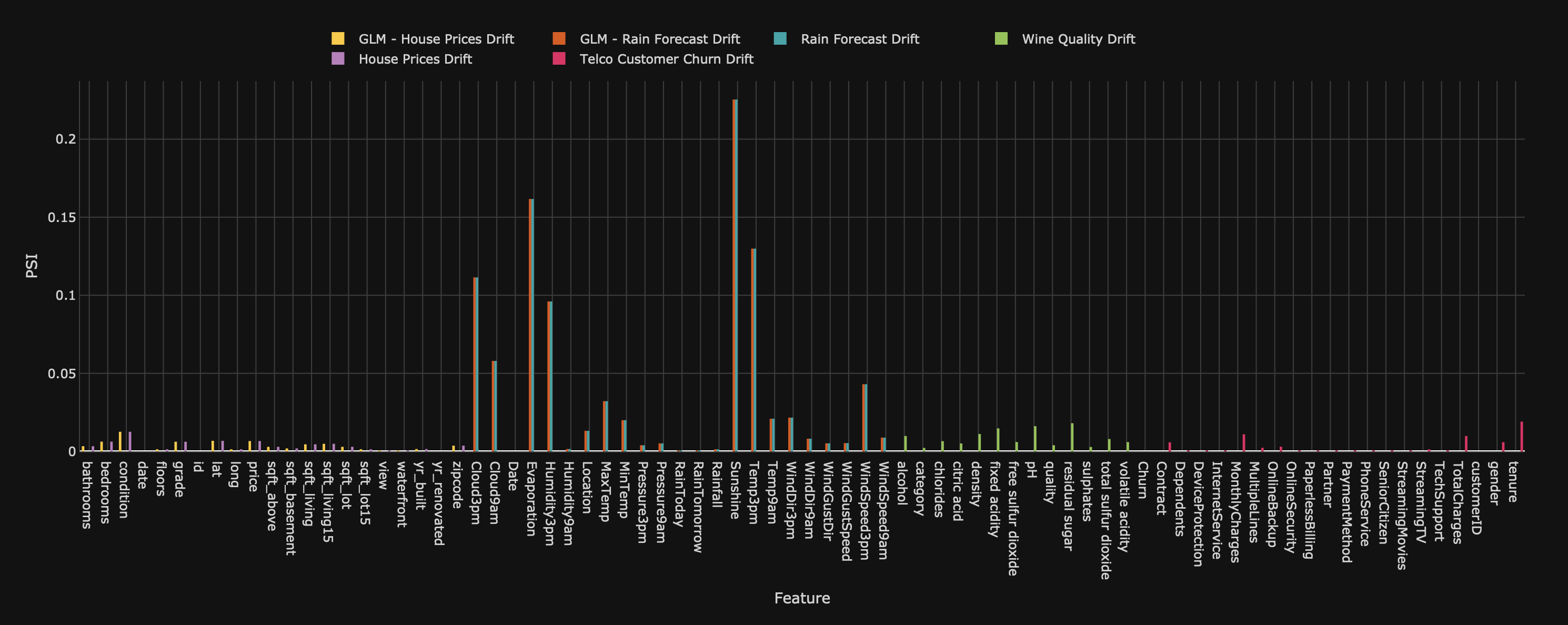
The PSI scores bar graph displays the population stability index (PSI) for each feature in the drift detection tests.
- X-axis: Features
- Y-axis: PSI scores
Size dependency
Overview
H2O Model Validation offers the following metrics to understand compared dependency tests:
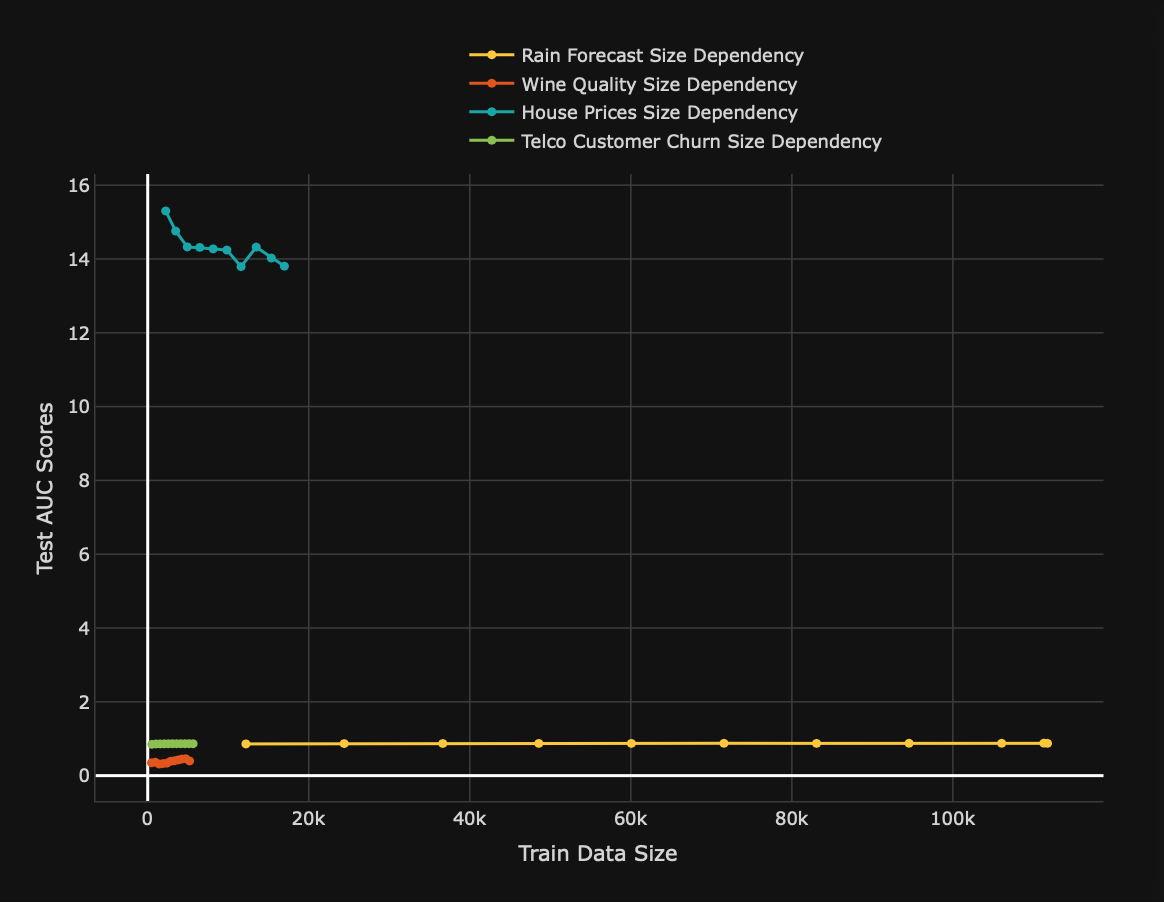
Graph: Test results
The test results graph displays the test [metric] values for the size dependency tests obtained with different test dataset sizes. [Metric], in this case, refers to the scorer of the model of a validation test (for example, root mean square error (RMSE)).
- X-axis: Train data sizes
- Y-axis: Test
[metric]scores
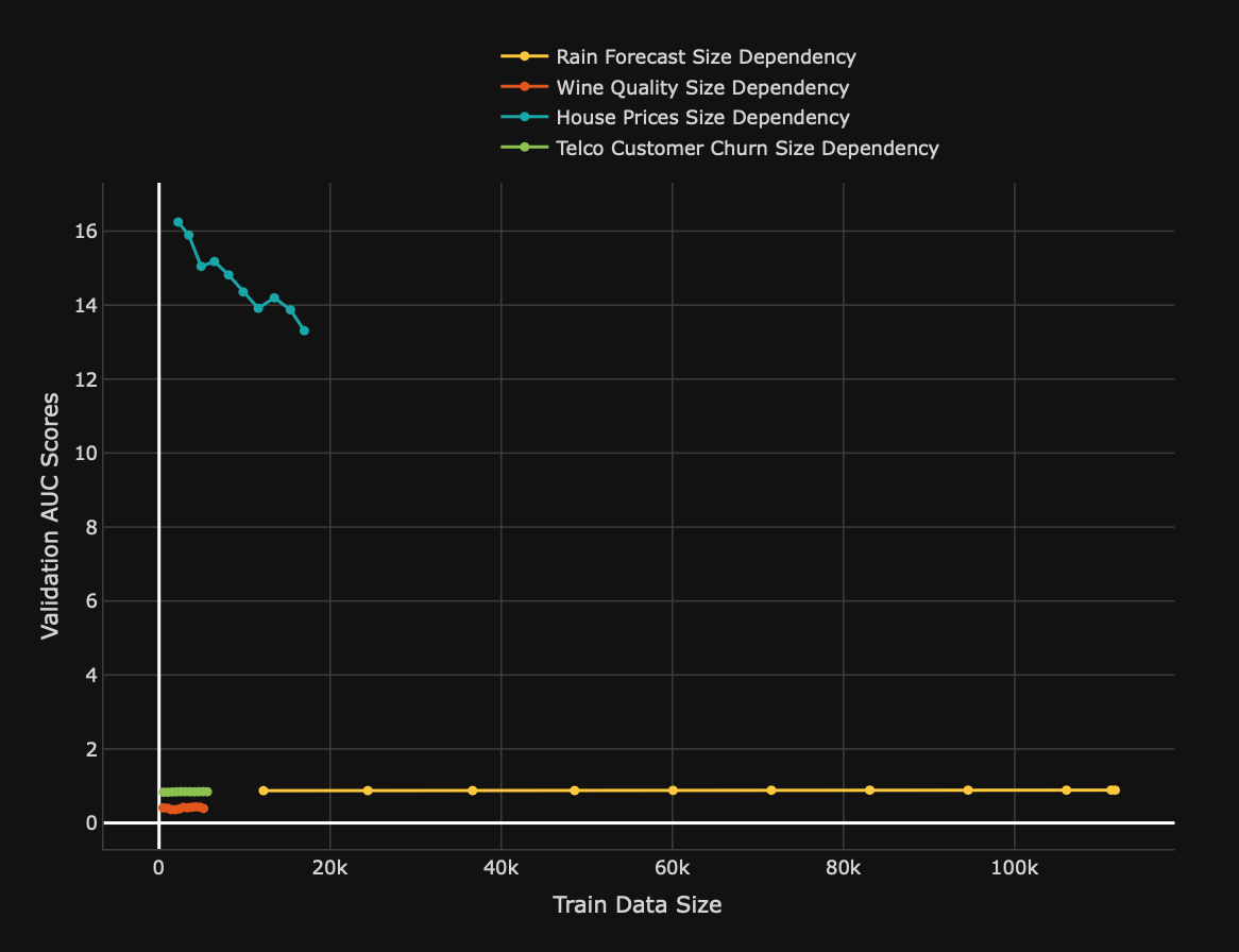
Graph: Validation results
The validation results graph displays the validation [metric] values for the size dependency tests obtained with different validation dataset sizes. [Metric], in this case, refers to the scorer of the model of a validation test (for example, root mean square error (RMSE)).
- X-axis: Train data sizes
- Y-axis: Validation
[metric]scores
Calibration score
Overview
H2O Model Validation offers the following metric to understand compared calibration score tests:
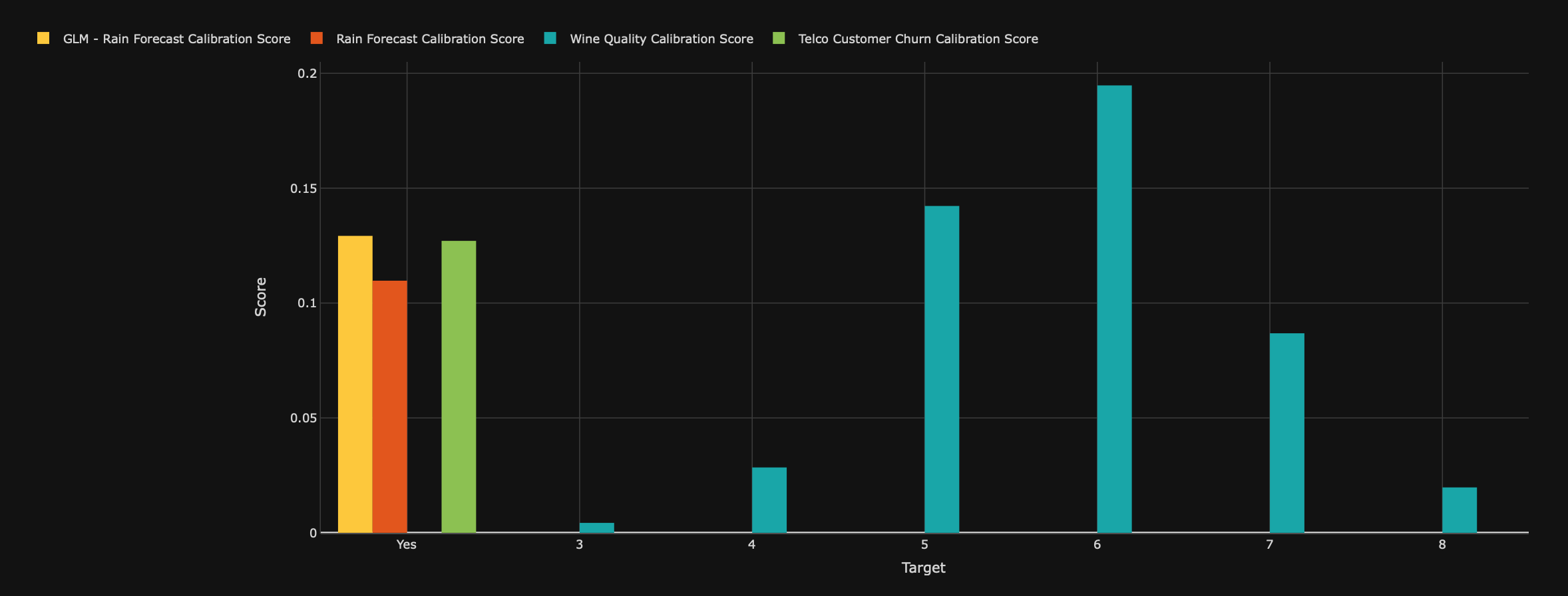
Chart: Calibration scores
The calibration scores chart displays the calibration score (Brier score) for each target class in the compared tests.
- X-axis: Target classes
- Y-axis: Calibration scores
Segment performance
Overview
H2O Model Validation offers the following metric to understand compared segment performance tests:
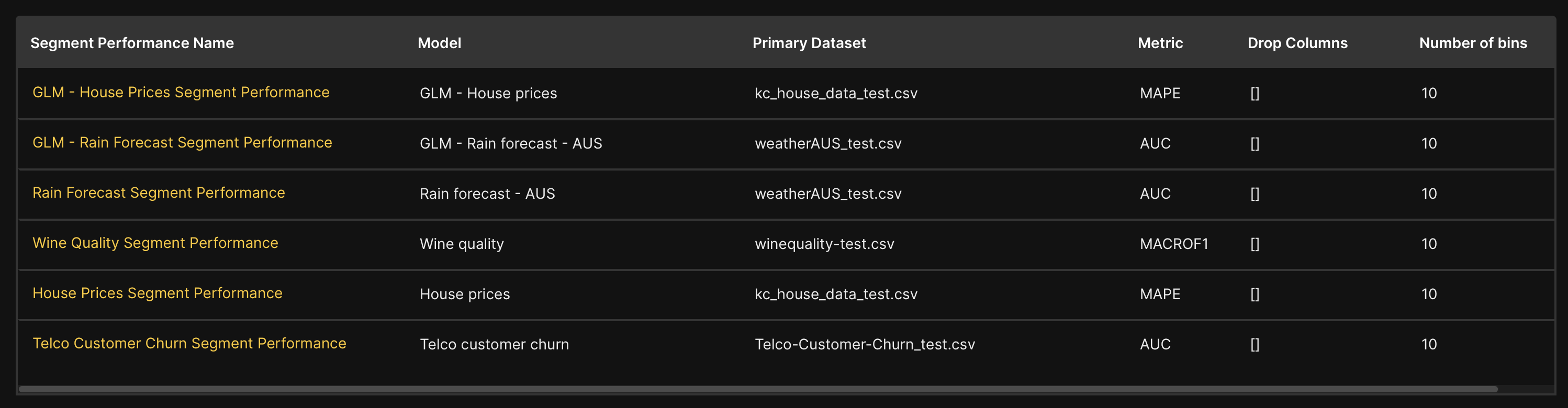
Table: Segment performances
The table displays the following informational points of each compared segment performance test:
| Name | Description |
|---|---|
Segment performance name | Name of the segment performance test. |
Model | The model utilized by H2O Model Validation to run the segment performance test. |
Primary dataset | Name of the dataset H2O Model Validation utilized during the segment performance test. |
Metric | The model's scorer. |
Drop columns | Dropped columns H2O Model Validation dropped during the segment performance test. |
Number of bins | The number of bins H2O Model Validation utilized to split the primary dataset into segments by the bins of values of every variable and every pair of variables to generate results around the ability of the model to produce accurate predictions with different data segments. |
Robustness
Overview
H2O Model Validation offers the following metrics to understand compared robustness tests:
Plot: Perturbed [metric] scores
The perturbed [metric] scores box and whisker plot illustrate the quartile, median, third quartile, and maximum value of the perturbated model scores obtained from each generated perturbed dataset in each robustness test. In this case, the [metric] refers to the model's metric (scorer).
- X-axis: The x-axis represents the size of the perturbations while representing each robustness test.
- Y-axis: The y-axis represents the corresponding performance (metric scores) of the model.
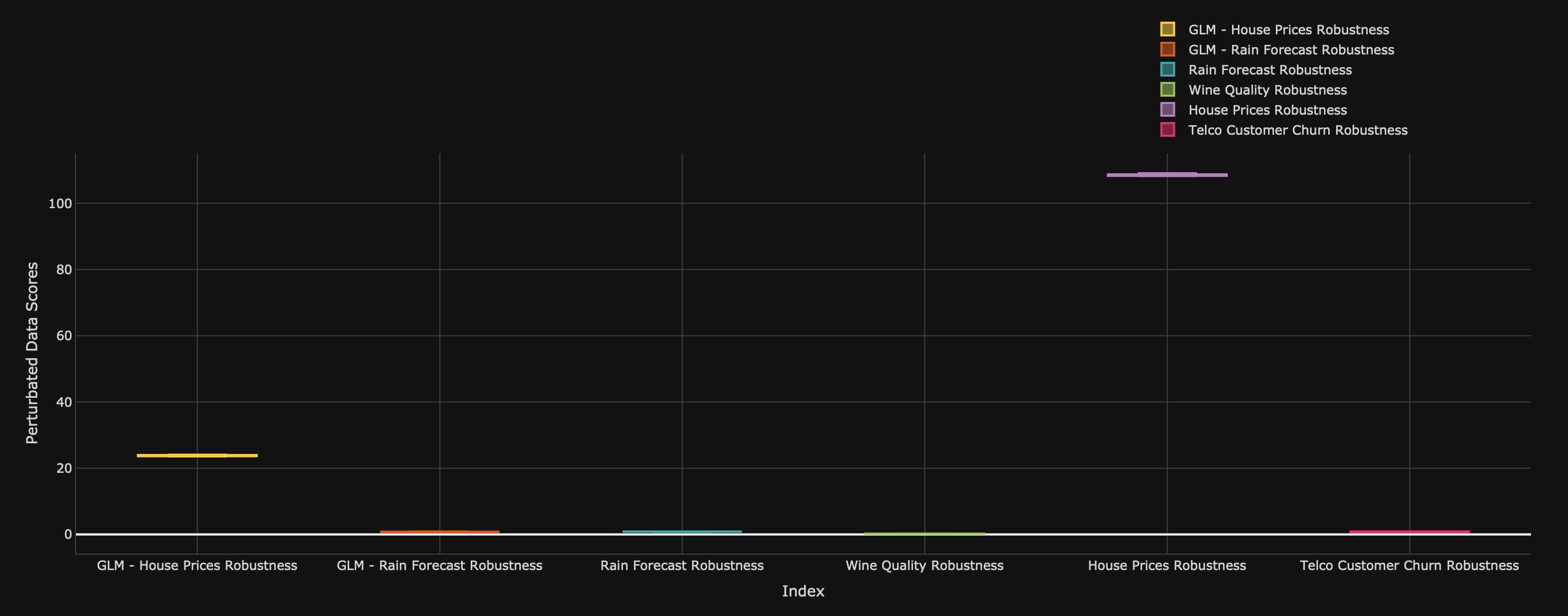
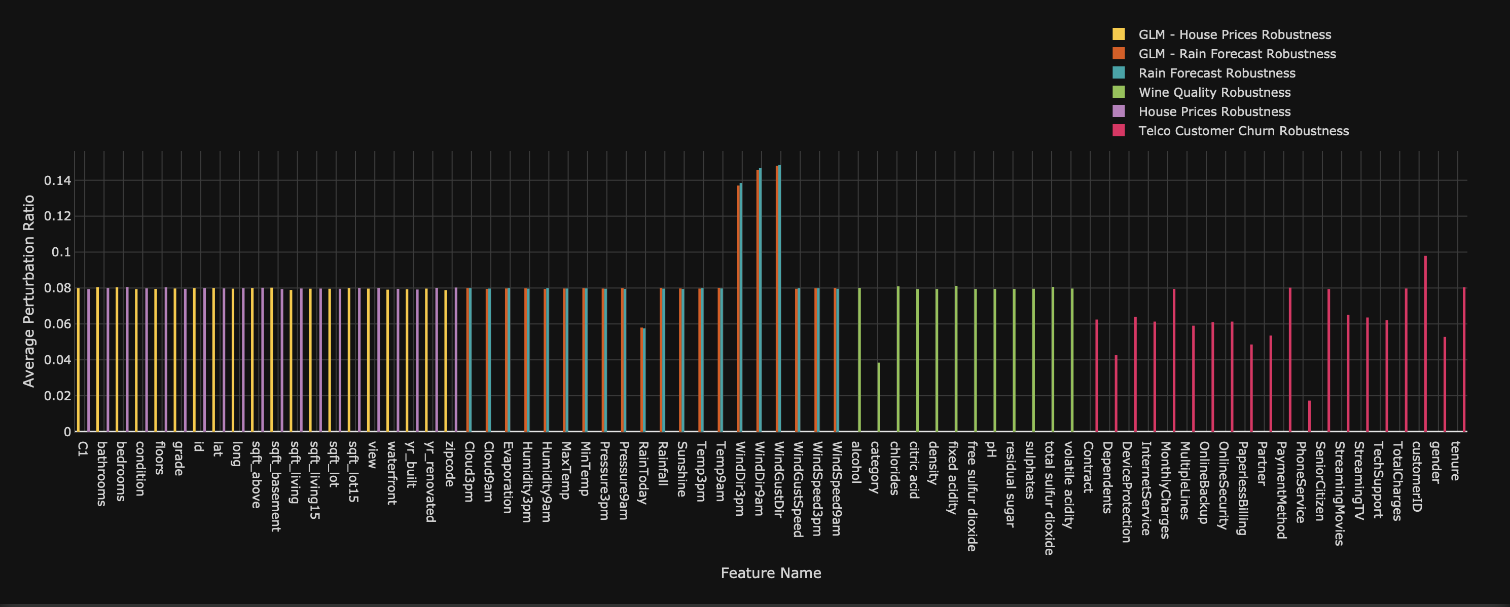
Chart: Perturbed ratios per feature
The perturbed ratios per feature chart displays the average perturbation ratio per feature in each robustness test.
- Submit and view feedback for this page
- Send feedback about H2O Model Validation to cloud-feedback@h2o.ai