Task 6: Interpret built model
To delve deeper into the regression model we've constructed, let's utilize the INTERPRET THIS MODEL button in H2O Driverless AI to generate an MLI report. This functionality is particularly valuable for enhancing machine learning interpretability, especially in regulated industries where transparency and explanation are crucial. You can interpret the model by using the generated MLI report. As a result, you can uncover valuable insights into its inner workings, such as feature importance and other performance metrics. This process can empower you to understand better and trust the predictions made by the model.
- Click INTERPRET THIS MODEL.
- Select WITH DEFAULT SETTINGS.
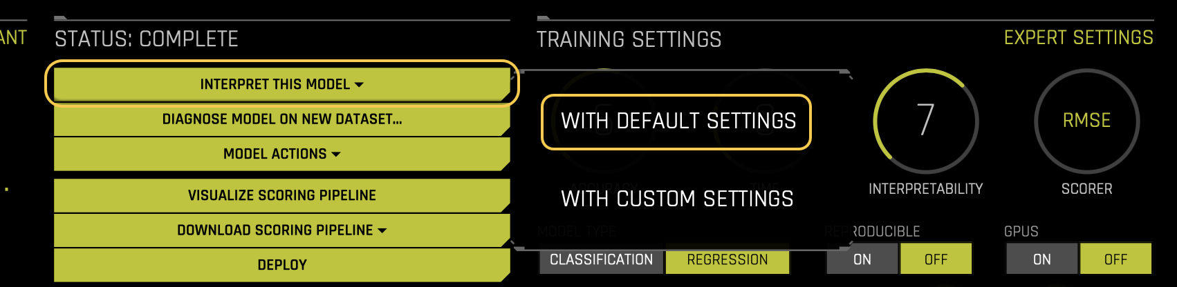
- Wait a few moments for the MLI report to get generated.
DAI model
The DAI model tab is organized into tiles for each interpretation method. To view a specific plot, click the tile for the plot that you want to view.
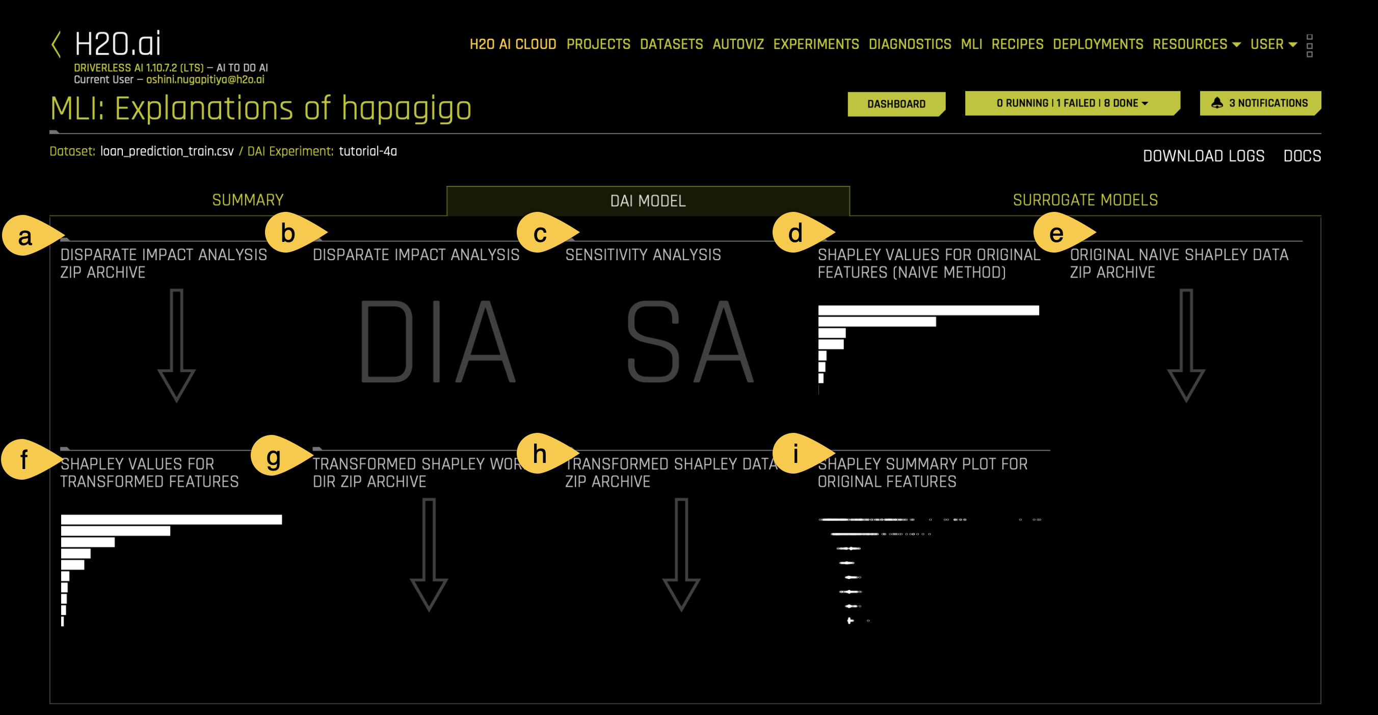
a. Disparate Impact Analysis (DIA) ZIP Archive
To download a .zip of the DIA data, click on the Disparate Impact Analysis ZIP Archive tile.
b. Disparate Impact Analysis (DIA)
Disparate Impact Analysis (DIA) is a method used to evaluate whether a model is fair in its predictions, especially for binary classification and regression models. Bias can be introduced to a model during the collection, processing, or labeling of data. If a model consistently makes decisions that harm or favor one group over another, it is said to have a disparate impact. DIA helps detect and measure this kind of bias. DIA compares how different groups are treated by a model.
Now, let’s explore the DIA plot in your experiment.
- Click on the DIA (Disparate Impact Analysis) tile to open the plot.
- From the Disparate impact variable drop-down menu, select Gender to evaluate fairness based on gender.
- Select Female as the Reference level. This allows us to compare aggregate measurements for females against other levels (e.g., Male).
- Interpret the comparison. In this case, we are comparing females to males. For example,
- The proportion of females who receive a favorable outcome (e.g., being granted a higher loan amount) is divided by the proportion of males who receive the same favorable outcome.
- This ratio helps us determine whether the model is biased based on the variable (Gender) and its levels (Female, male).
- Analysis of results. In this example:
- Fairness Female is True, which means the model treats females fairly.
- Fairness Male is False which means the model does not treat males fairly.
- This result indicates that the model is not fair across all levels of the gender variable.
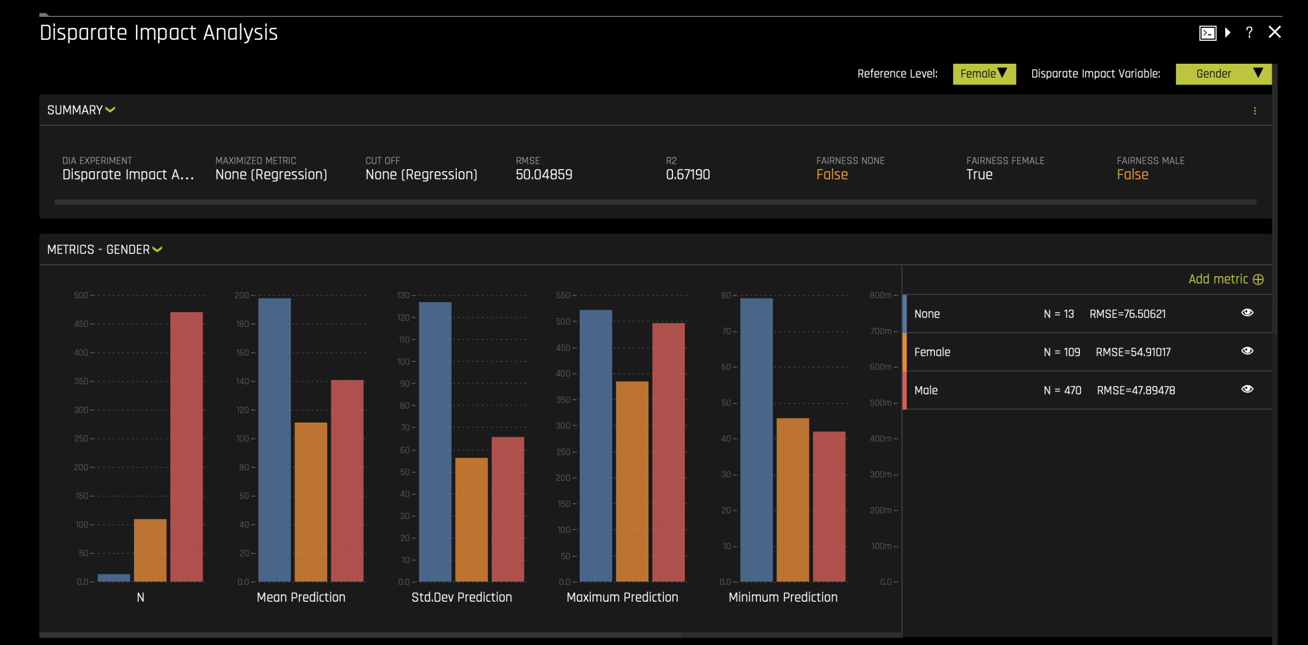
For more information, see Disparate Impact Analysis in the H2O Driverless AI documentation.
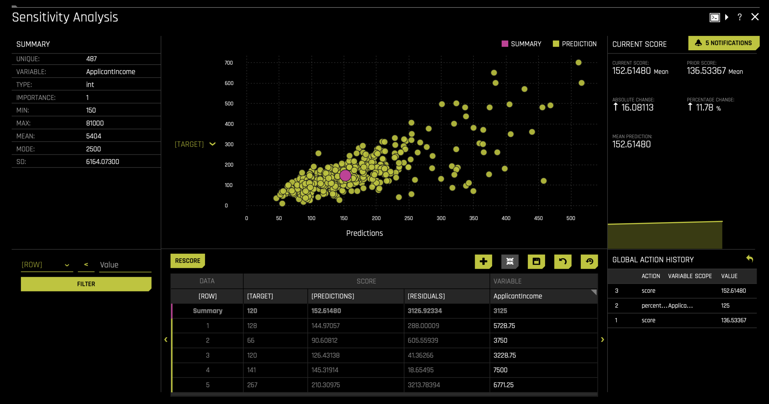
c. Sensitivity Analysis (SA)
Sensitivity analysis is one of the most critical validation techniques for machine learning models. It helps determine whether the model's behavior and predictions remain stable when small changes or intentional perturbations are made to the input data.
Machine learning models can sometimes produce significantly different predictions even with minor changes to input variables. For example, in financial decision-making models, SA can show how the model’s predictions might change if key variables like income, credit score, or other factors are modified. It can also reveal how the model responds when sensitive variables, such as gender, age, or race, are altered.
For more information, see Sensitivity Analysis in the H2O Driverless AI documentation.
Let’s see what happens to the predictions if the applicant income in our population increases.
- Click on the SA (Sensitivity Analysis) tile to open the plot.
- Select the ApplicantIncome variable and apply a 25% increase to the current applicant income in our population.
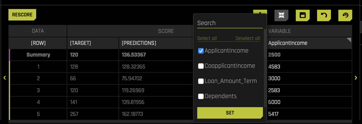
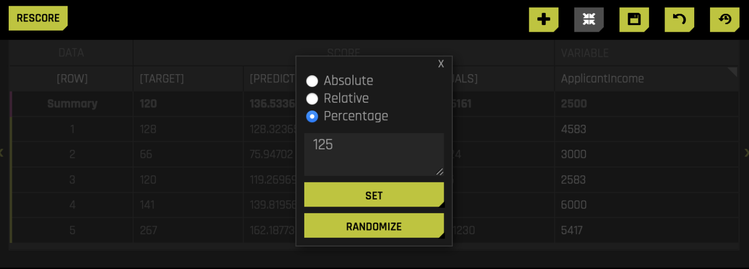
- Click Rescore, and the model and charts will update accordingly.
After the update, you'll notice changes in the results. The absolute change is 16, and the percentage change is 11.78%. This indicates that applicant income has an impact on the model's predictions.
d. Shapely Values for Original Features (Naive Method)
Shapley values provide a method to interpret a model's predictions by attributing the contribution of each feature to a specific prediction. The Shapley Values for Original Features (Naive Method) graph provides insights at the level of the original input features, even after feature engineering has transformed them.
To access it, click on the Shapely Values for Original Features (Naive Method) tile.
Driverless AI automatically performs feature engineering to create transformed features that the model uses for predictions. These transformed features may not directly correspond to the original input features. The naive Shapley method addresses this by assuming that the input features to a transformer are independent and evenly splits the contribution among the original features that contributed to it. For example, if a transformed feature results from the interaction of two original variables, the naive Shapley method allocates the contribution equally between these two original variables. This approach helps users understand the impact of the original features on the model's predictions.
You can view the Shapley contributions for the transformed features in the Shapley Values for Transformed Features chart.
For more information, see Shapley orginal and transformed features in the H2O Driverless AI documentation.
e. Original Naive Shapely data ZIP Archive
To download a .zip of the Original Naive Shapely data, click on the Original Naive Shapely data ZIP Archive tile.
f. Shapley Values for Transformed Features
The Shapley Values for Transformed Features graph displays Shapley contributions across the dataset, aggregated to indicate the importance of the transformed variables. To view this graph, click on the Shapley Values for Transformed Features tile.
Most of the variables shown in the graph are not the original variables because H2O Driverless AI automatically applies feature engineering. If you wish to explore the Shapley values for a specific record, you can use the row number search bar at the top of the interface to locate the reasons for that specific row.
For more information, see Shapley orginal and transformed features in the H2O Driverless AI documentation.
g. Transformed Shapley Work Dir ZIP Archive
To download a .zip file of the working directory of the Transformed Shapley values, click on the Transformed Shapley Work Dir ZIP Archive tile.
h. Transformed Shapley Data ZIP Archive
To download a .zip of the Transformed Shapley data, click on the Transformed Shapley Data ZIP Archive tile.
i. Shapley Summary Plot for Original Features
The Shapley Summary plot shows original features versus their local Shapley values on a sample of the data. The goal of this plot is to show how different values of the feature affect the model predictions. The color of the point shows the value of the feature, where yellow is a low value and orange is a high value.
To access it, click on the Shapley Summary Plot for Original Features tile.
Surrogate model
The Surrogate model tab is organized into tiles for each interpretation method. To view a specific plot, click the tile for the plot that you want to view.
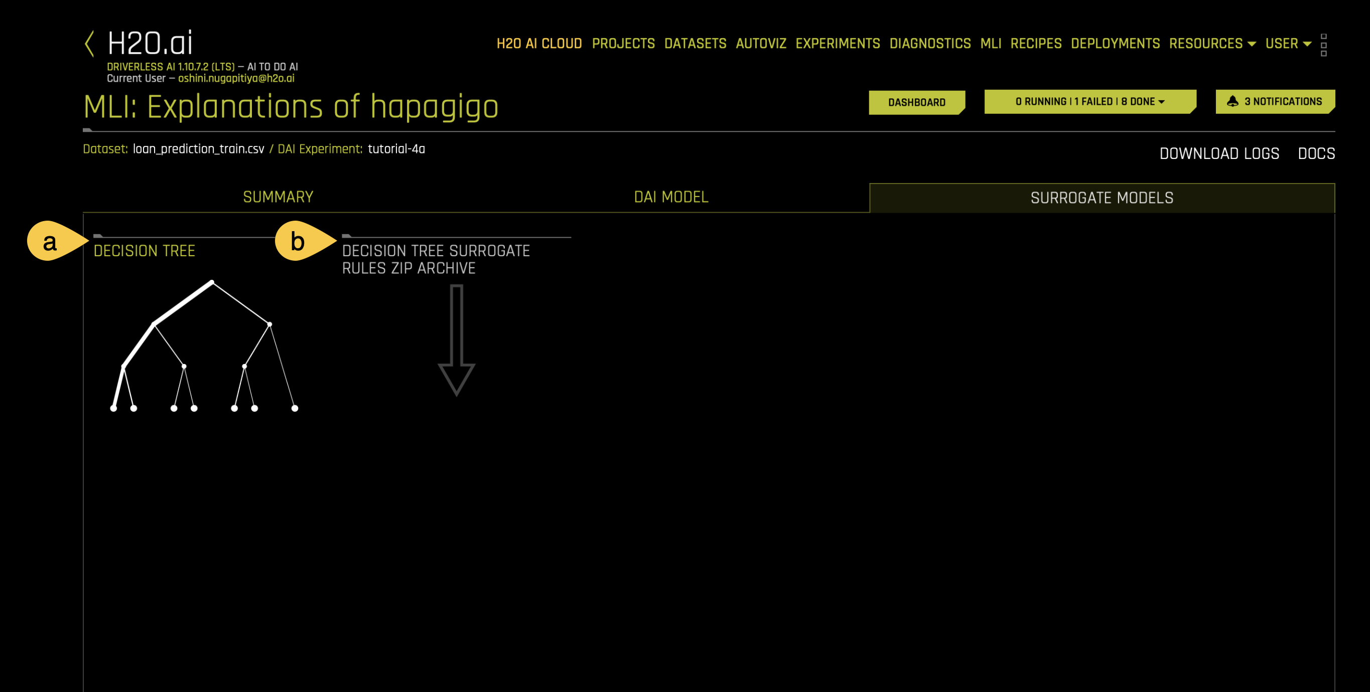
a. Decision tree
A surrogate decision tree is a simplified model built to interpret the predictions of a H2O Driverless AI model. By creating a decision tree, you can quickly identify data segments associated with high or low predictions. Also, you can search for a specific row in your dataset and trace the decision tree path it follows. If there are outliers or exceptions in your data, the decision tree helps identify their paths. This allows you to understand why a particular row takes a specific path and gain insights into unusual predictions.
To view the decision tree, click on the Decision tree tile.
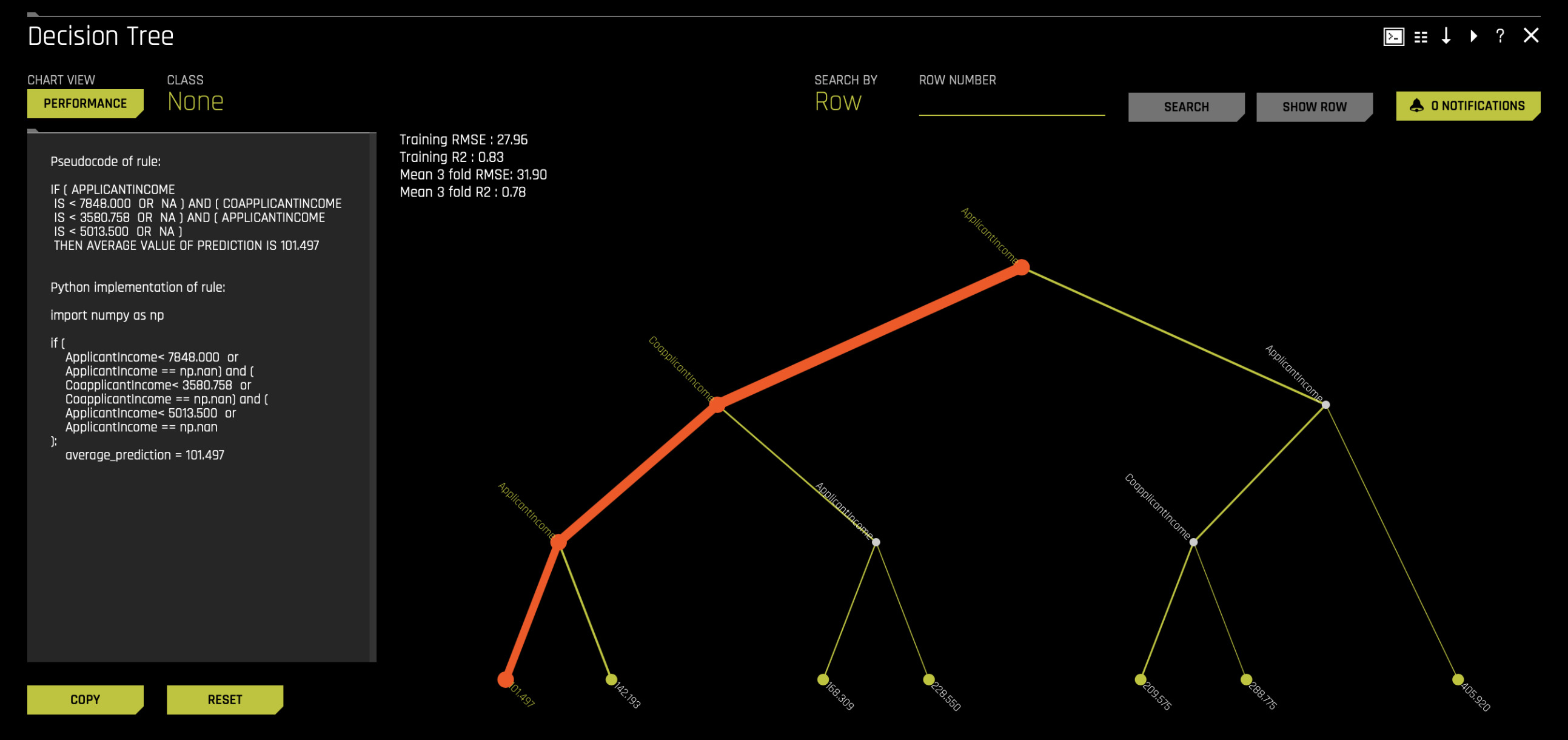
In this tutorial, we are predicting loan amounts. The decision tree starts by evaluating 100% of the dataset, using applicant income as the first criterion. The tree splits the data based on a threshold of 7,848 and create two branches,
- Branch 1: Applicant income < 7,848
- Branch 2: Applicant income ≥ 7,848
The tree continues to split the data at each subsequent node using similar if-else conditions. Each split isolates specific data segments, and the process repeats until the tree reaches its leaf nodes. At the leaf nodes, the average prediction for records in that segment is displayed.
To dive deeper,
- Click on the last node of the thickest branch in the decision tree, which represents the segment containing the majority of predictions in the dataset.
- On the left-hand side of the screen, observe the pseudocode, which outlines rules for each segment.
The selected node represents a segment where,
- Applicant income < 7,848
- Co-applicant income < 3,580.758
- Applicant income < 5,013.5
This segment accounts for approximately 62% of the dataset, with an average prediction value of 101.497.
b. Decision tree surrogate rules ZIP archive
To download a .zip of the Decision tree surrogate rules, click on the Decision tree surrogate rules ZIP archive tile.
Now that you’ve learned how to interpret the model using the generated MLI report, in Task 7, you’ll learn how to deploy the generated NLP model with H2O MLOps.
- Submit and view feedback for this page
- Send feedback about H2O Driverless AI | Tutorials to cloud-feedback@h2o.ai