Task 7: Explore experiment results
In this task, we will dig deeper and explore the results of the classification experiment you created in task 5.
Navigate to the Experiments page. Your experiment should be listed there. Click on the experiment to view the experiment summary.
You can find useful metrics in the experiment Summary at the right-bottom of the Experiment Summary page. Next to the Summary section, you can observe graphs that reflect insights from the training and validation data resulting from the classification problem. Now, let us observe and learn about these graphs and the summary generated by Driverless AI. Follow along as we explore each subsection of the summary section (you can access each graph that is discussed below by clicking on the name of the graph).
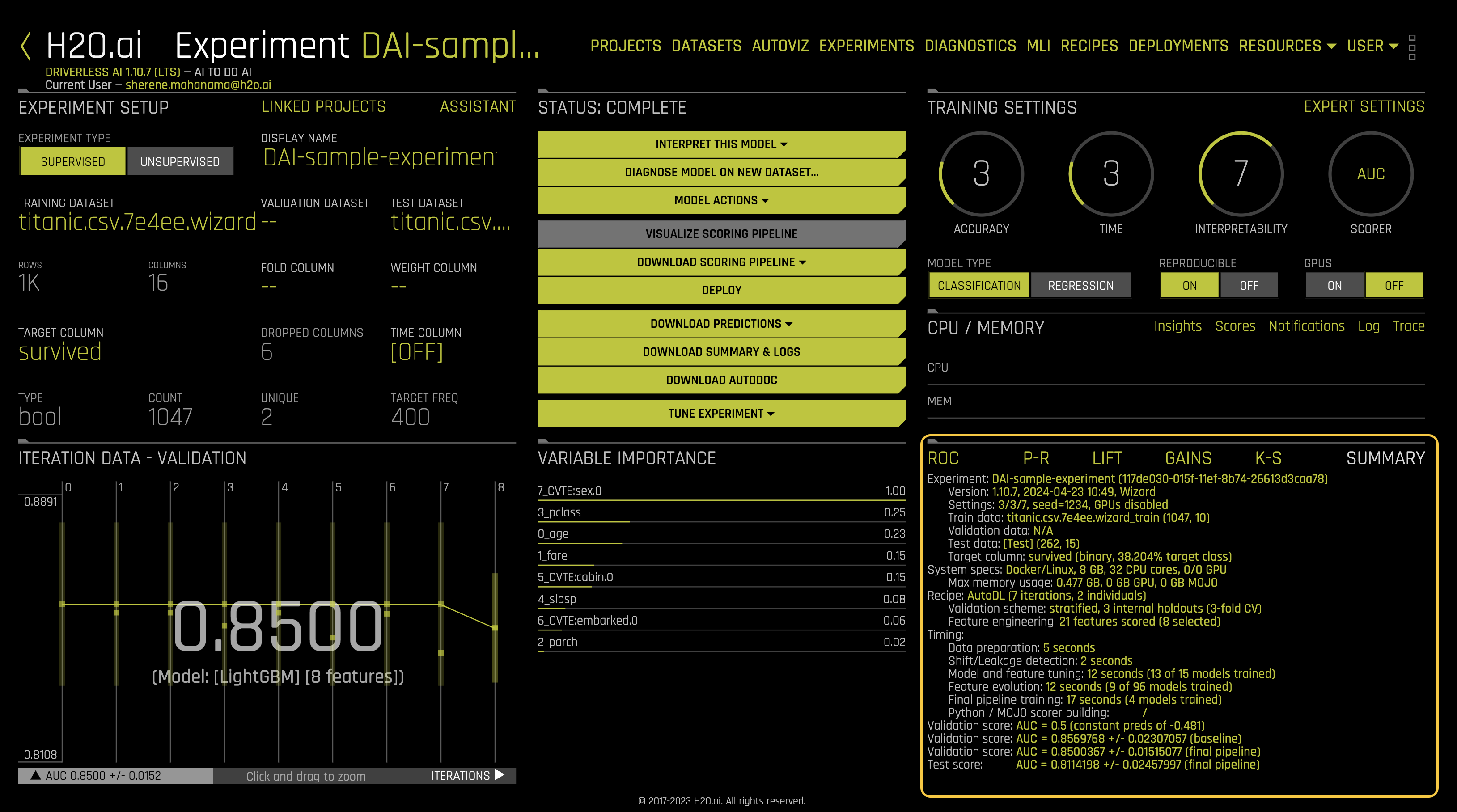
Summary
Once the experiment is complete, a Summary is generated at the bottom-right corner of the experiment page. The summary includes:
- Experiment: experiment name
- Version: the version of Driverless AI and the date it was launched
- Settings: selected experiment settings, seed, whether or not GPU’s were enabled
- Train data: name of the training set, number of rows and columns
- Validation data: name of the validation set, number of rows and columns
- Test data: name of the test set, number of rows and columns
- Target column: name of the target column (the type of data and % target class)
- System Specs: machine specs including RAM, number of CPU cores and GPU’s
- Max memory usage
- Recipe:
- Validation scheme: type of sampling, number of internal holdouts
- Feature Engineering: number of features scored and the final selection
- Timing
- Data preparation
- Shift/Leakage detection
- Model and feature tuning: total time for model and feature training and number of models trained
- Feature evolution: total time for feature evolution and number of models trained
- Final pipeline training: total time for final pipeline training and the total models trained
- Python/MOJO scorer building
- Validation Score: Log loss score +/- machine epsilon for the baseline
- Validation Score: Log loss score +/- machine epsilon for the final pipeline
- Test Score: Log loss score +/- machine epsilon score for the final pipeline
- Most of the above information, along with additional details, can be found in the experiment summary zip (Click the Download Summary & Logs button to download the
h2oai_experimentsummary.zipfile). Some questions to consider when exploring this section: - What are the number of features that Driverless AI scored for your model and the total features that Driverless AI selected?
- Take a look at the validation Score for the final pipeline and compare that value to the test score. Based on those scores, would you consider this model a good or bad model?
ROC - Receiver Operating Characteristics
The ROC curve on the Receiver Operating Characteristics (ROC) graph below shows the stats on validation data and the best Accuracy, MCC, and F1 values.
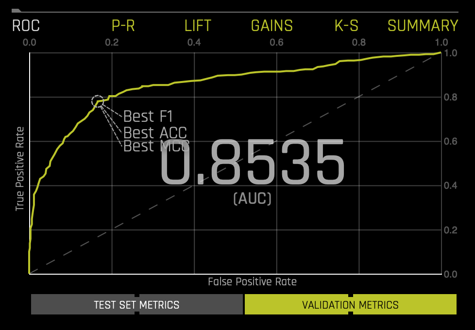
If a test set was provided for the experiment, then click on the Validation Metrics button below the graph to view these stats on test data.
This ROC gives an Area Under the Curve (AUC) of .8535. The AUC tells us that the model can separate the survivor class with an accuracy of 85.35%.
For more in-depth learning about the ROC Curve, see Tutorial 1B:Machine Learning Experiment Scoring and Analysis - Financial Focus.
Prec-Recall: Precision-Recall Graph
The Prec-Recall plot below shows the Precision-Recall curve on validation data along with the best Accuracy, MCC, and F1 values. The area under this curve is called AUCPR.

If a test set was provided for the experiment, then click on the Validation Metrics button below the graph to view these stats on test data.
Similar to the ROC curve, when we look at the area under the curve of the Prec-Recall Curve of AUCPR, we get a value of .8230(accuracy of 82.30%).
For more in-depth learning about the Precision-Recall Graph, see Tutorial 1B:Machine Learning Experiment Scoring and Analysis - Financial Focus.
Cumulative Lift Chart
This Cumulative Life Chart shows lift stats on validation data. Lift can help answer the question of how much better you can expect to do with the predictive model compared to a random model (or no model). Hover over a point in the Lift chart to view the quantile percentage and cumulative lift value for that point.
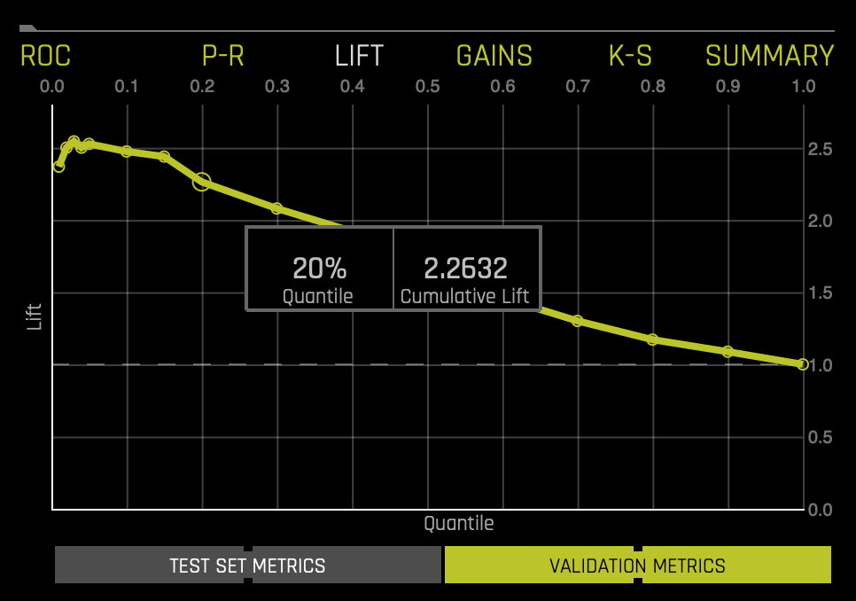
If a test set was provided for the experiment, then click on the Validation Metrics button below the graph to view these stats on test data.
For more in-depth learning about the Cumulative Lift Chart, see Tutorial 1B:Machine Learning Experiment Scoring and Analysis - Financial Focus.
Cumulative Gains Chart
Gain and Lift charts measure a classification model's effectiveness by looking at the ratio between the results obtained with a trained model versus a random model(or no model).
In the Gains Chart below, the x-axis shows the percentage of cases from the total number of cases in the test dataset, while the y-axis shows the percentage of positive outcomes or survivors in terms of quantiles.
The Cumulative Gains Chart below shows Gains stats on validation data. For example, "What fraction of all observations of the positive target class are in the top predicted 1%, 2%, 10%, etc. (cumulative)?" By definition, the Gains at 100% are 1.0.
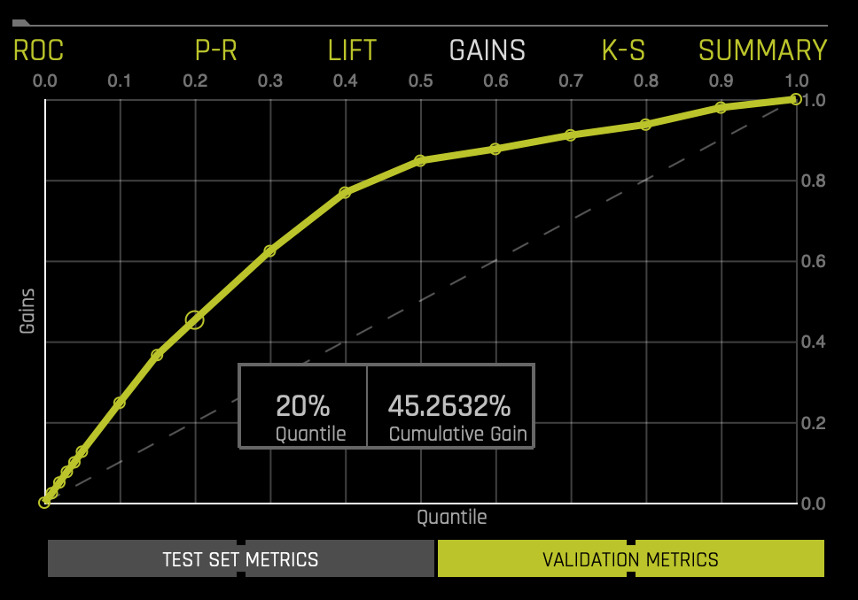
If a test set was provided for the experiment, then click on the Validation Metrics button below the graph to view these stats on test data.
The Gains chart above tells us that when looking at the 20% quantile, the model can positively identify ~45% of the survivors compared to a random model(or no model), which would be able to positively identify about ~20% of the survivors at the 20% quantile.
For more in-depth learning about the Cumulative Gains Chart, see Tutorial 1B:Machine Learning Experiment Scoring and Analysis - Financial Focus.
Kolmogorov-Smirnov
K-S or the Kolmogorov-Smirnov chart measures the degree of separation between positives and negatives for validation or test data.
Hover over a point in the chart to view the quantile percentage and Kolmogorov-Smirnov value for that point:
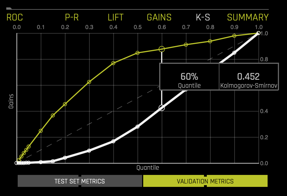
If a test set was provided for the experiment, then click on the Validation Metrics button below the graph to view these stats on test data.
For the K-S chart above, if we look at the top 60% of the data, the at-chance model (the dotted diagonal line) tells us that only 60% of the data was successfully separated between positives and negatives (survived and did not survive). However, with the model, it was able to do .452, or about ~45.2% of the cases were successfully separated between positives and negatives.
For more in-depth learning about the Kolmogorov-Smirnov graph, see Tutorial 1B:Machine Learning Experiment Scoring and Analysis - Financial Focus.
Now, we can proceed to Task 8 to execute the fourth step of the DAI workflow: interpretting the model.
- Submit and view feedback for this page
- Send feedback about H2O Driverless AI | Tutorials to cloud-feedback@h2o.ai