Task 4: Explore and visualize the data
In this task, let's explore the data details and visualize the data using AutoViz in H2O Driverless AI. AutoViz can be used to generate and visualize the dataset via all the available types of graphs for a particular dataset. AutoViz in H2O Driverless AI also recommends certain data transformations to the columns of a dataset to optimize visualization.
This task is optional. Its objective is to explore AutoViz in H2O Driverless AI and learn how visualizations and learning about the correlations between dataset variable can help us build our first DAI experiment. However, if you feel visualizations are not needed for you right now, you can also move straight on to Task 5 to start building your first DAI experiment.
Data details
We are now going to explore the Titanic dataset that we uploaded to H2O Driverless AI in the previous task.
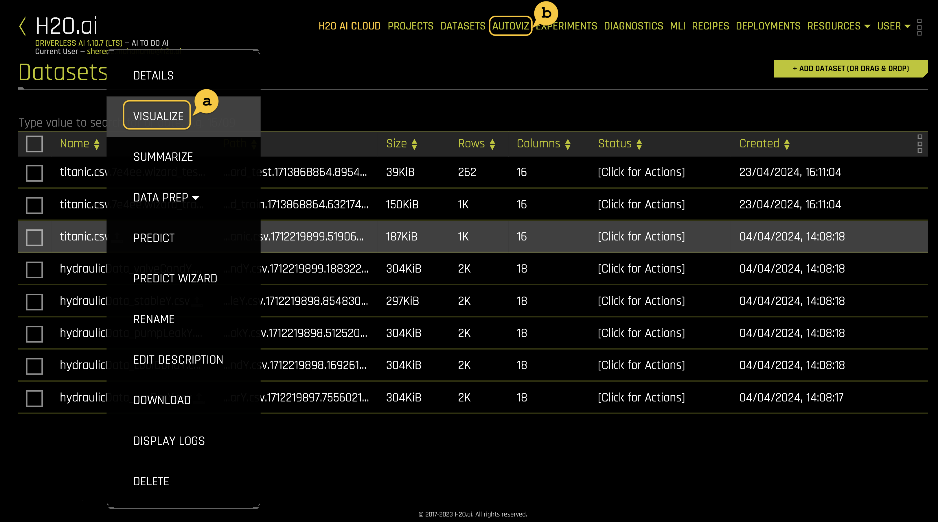
On the Datasets page, click on
titanic.csvto view the dataset options.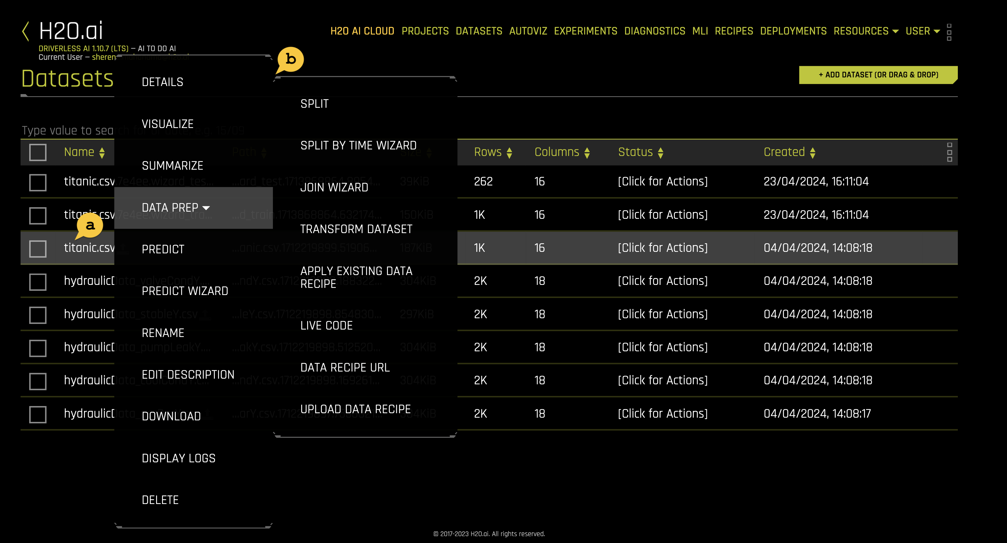 note
notea. The dataset we imported in task 3
b. Options:
- Details - View a summary of the dataset or preview the dataset
- Visualize - Visualize the dataset with available graphs
- Summarize - Generate a summary of the dataset by leveraging DAI's integration with h2oGPT models. For more information, see h2oGPT integration in the H2O Driverless AI documentation.
- Data Prep:
- Split: Split the dataset into two subsets.
- Split by Time Wizard: Split a time series dataset into train and test sets by specifying an exact starting point in time for the test set. If the dataset has only a single time column, that time column is automatically selected for the time series split. If the dataset has multiple time columns, you can select which time column you want to use for the time series split.
- Join Wizard: The DAI dataset Join Wizard makes it simple for you to join two datasets together.
- Transform dataset: Opens a page that lets you edit specific values in a dataset. To confirm your changes, click the Save button. To undo your most recent change, click the Undo button. You can also reset all your changes by clicking the Reset button.
- Apply Existing Data Recipe: Select a previously uploaded data recipe to apply to the dataset.
- Live Code: Manually enter custom recipe code that is used to modify the dataset. Click the Get Preview button to preview the code’s effect on the dataset, then click Apply to create a new dataset. To download the entered code script as a Python file, click the Download button.
- Data Recipe URL: Load a data recipe from a URL and apply it to the dataset.
- Upload Data Recipe: Select a data recipe from your local file system to upload to Driverless AI.
- Predict - Run an experiment using Driverless AI. This option automatically specifies the selected dataset as the training dataset. You can use this option to configure and set up your experiment the way you want. If you want more guidance and support with deciding on the ideal configurations for your experiment, you can use the Predict Wizard instead.
- Predict Wizard - The Predict Wizard makes it simple for you to set up a Driverless AI experiment and ensures that the experiment’s settings are optimally configured for your specific use case. This method of setting up an experiment gives you more guided support by automatically identifying the required settings according to your dataset, and helping you configure the experiment.
- Rename - Rename the dataset
- Edit description - Edit the dataset description
- Download - Download the dataset to your local file system
- Display Logs - Dataset logs
- Delete - Delete the dataset from the list on the Datasets page. A dataset can only be deleted if it's not being used in an experiment. Otherwise, you must delete the experiment first, and then the dataset.
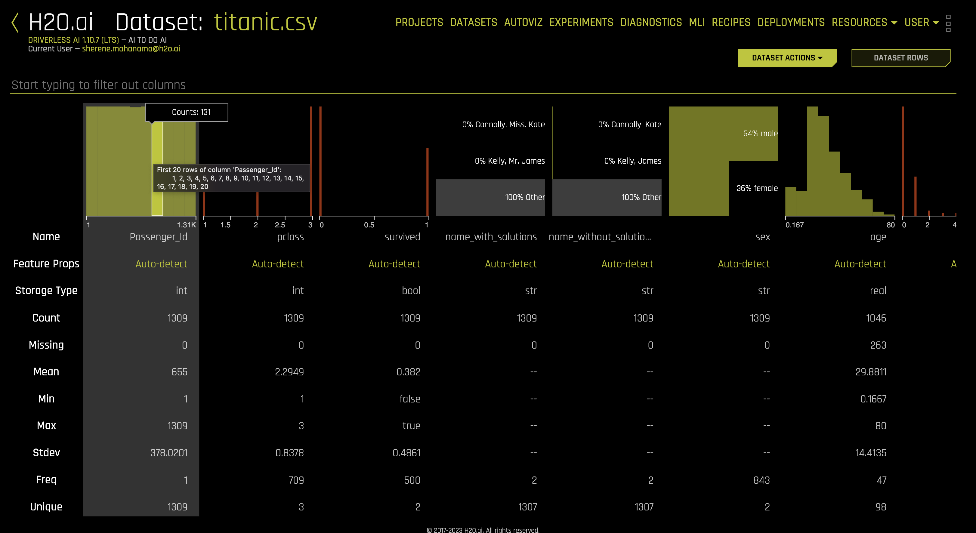
Next, we are going to confirm that the dataset loaded correctly and that it has the correct number of rows and columns. Click the Details option, and it will take you to the Dataset Details page.
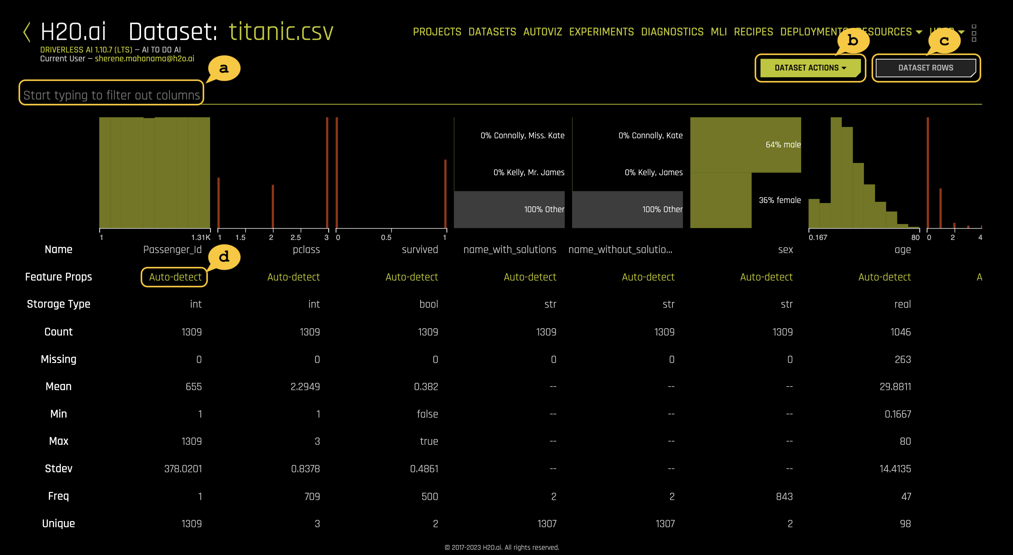
The Dataset Details page provides a summary of the dataset. View the first 20 rows of a column by hovering over the column name (see image below).
Driverless AI recognizes the following column types:
integer,string,real,boolean, andtime. Date columns are given a stringstrtype.notea. You can view information for a specific column by entering the column's name in the field above the graph.
b. The Dataset Actions button provides the following options:
- Visualize
- Split
- Predict
- Rename
- Download
- Display Logs
- Delete
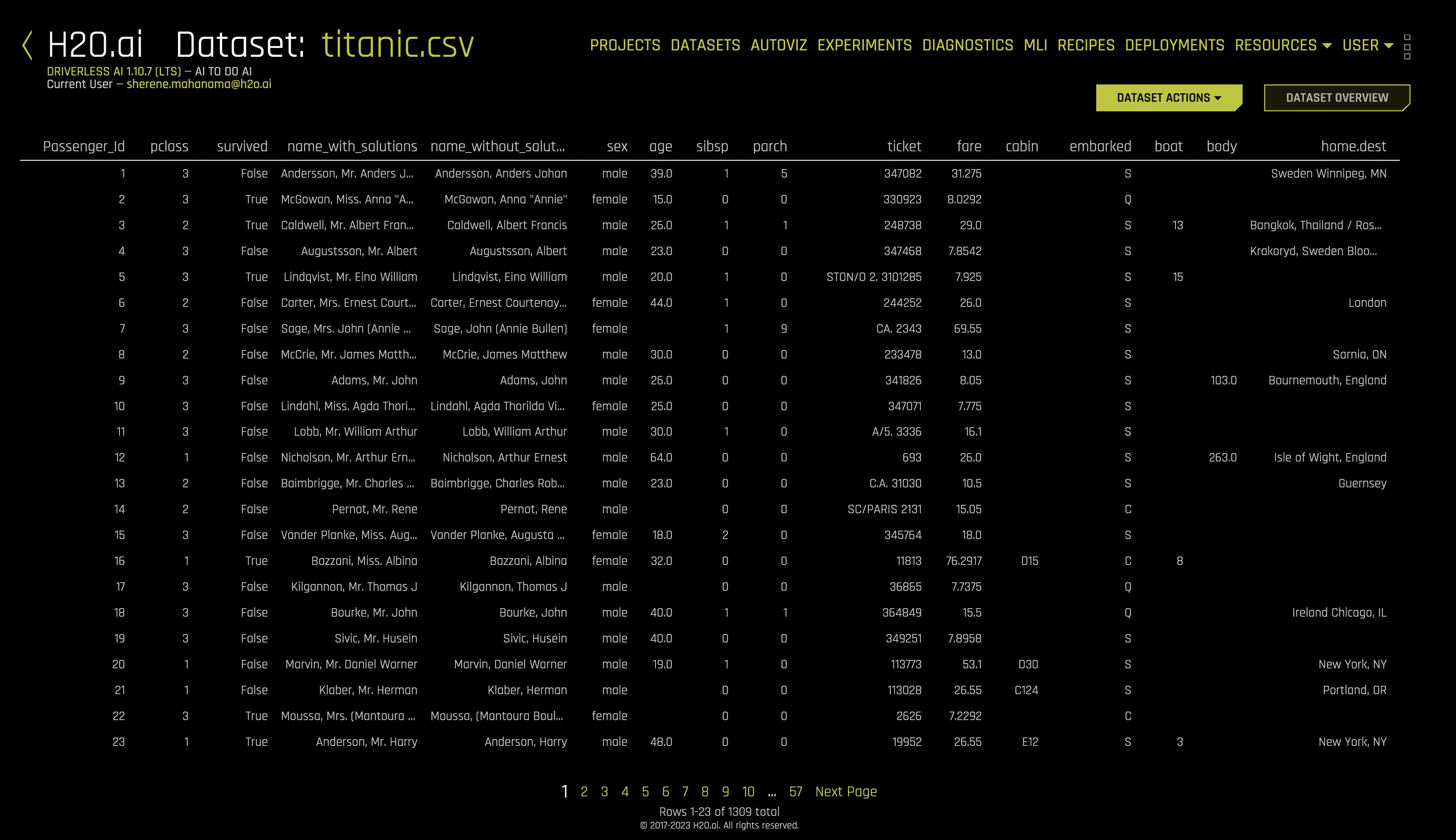
c. Dataset Rows allows you to preview the dataset.
d. Feature Props: Allows you to change the column's logical type. If you were to change a given column, you could do so by following these steps:
- Click Auto-detect.
- Click Feature Engineering Type(s).
- Select the column features and then click Done at the bottom of the page.
- Click Dataset Rows and preview the actual data within the dataset including its columns and data values.
AutoViz
Before we begin our experiment, let's begin by visualizing our dataset while further understanding what features and labels will play a crucial role in our machine learning model.
Pick a method to visualize the
titanic.csvdataset. There are two ways to visualize the training set:a. Method One: Click on the titanic.csv file, select Visualize, then click on the visualization file generated.
b. Method Two: Click on the AUTOVIZ button on the top-navigation bar, and then click + NEW VISUALIZATION. DAI will prompt you to pick the dataset you want to visualize.
Once the visalizations are ready you will see it listed on the Visualizations page.
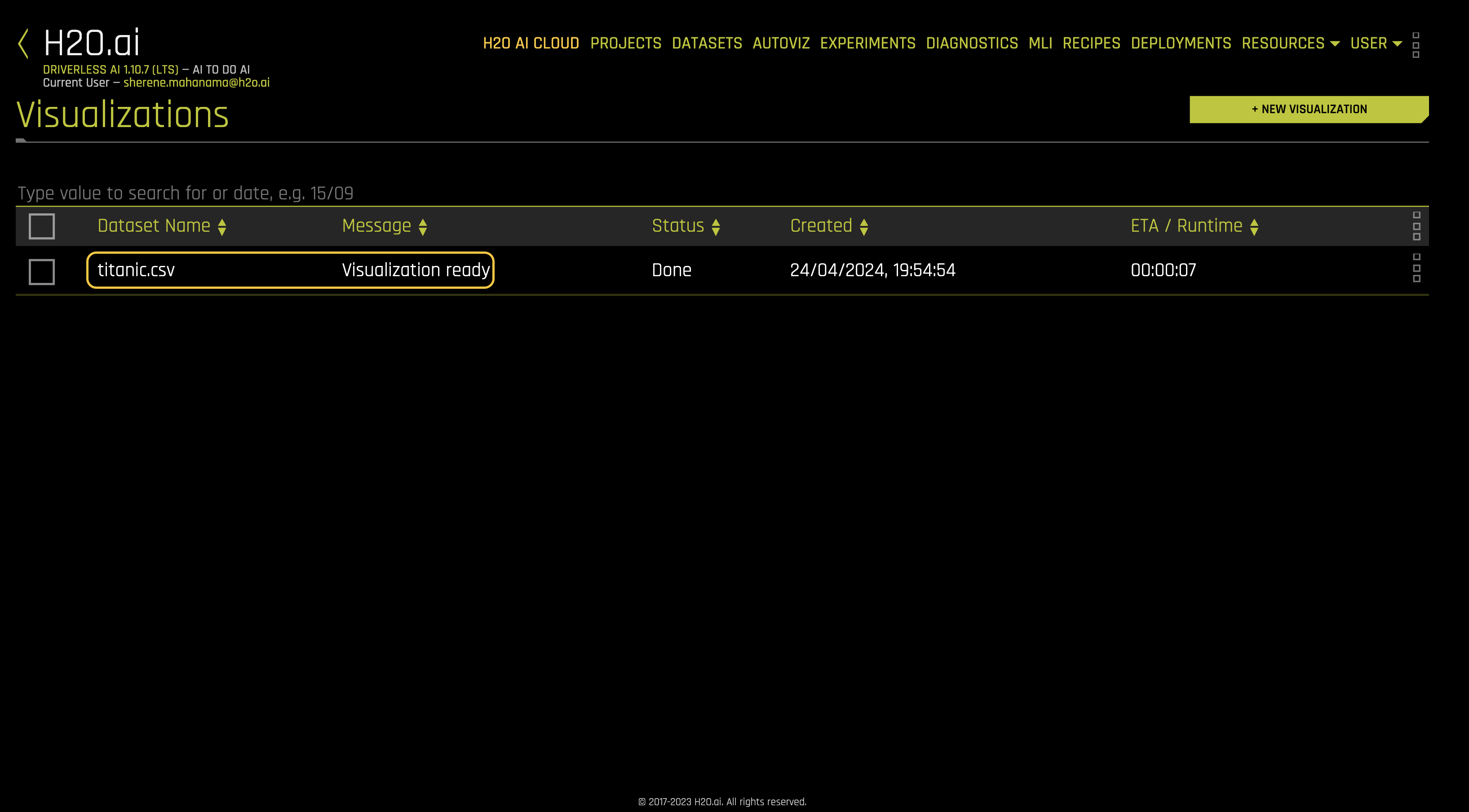
Click titanic.csv, and a list of graph types will appear.
Is it possible to visualize how variables on the training set are correlated? Can we determine what other variables are strongly correlated to a passenger's survival? The answer to those questions is yes! One of the graphs that allow us to visualize the correlations between variables is the Correlation Graph.
Let's explore the correlation between the survived variable and other variables in the dataset.
- Select the Correlation Graph and then click on Help located at the graph's lower-left corner.
- Take a minute to read about how H2O Driverless AI constructed the correlation graph. Learn more about how variables are color-coded to show their correlations.
- Take the ‘survived' variable and drag it slightly to look at how the other variables correlated to the survived attribute.
Exit out of the Correlation Graph view by clicking on the X at the graph's top-right corner.
After you are done exploring the other graphs, go back to the Datasets page. While exploring, keep in mind that Driverless AI shows graphs that represent "relevant" aspects of the data.
For more information and learning about Automatic Visualization, see the H2O Driverless AI documentation.
In Task 5, we will proceed to step 3 of our Driverless AI workflow: run an experiment.
- Submit and view feedback for this page
- Send feedback about H2O Driverless AI | Tutorials to cloud-feedback@h2o.ai