Task 8: Machine learning interpretability report for non-time-series experiments
For non-time-series experiments, H2O Driverless AI provides several visual explanations and reason codes for the trained DAI model and its results. After the predictive model is finished, we can have access to these reason codes and visuals by generating an MLI Report. With that in mind, let us focus on the fourth step of the Driverless AI workflow: Interpret the model.
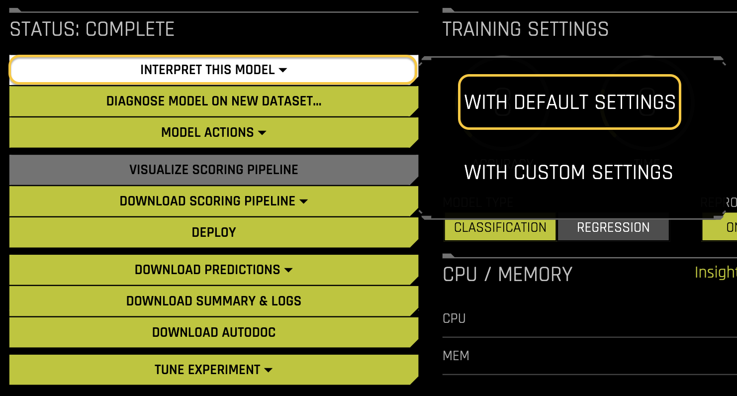
Generate MLI Report: In the Status section, click Interpret this Model and select With Default Settings.
Wait a few moments for the MLI report to get generated.
The Model Interpretation page is organized into three tabs:
- Summary: summary of the MLI report including the MLI parameters
- DAI Model: interpretations using the DAI model
- Surrogate Model: interpretations using surrogate models
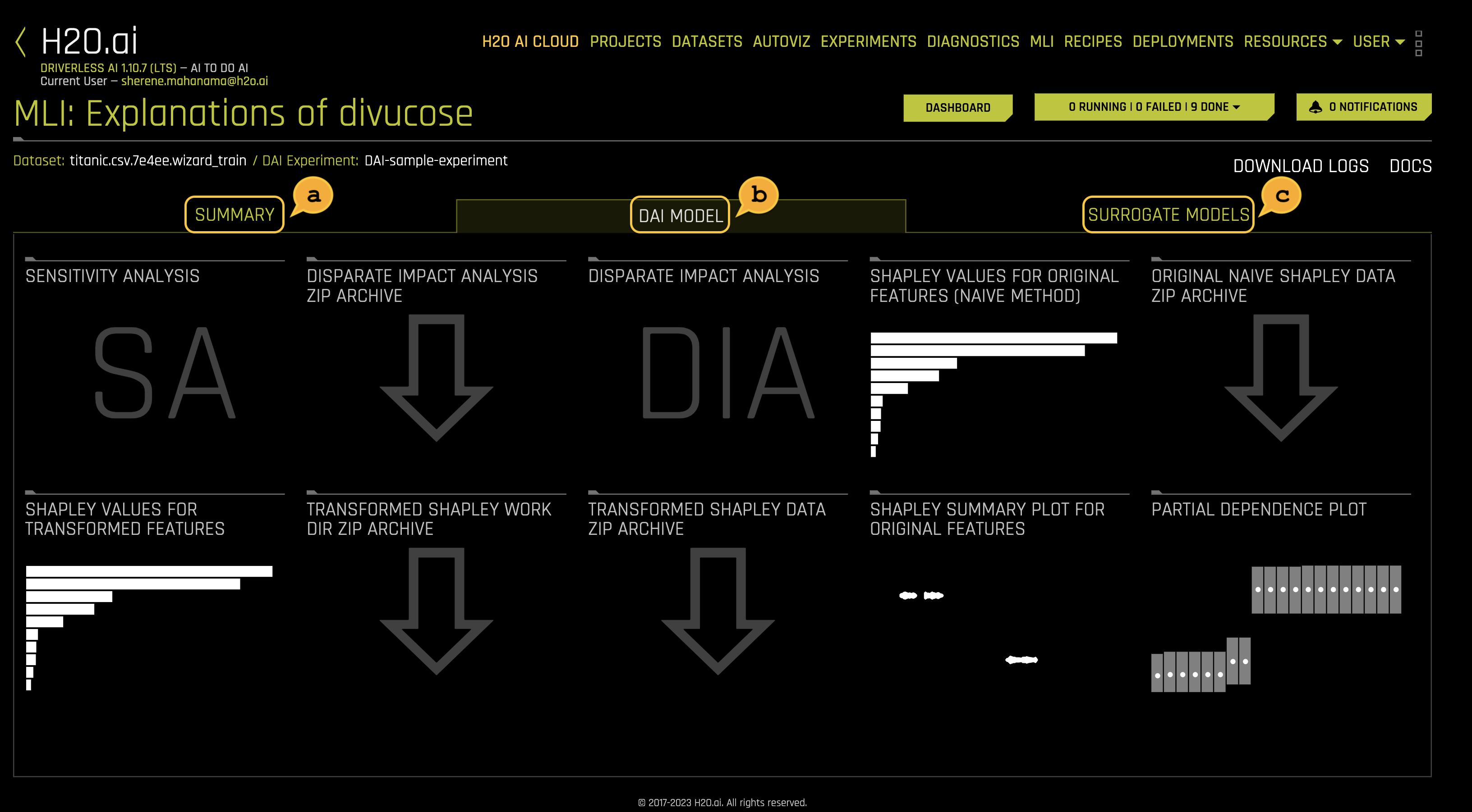
Sections of an MLI report
Once the MLI Experiment is finished the following should appear:
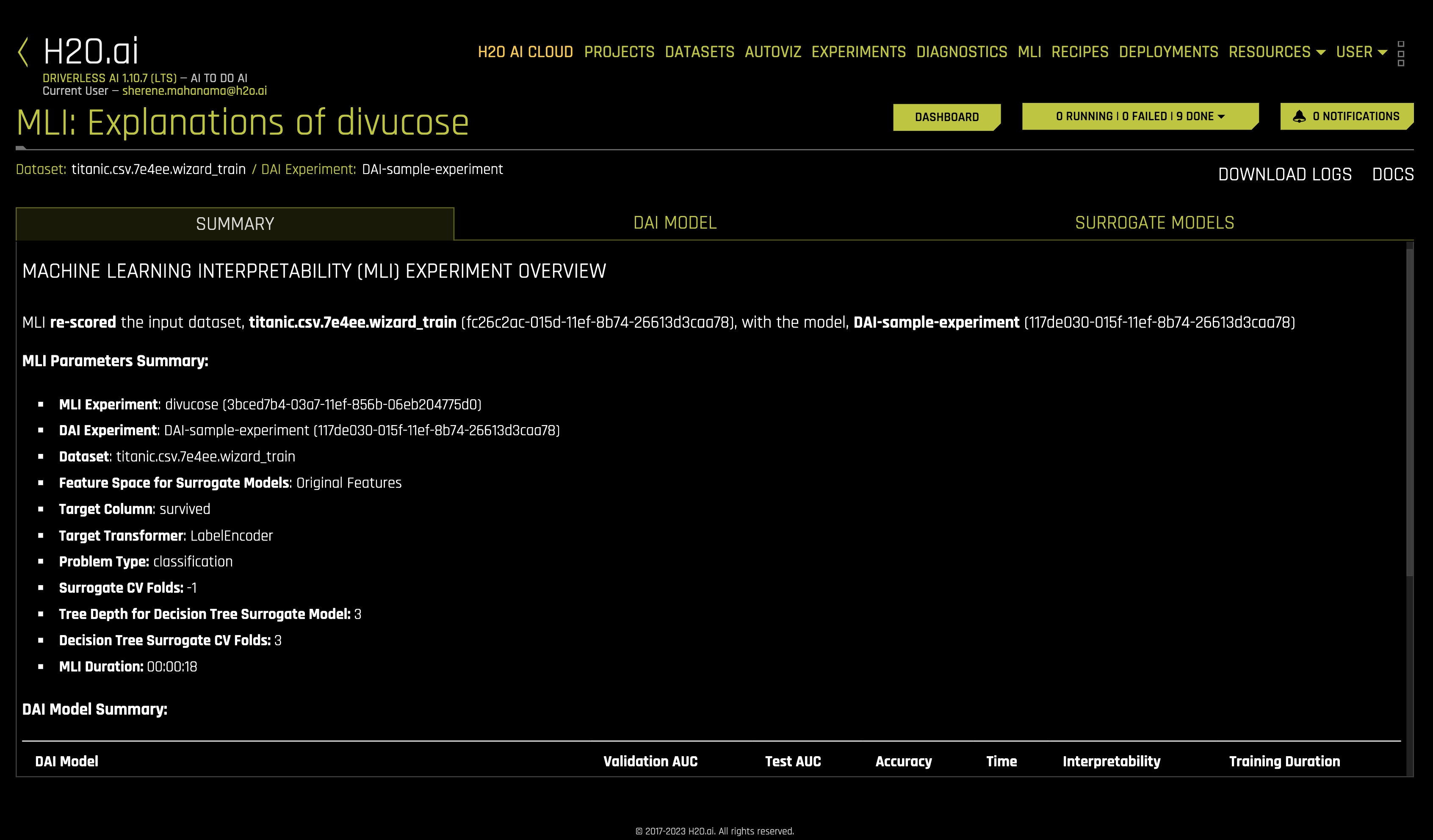
a. Summary
This is a summary of the MLI experiment. This page provides an overview of the interpretation, including the dataset and Driverless AI experiment (if available) that were used for the interpretation along with the feature space (original or transformed), target column, problem type, and k-Lime information.
b. DAI Model
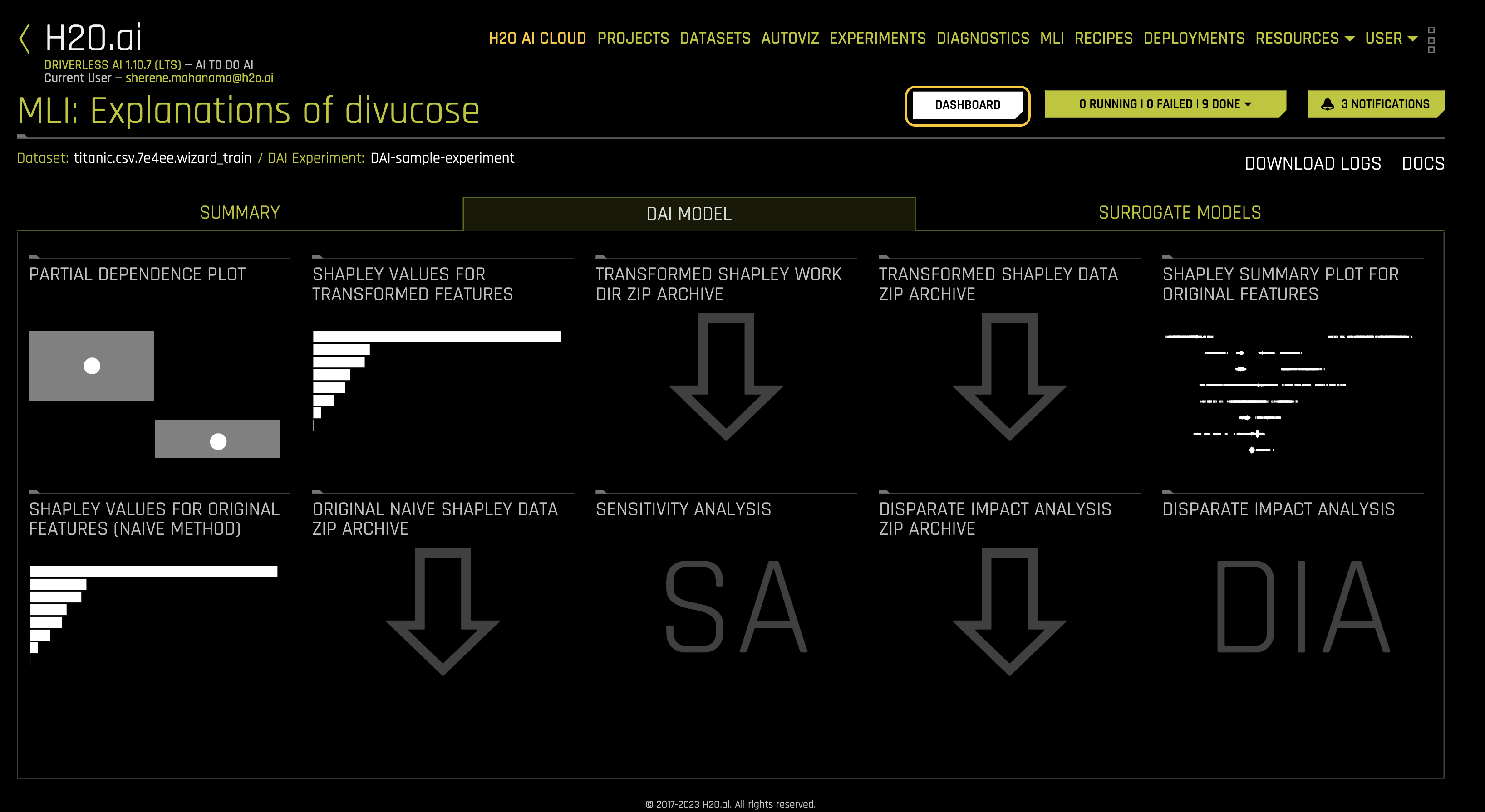
The DAI Model tab is organized into tiles for each interpretation method. To view a specific plot, click the tile for the plot that you want to view.
For binary classification and regression experiments, this tab includes Feature Importance and Shapley (not supported for RuleFit and TensorFlow models) plots for original and transformed features as well as Partial Dependence/ICE, Disparate Impact Analysis (DIA), Sensitivity Analysis, NLP Tokens and NLP LOCO (for text experiments), and Permutation Feature Importance (if the autodoc_include_permutation_feature_importance configuration option is enabled) plots.
For multiclass classification experiments, this tab includes Feature Importance and Shapley plots for original and transformed features:
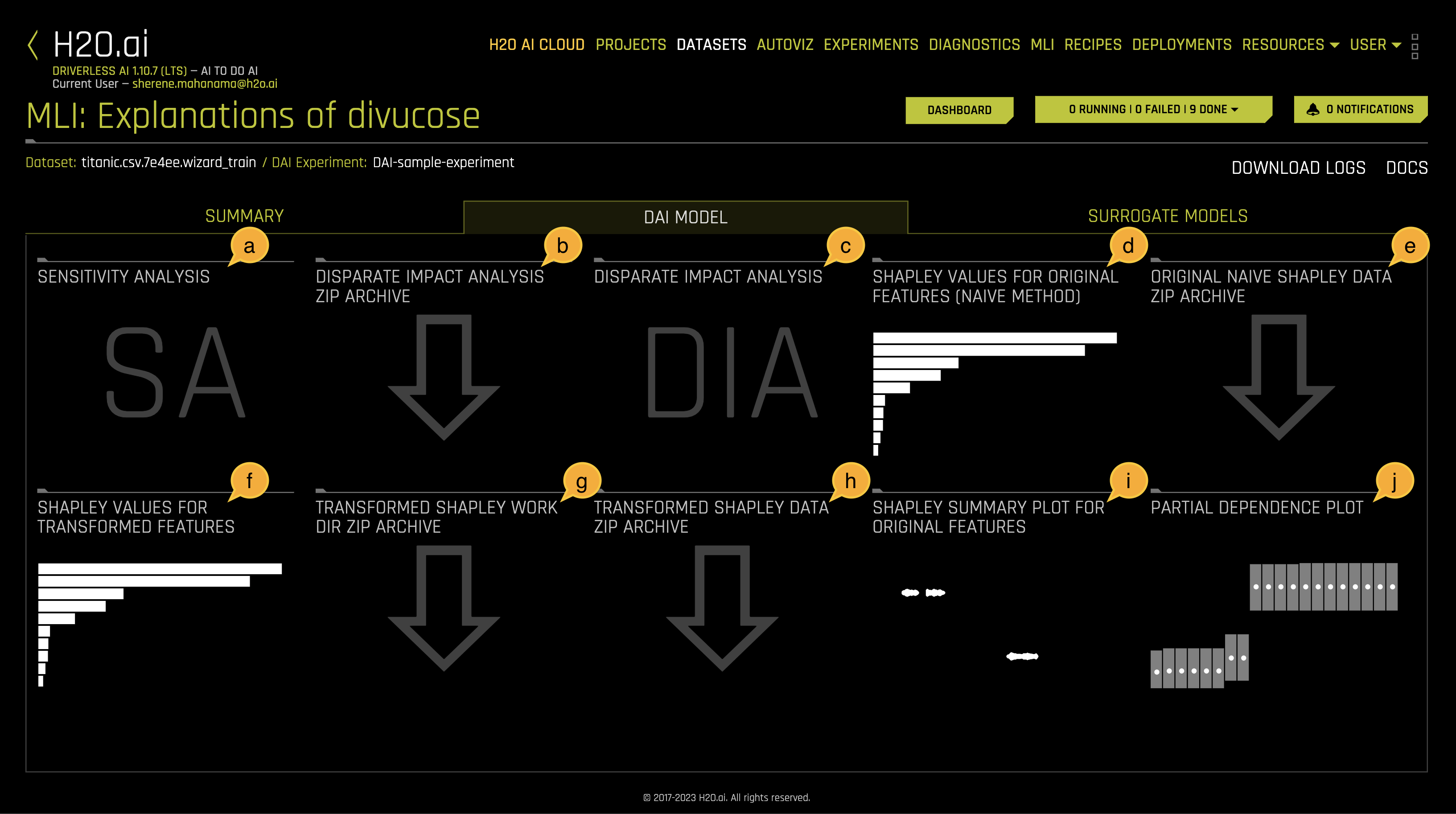
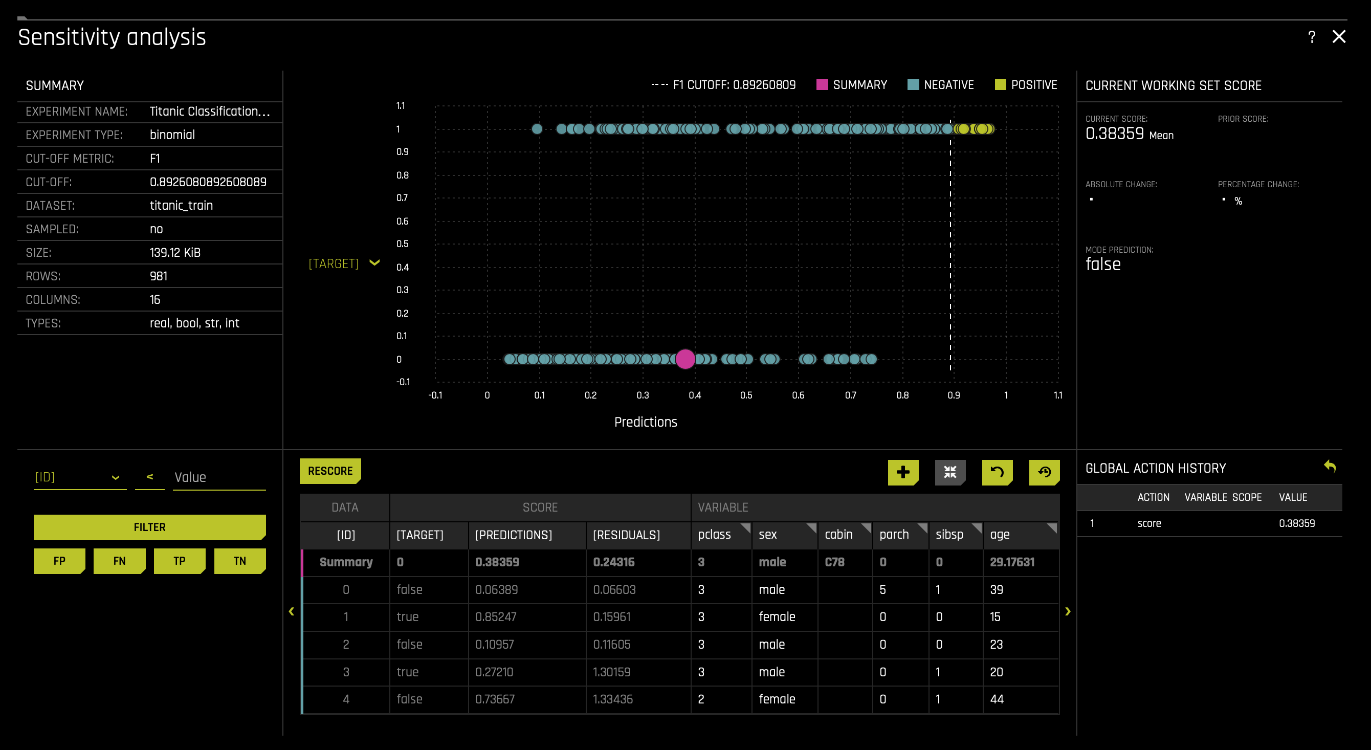
a. Sensitivity Analysis (SA) (or "What if?") is a simple and powerful model debugging, explanation, fairness, and security tool that investigates whether model behavior and outputs remain stable when data is intentionally perturbed, or other changes are simulated in the data.
For more information, see Sensitivity Analysis in the H2O Driverless AI documentation.
To access the SA plot, click on the SA (Sensitivity Analysis) tile.
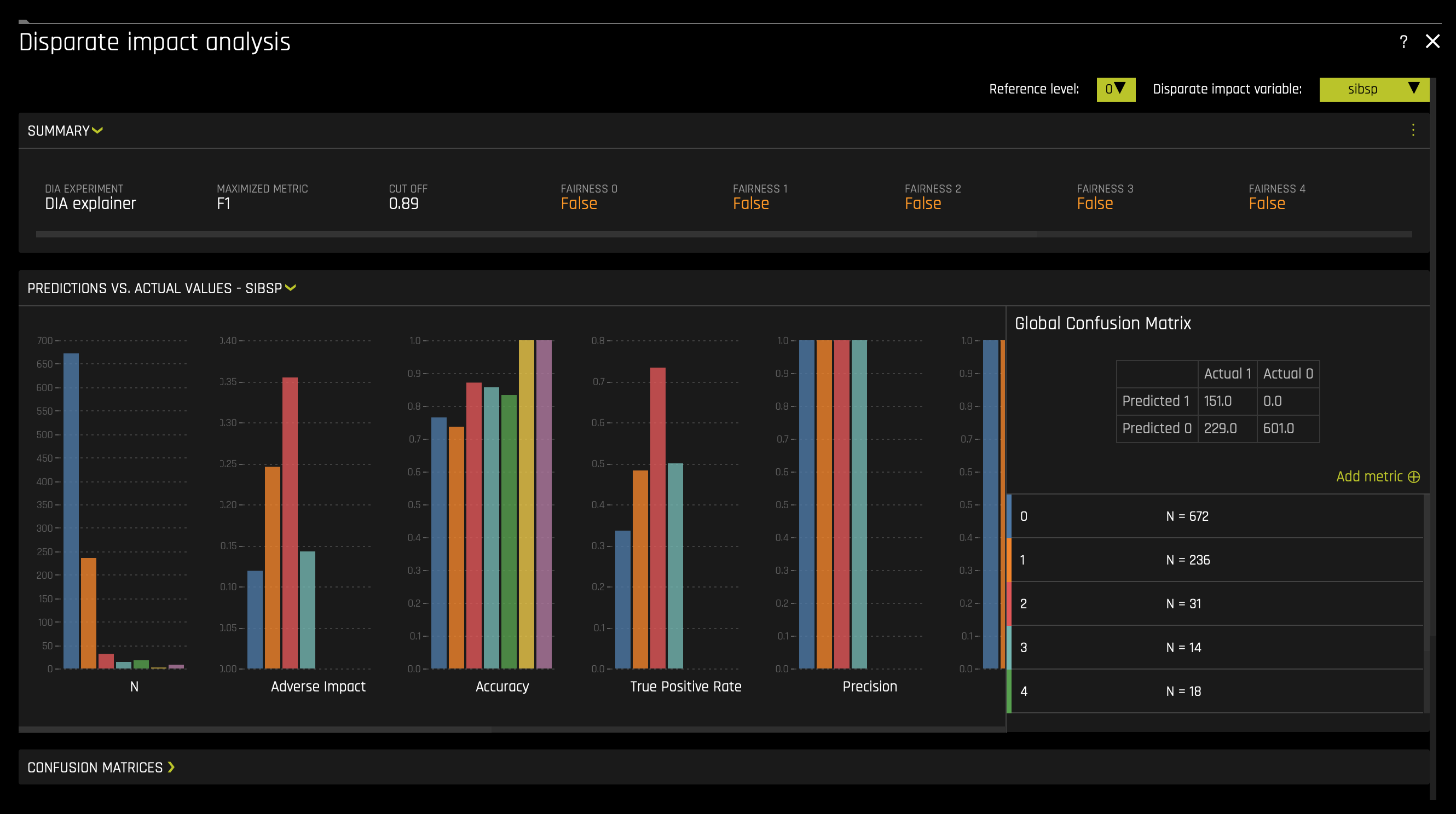
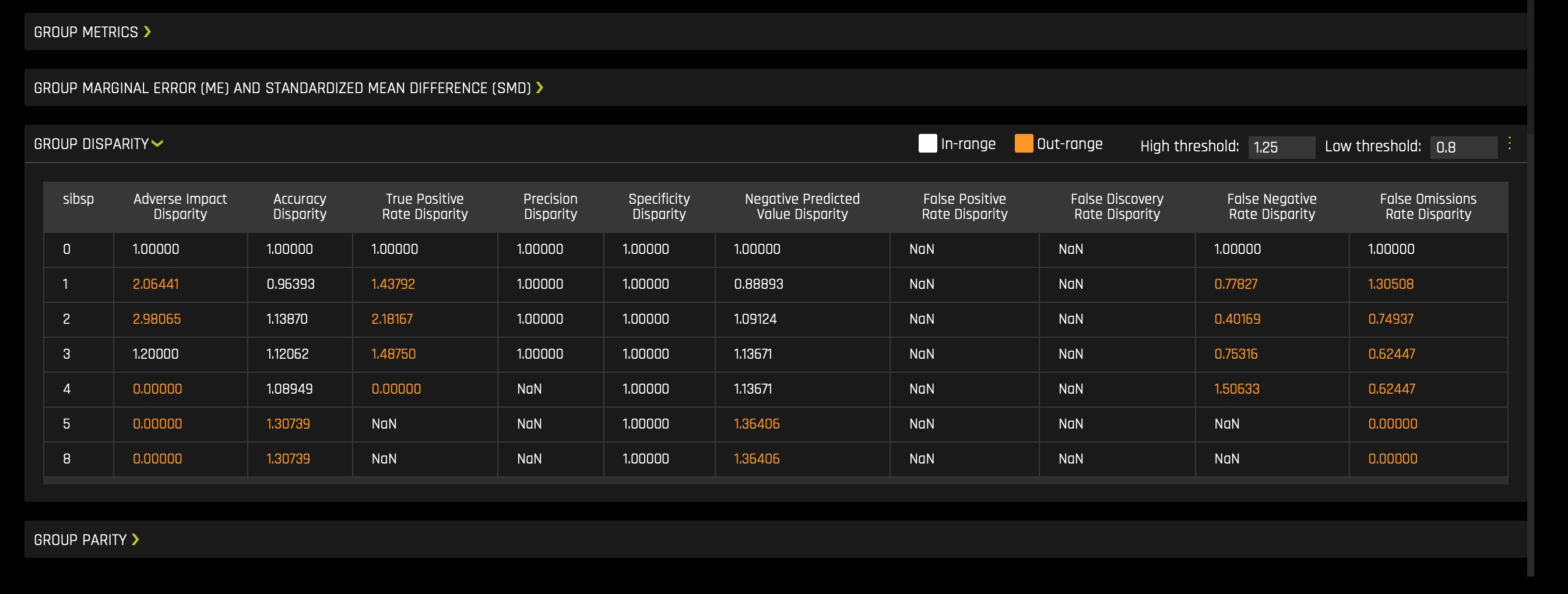
b. Disparate Impact Analysis (DIA) is a technique that is used to evaluate fairness. Bias can be introduced to models during the process of collecting, processing, and labeling data—as a result, it is essential to determine whether a model is harming certain users by making a significant number of biased decisions.
For more information, see Disparate Impact Analysis in the H2O Driverless AI documentation.
To download a .zip of the DIA data, click on the Disparate Impact Analysis ZIP Archive tile.
c. The Disparate Impact Analysis (DIA) plot and metrics information provide a visualization of the model's fairness.
To access it, click on the DIA (Disparate Impact Analysis) tile.
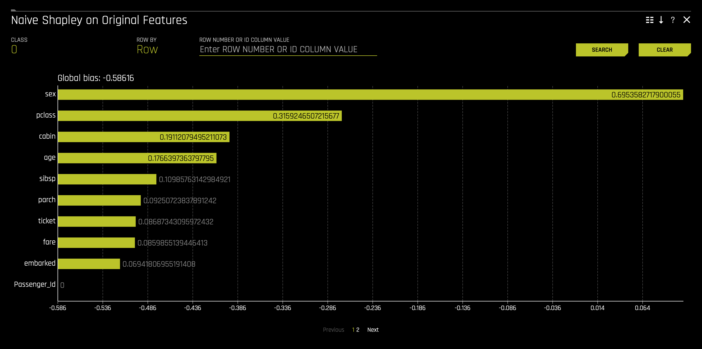
d. Shapely Values for Original Features (Naive Method) are approximated from the accompanying Shapley values for transformed features plot using the Naive Shapley method. Shapley values for original features can also be calculated with the Kernel Explainer method, which uses a special weighted linear regression to compute the importance of each feature. This can be enabled by using the recipe Original Kernel Shap explainer.
For more information, see Shapley orginal and transformed features in the H2O Driverless AI documentation.
To access it, click on the Shapely Values for Original Features (Naive Method) tile.
e. Original Naive Shapely data ZIP Archive
f. Shapley Values for Transformed Features are calculated by tracing individual rows of data through a trained tree ensemble and then aggregating the contribution of each input variable as the row of data moves through the trained ensemble.
For more information, see Shapley orginal and transformed features in the H2O Driverless AI documentation.
To access it, click on the Shapley Values for Transformed Features tile.
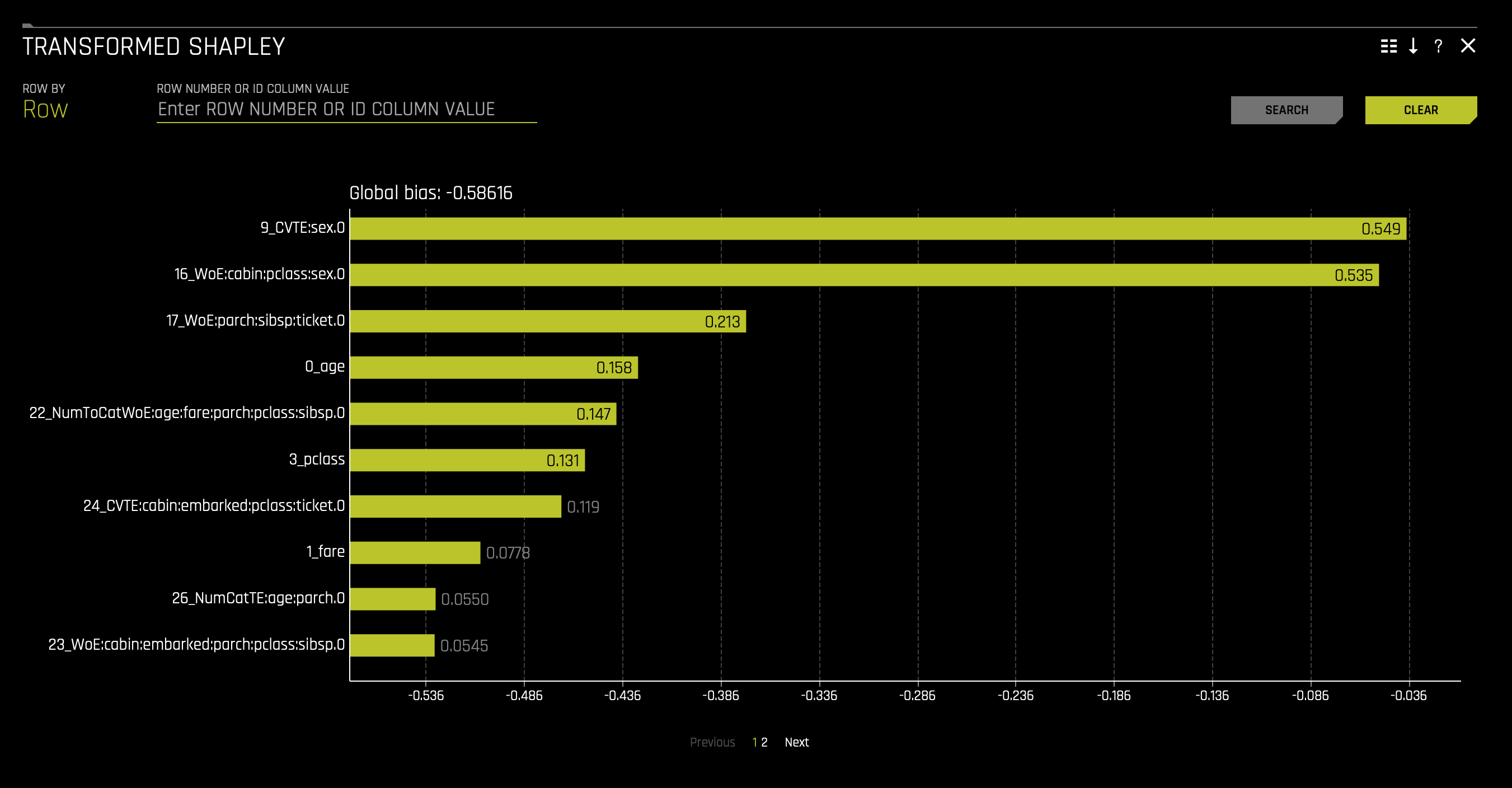
g. Transformed Shapley Work Dir ZIP Archive
h. Transformed Shapley Data ZIP Archive
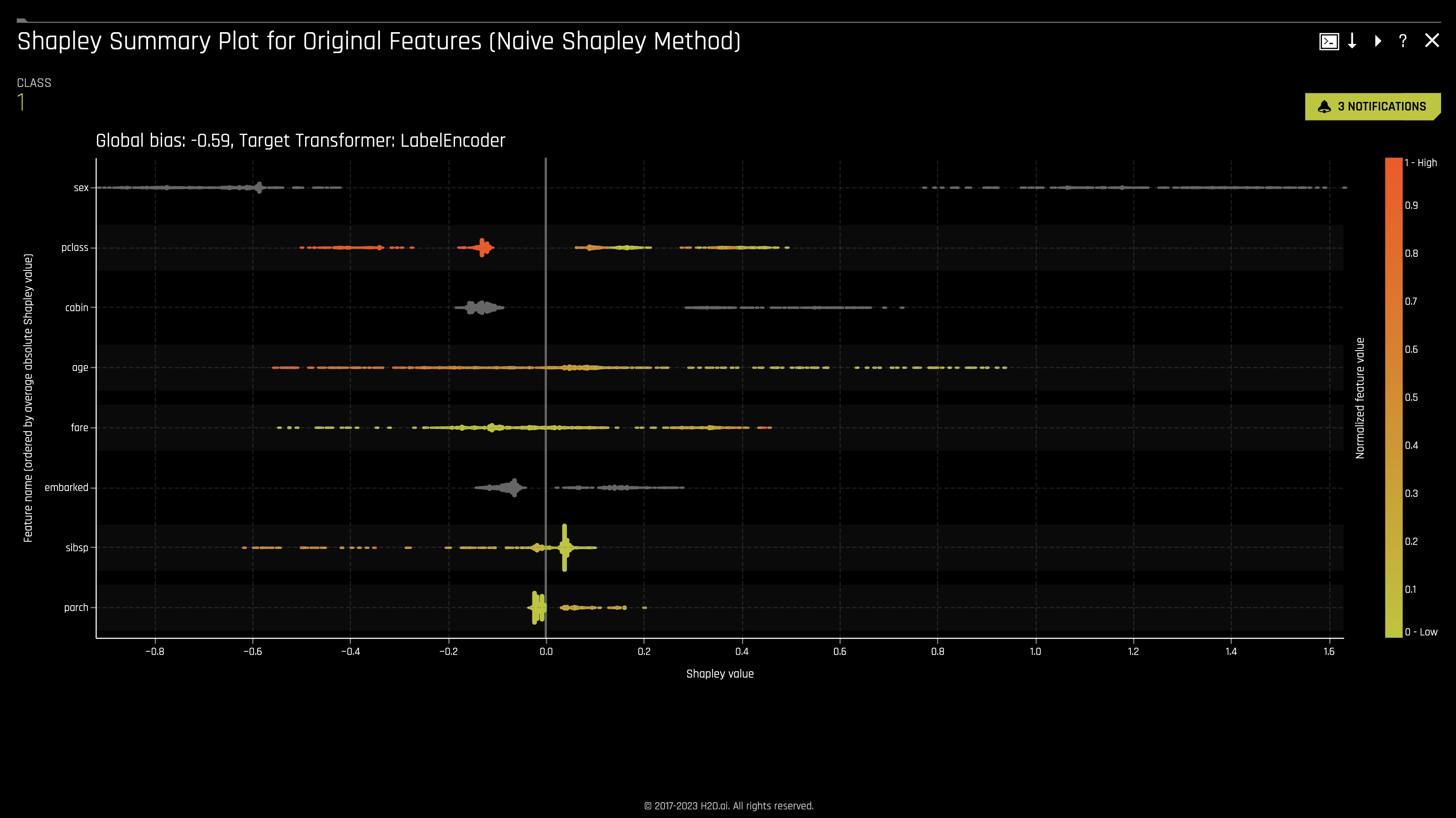
i. The Shapley Summary Plot for Original Features shows original features versus their local Shapley values on a sample of the dataset. Feature values are binned by Shapley values, and the average normalized feature value for each bin is plotted. To see the Shapley value, number of rows, and average normalized feature value for a particular feature bin, hold the pointer over the bin. The legend corresponds to numeric features and maps to their normalized value. Yellow is the lowest value, and deep orange is the highest. You can click on numeric features to see a scatter plot of the actual feature values versus their corresponding Shapley values. Categorical features are shown in grey and do not provide an actual-value scatter plot.
For more information, see Shapley orginal and transformed features in the H2O Driverless AI documentation.
To access it, click on the Shapley Summary Plot for Original Features tile.
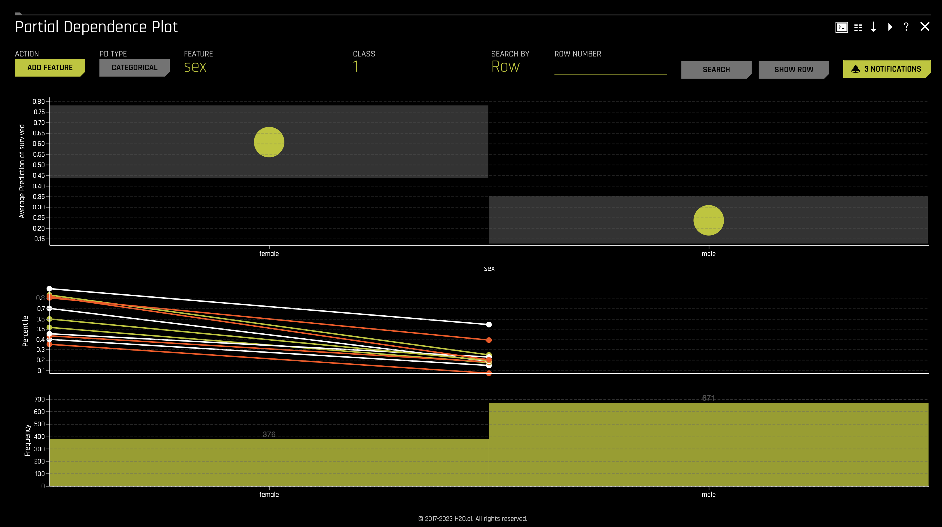
j. Partial Dependence Plot displays how machine-learned response functions change based on the values of an input variable of interest while taking nonlinearity into consideration and averaging out the effects of all other input variables. Partial dependence is a measure of the average model prediction with respect to an input variable.
For more information, see Partial Dependence and ICE Technique in the H2O Driverless AI documentation.
To access it, click on the Partial Dependence Plot tile.
C. Surrogate Models
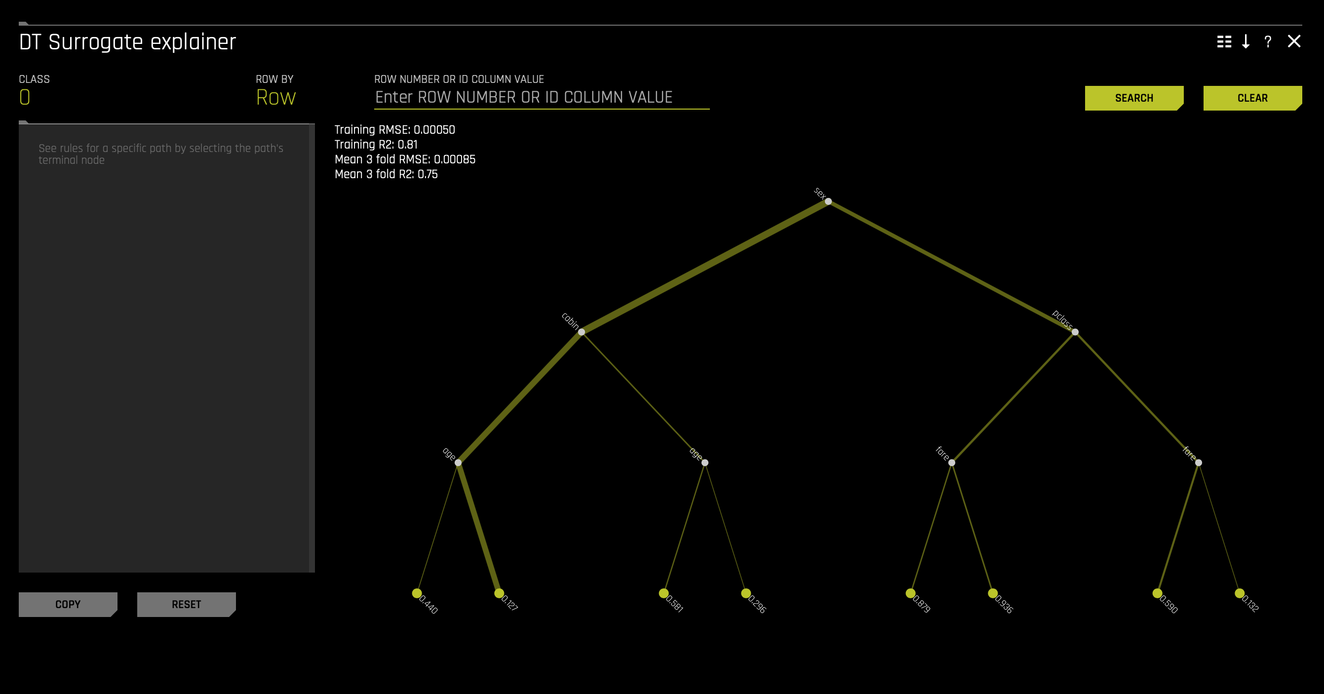
A surrogate model is a data mining and engineering technique in which a generally simpler model is used to explain another, usually more complex, model or phenomenon. For example, the decision tree surrogate model is trained to predict the predictions of the more complex Driverless AI model using the original model inputs. The trained surrogate model enables a heuristic understanding (i.e., not a mathematically precise understanding) of the mechanisms of the highly complex and nonlinear Driverless AI model.
The Surrogate Model tab is organized into tiles for each interpretation method. To view a specific plot, click the tile for the plot that you want to view. For binary classification and regression experiments, this tab includes K-LIME/LIME-SUP and Decision Tree plots as well as Feature Importance, Partial Dependence, and LOCO plots for the Random Forest surrogate model.
For more information on these plots, see Surrogate Model Plots.
a. Decision Tree
b. Decision Tree Surrogate Rules Zip
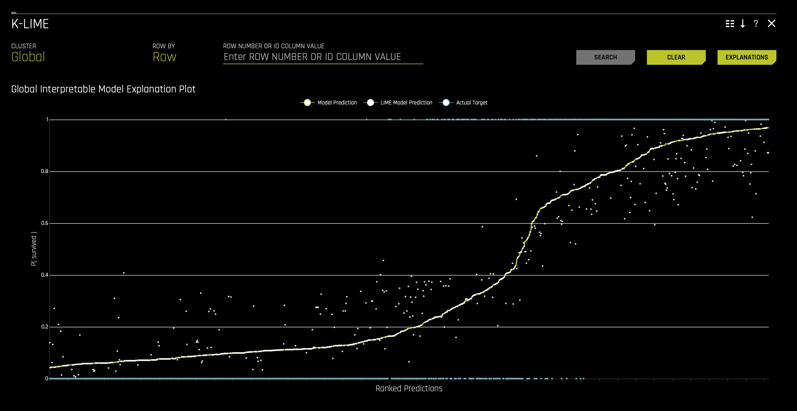
c. K-Lime
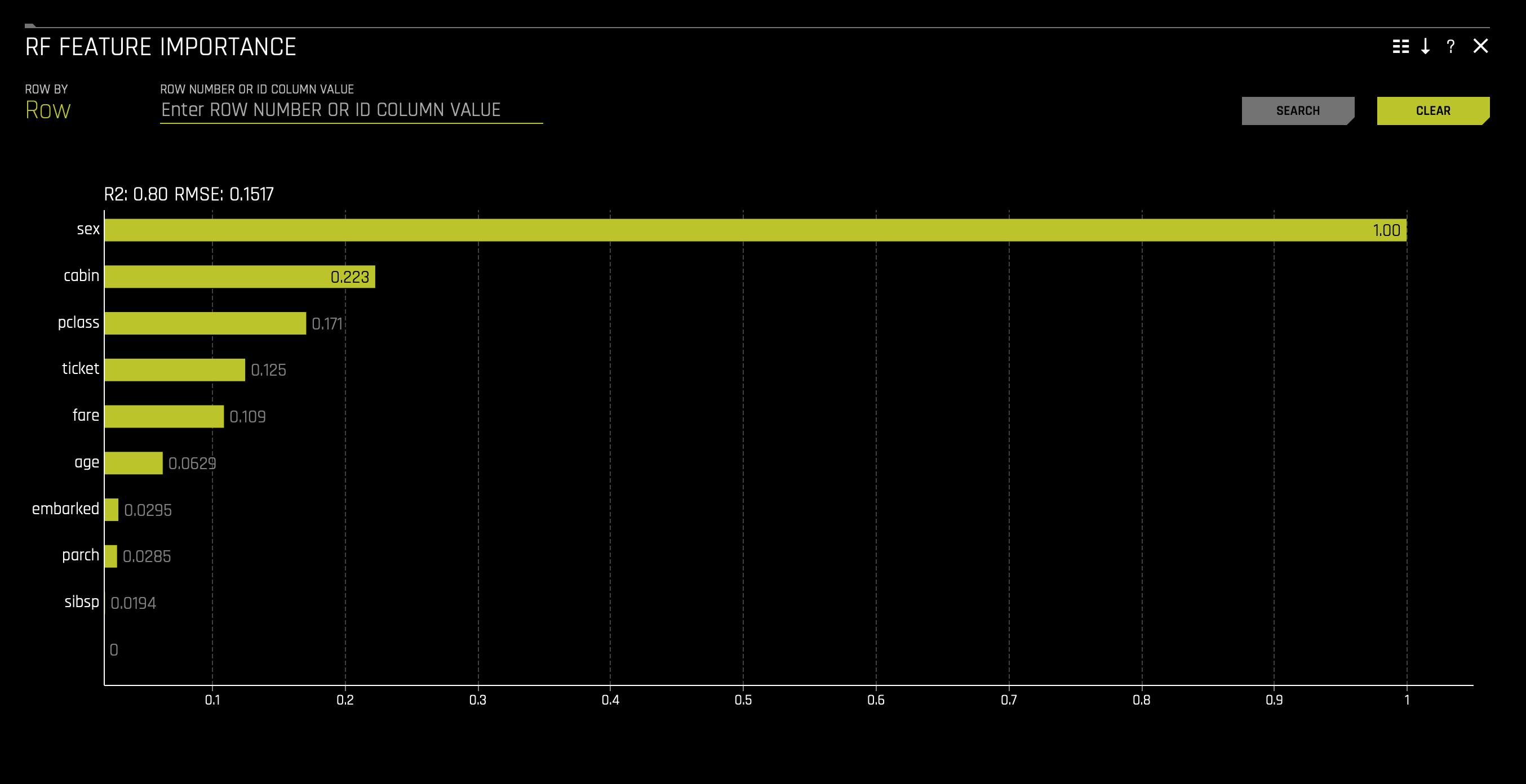
d. RF Feature Importance
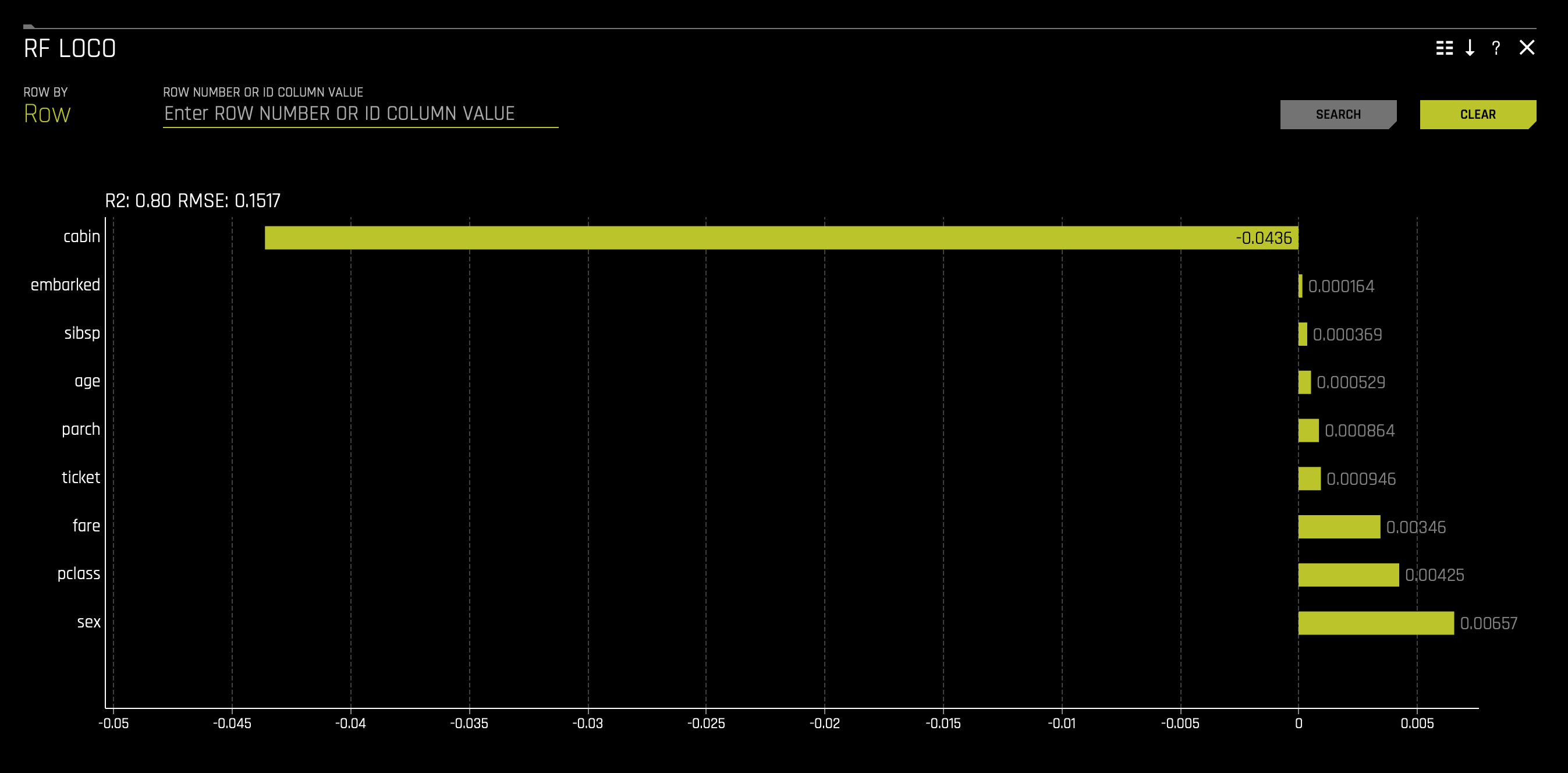
e. RF LOCO
f. RF Partial Dependence Plot

g. Surrogate and Shapley Zip Archive
MLI Dashboard
Click Dashboard to access the MLI Dashboard and explore the different types of insights and explanations regarding the model and its results.
You will see the following screen. All plots are interactive.
![]()
a. Expand: Click on the expand icon found on the top-left corner of each interactive plot to expand the plot and view it in detail.
b. Download: Click on the download icon found on the top-right corner of each plot to download a .png static image of the plot.
The first two Shapley Values for Transformed Features and Shapley Values for Orignal Features (Naive Method) plots display feature importance and shows the essential features that drive the model's behavior.
- Which attribute/feature had the most importance? Note that the highest shapley values displayed here are for the
sex,cabin, andclassfeatures.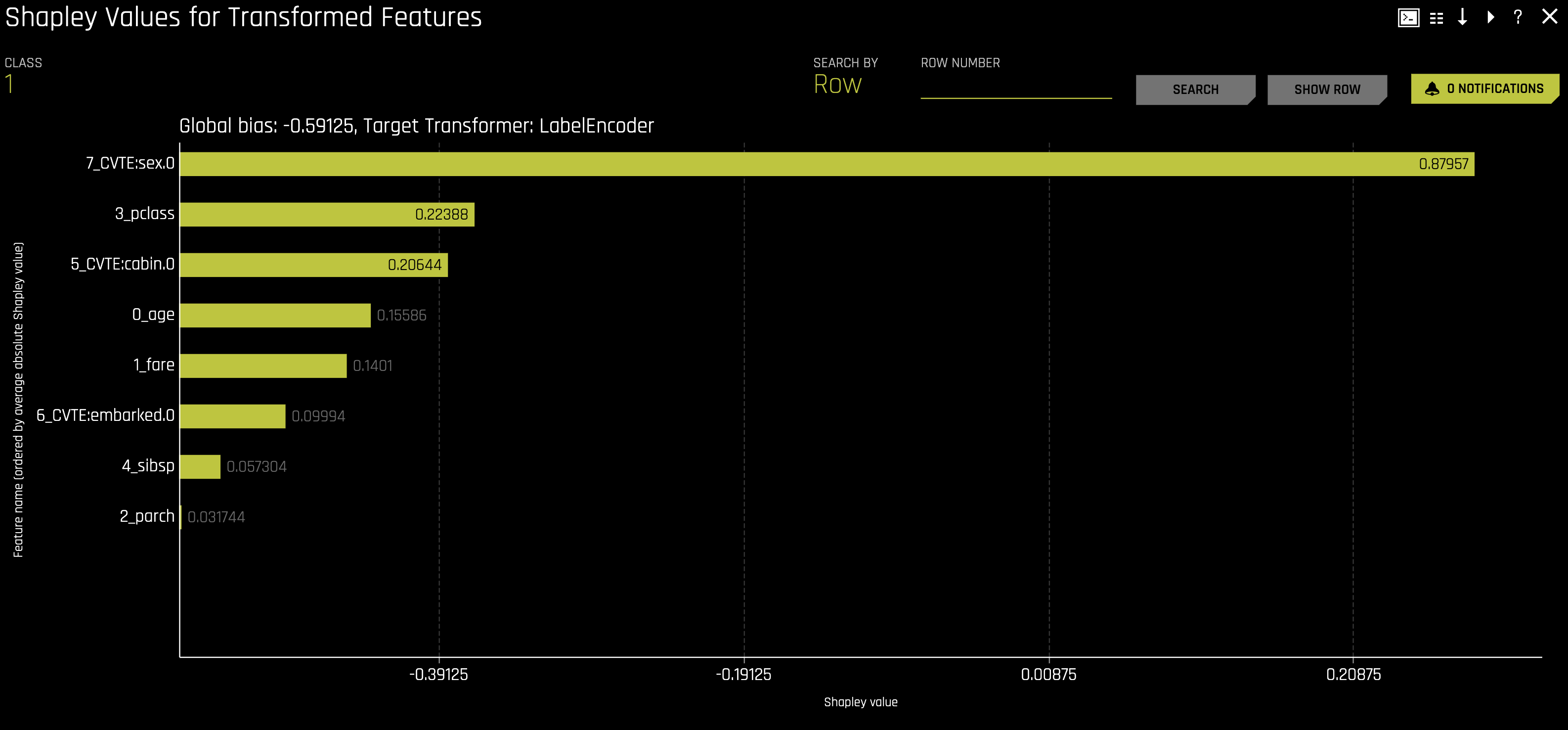
- Learn more about the Feature Importance graph in the next tutorial: Tutorial 1B: Machine Learning Interpretability - Financial Focus.
- Which attribute/feature had the most importance? Note that the highest shapley values displayed here are for the
The Partial Dependence Plot represents the model's prediction for different original variables' values. It shows the average model behavior for important original variables.
The grey bars in the first visualization represent the standard deviation of predictions. The yellow dots represent the average predictions. Hover over each yellow dot to view the exact values of average prediction and standard deviation.
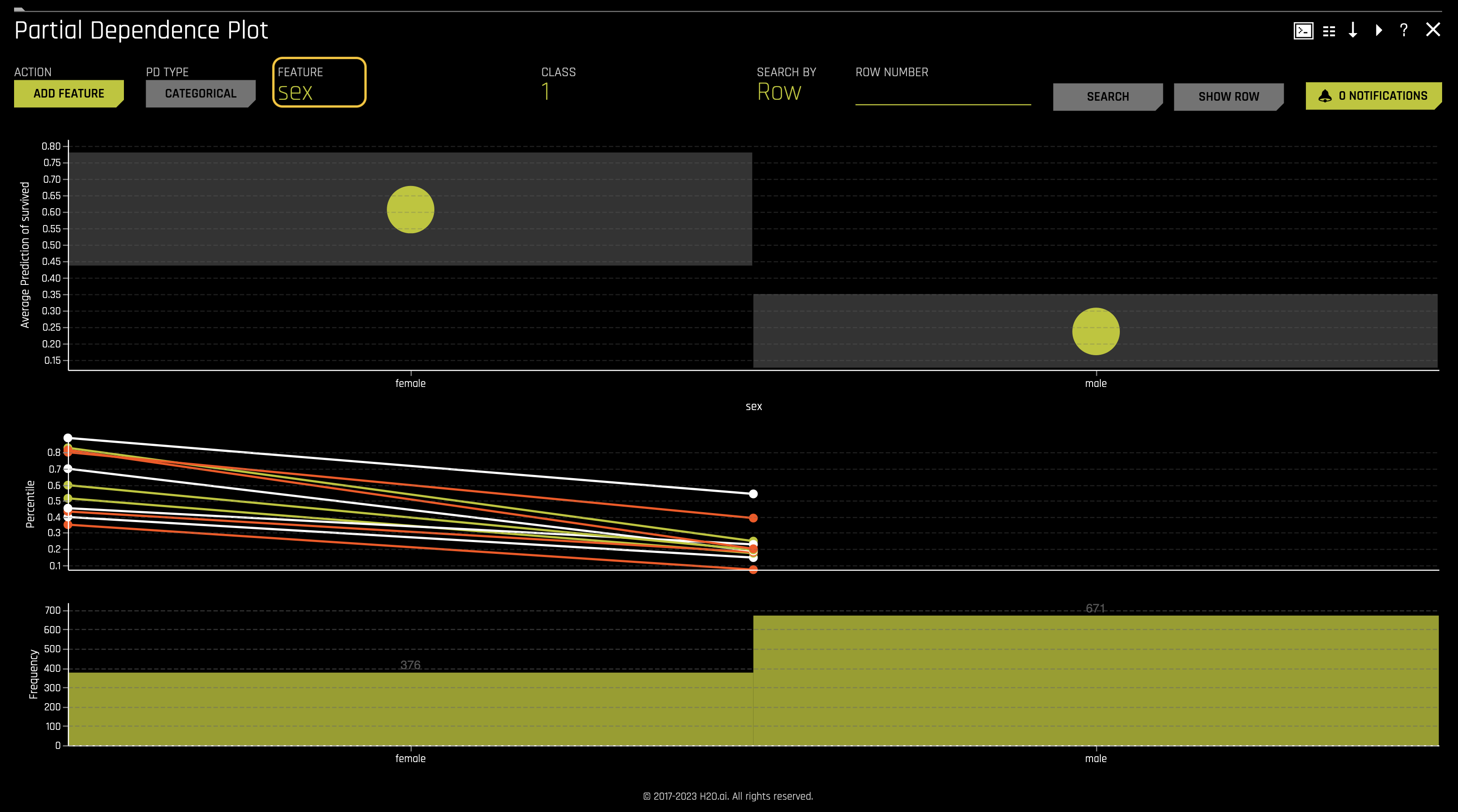
- Explore other average values for different variables and compare the results to your original observations. To change the variable, click on Feature found at the top of the plot and select the desired variable. Once DAI is done computing, you will see the plot change according to the variable you selected.
Every single graph, plot, or chart we have observed has a few icons on the top-right corner of the plot, including the ? icon. These icons further information about the visual in the form of data, video explanations, and logs.
Keeping our learnings and observations above in mind, we can say that the top three factors that contributed to a passenger surviving are as follows: sex, cabin, and class. From the perspective of an insurance company, knowing this information can drastically determine certain groups' insurance rates.
- Submit and view feedback for this page
- Send feedback about H2O Driverless AI | Tutorials to cloud-feedback@h2o.ai