Task 10: Kolmogorov-Smirnov chart
Continuing on the diagnostics page, select the KS chart. The K-S chart should look similar to the one below:
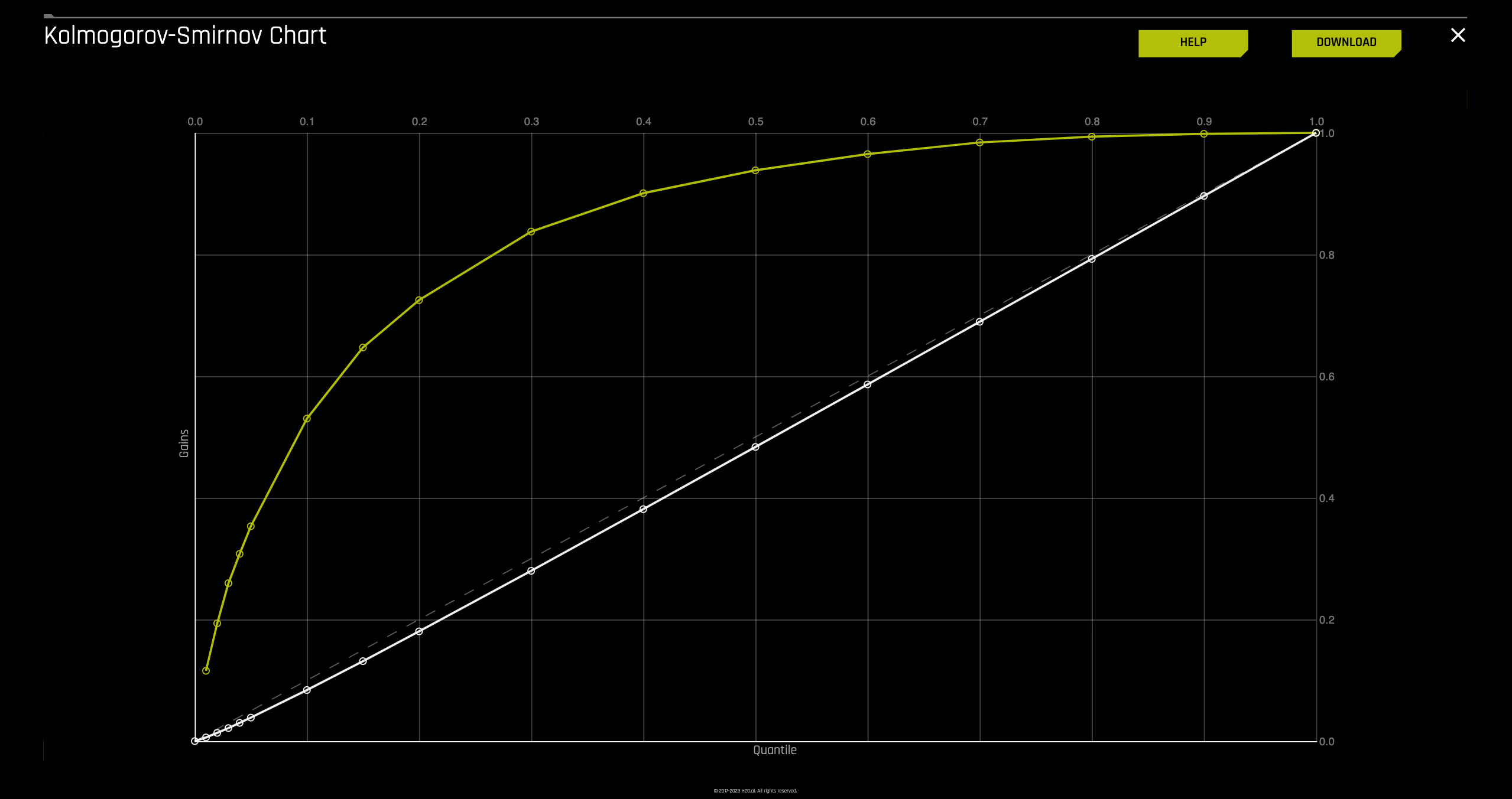
- K-S evaluates how well classification models distinguish between positives and negatives in validation or test data.
- A K-S of 100 indicates complete separation, where one group contains all positives and the other all negatives.
- If the model can't differentiate, it's like random selection, resulting in a K-S of 0.
- K-S ranges from 0 to 1.
- A higher K-S indicates better separation between positive and negative cases.
The y-axis of the plot has been adjusted to represent quantiles; this allows for focus on the quantiles that have the most data and, therefore, the most impact.
Hover over the various quantile points on the Lift chart to view the quantile percentage and cumulative lift values.
What is the cumulative lift at 1%, 2%, 10% quantiles?
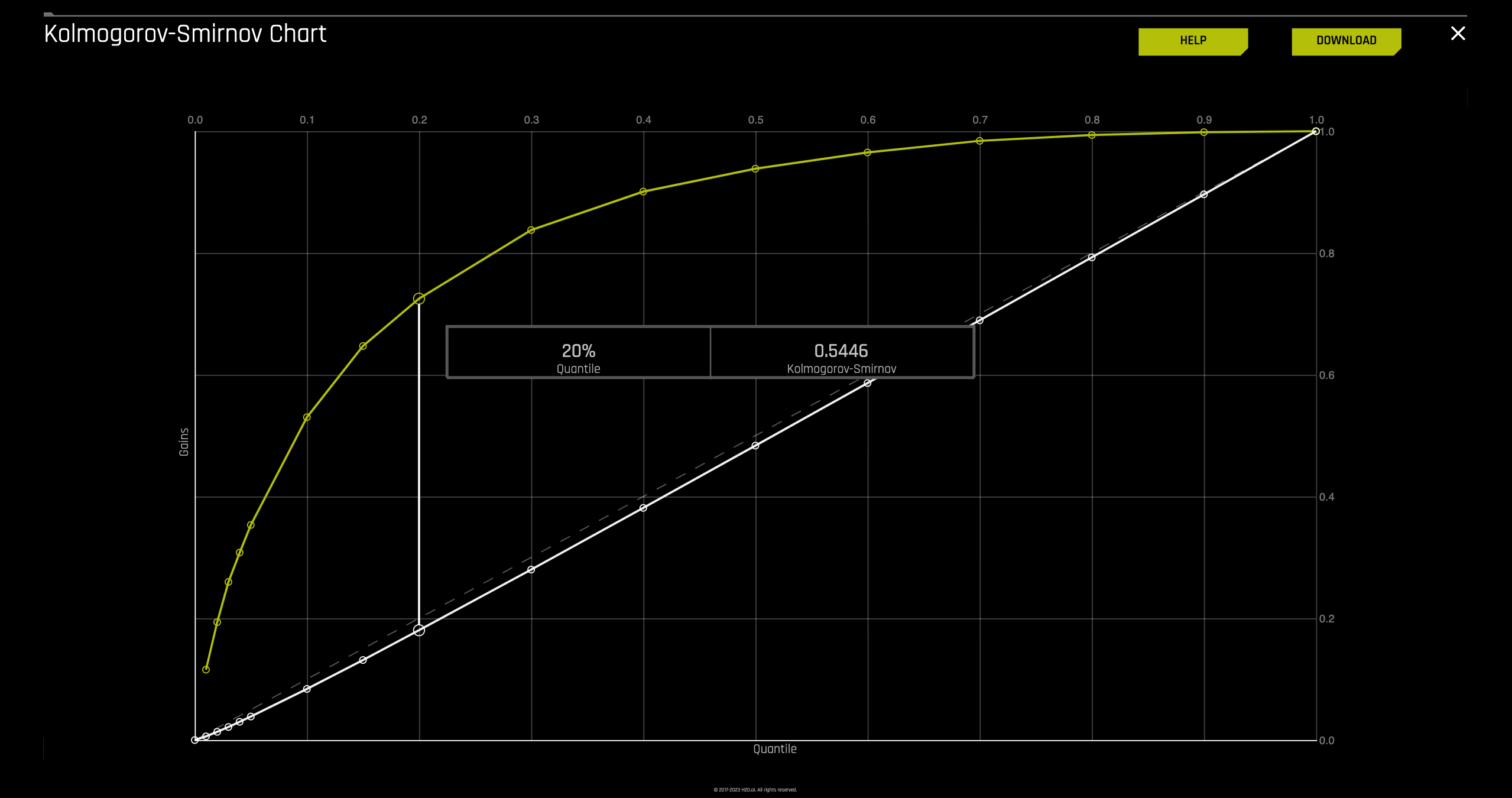
In this K-S chart, examining the top 20% of the data reveals that the at-chance model (represented by the dotted diagonal line) indicates a successful separation of only 20% between positives and negatives (defaulted and not defaulted). However, with the model, approximately 54% of the cases were successfully separated between positives and negatives, indicated by a K-S value of 0.540.
Based on the K-S curve (yellow) and the baseline (white diagonal dashed line) we could determine how effective the model is.
Exit out of the K-S chart by clicking on the X located at the top-right corner of the plot, next to the DOWNLOAD option
- Submit and view feedback for this page
- Send feedback about H2O Driverless AI | Tutorials to cloud-feedback@h2o.ai