Task 8: ER: Gains
Continuing on the diagnostics page, select the CUMULATIVE GAIN curve. The Gains curve should look similar to the one below: 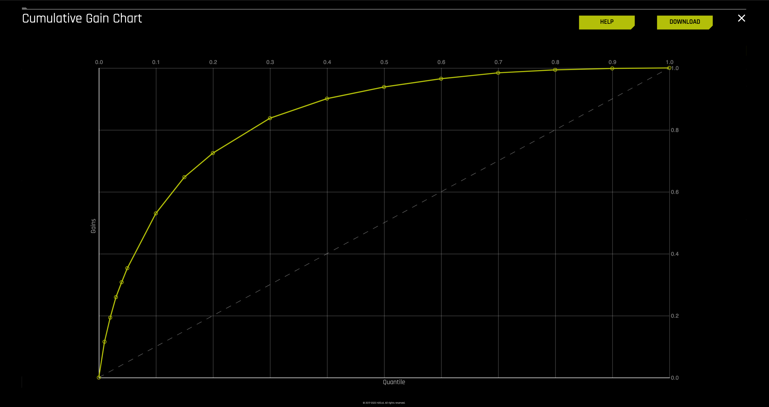
note
- A cumulative gains chart serves as a visual tool for assessing model performance.
- On the y-axis, we see the percentage of positive responses, representing a portion of all possible positive responses.
- The x-axis displays the percentage of customers from the Freddie Mac dataset who did not default, relative to the total cases.
- The dashed line denotes the baseline, which reflects the overall response rate.
- The lift chart provides a means to quantify the model's capability in identifying instances of the positive class. It addresses the question: "For the top 1%, 2%, - 10%, etc., of predictions generated by the model, what proportion of those predictions align with actual positive cases?" Notably, the gain at the 100th percentile always equals 1.0, indicating that all positive instances have been correctly identified by the model at that juncture.
The y-axis of the plot has been adjusted to represent quantiles. This allows for focus on the quantiles that have the most data and, therefore, the most impact.
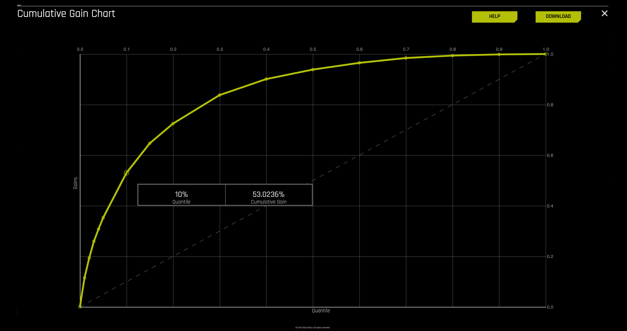
Hover over the various quantile points on the Gains chart to view the quantile percentage and cumulative gain values.
What is the cumulative gain at 1%, 2%, 10% quantiles?
- For this Gain Chart, if we look at the top 1% of the data, the at-chance model (the dotted diagonal line) tells us that we would have correctly identified 1% of the defaulted mortgage cases. The model generated (yellow curve) shows that it was able to identify about 12% of the defaulted mortgage cases.
- If we hover over to the top 10% of the data, the at-chance model (the dotted diagonal line) tells us that we would have correctly identified 10% of the defaulted mortgage cases. The model generated (yellow curve) says that it was able to identify about 53% of the defaulted mortgage cases.
We can determine how effective this model is based on the shape of the gain curve and the baseline (white dashed line). What does a good lift curve look like?
- Good lift curves show a sharp rise at the beginning, meaning the model prioritizes positive predictions well from the start. A steeper curve overall indicates the model performs better than random guessing. The area between the curve and the baseline (random prediction) is called the Area Under the Curve (AUC), with a larger AUC indicating a more effective model. But there's always room for improvement by making the lift curve even steeper.
note
If you are not sure what AUC or what the gain chart is, review the concepts section of this tutorial.
- Exit out of the Gains chart by clicking on the X located at the top-right corner of the plot, next to the DOWNLOAD option
Feedback
- Submit and view feedback for this page
- Send feedback about H2O Driverless AI | Tutorials to cloud-feedback@h2o.ai