Metrics: Adversarial similarity
H2O Model Validation offers an array of metrics in the form of histograms, charts, and a table to understand an adversarial similarity validation test. Below, each metric is described in turn.
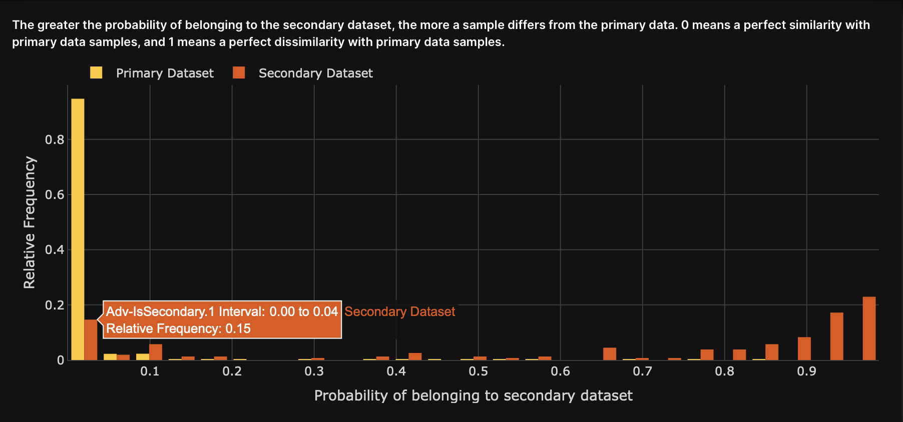
Histogram: Probability of belonging to Secondary Dataset
The histogram displays the AUC probability values obtained during the adversarial similarity test.
- In the adversarial similarity test, predictions (AUC probability values) are generated to determine how much a dataset’s row differs from those belonging to the training dataset
- The target column is called Adv-IsSecondary, and the predictions generated by the adversarial model are called Probability of belonging to Secondary Dataset
- Higher values to the histogram's right will indicate a greater difference between the Primary Dataset and the Secondary Dataset
- A balance of values on both sides of the histogram will indicate a 1.0 AUC score (a perfect separation between the two datasets)
- The Y-axis refers to the relative frequency of an AUC probability value in one of the histogram's intervals
- Futhermore, the relative frequency (Y-axis) refers to the percent-wise frequencies or number of occurrences of values in the datasets. H2O Model Validation performs this relative or percent-wise calculation to compare numbers between the Primary and Secondary Datasets. Since H2O Model Validation expects each dataset to have a different size, making a fair comparison on direct frequencies will be harder. Therefore, H2O Model Validation divides the number of occurrences by the length of the dataset
Dissimilarity score
The Dissimilarity score displays the Area Under the Curve (AUC) value for the Secondary Dataset compared to the Primary Dataset. A higher AUC value indicates a higher dissimilarity.
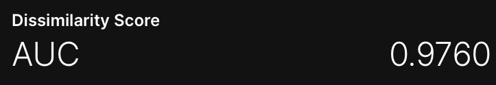
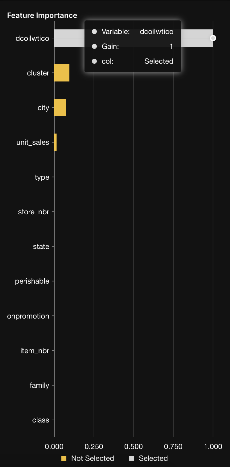
Chart: Feature importance
The Feature importance chart displays the top features that generated a high AUC value during the adversarial similarity test. In other words, the chart displays the features from top to lowest.
Clicking on the bar of a feature will trigger the display of the following plot: Plot: Feature PDP.
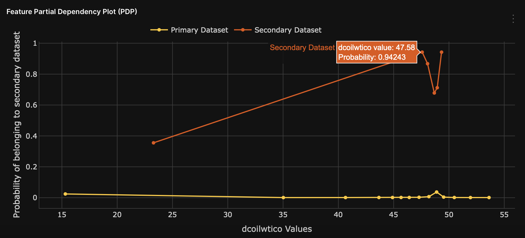
Plot: Feature PDP
The Feature Partial Dependence Plot (PDP) displays the impact the different values of the selected feature have on the predicted values. The selected feature refers to the feature (clicked) on the Feature importance chart.
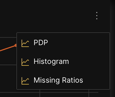
The following histogram and graph are available for the observed feature in the Feature Partial Dependence Plot (PDP):
To access either the histogram or graph, consider the following instructions when viewing the Feature Partial Dependence Plot (PDP):
-
Click
Kebab menu.- To view the Feature histogram per data, click Histogram.
- To view the Feature missing ratios graph, click Missing Ratios.
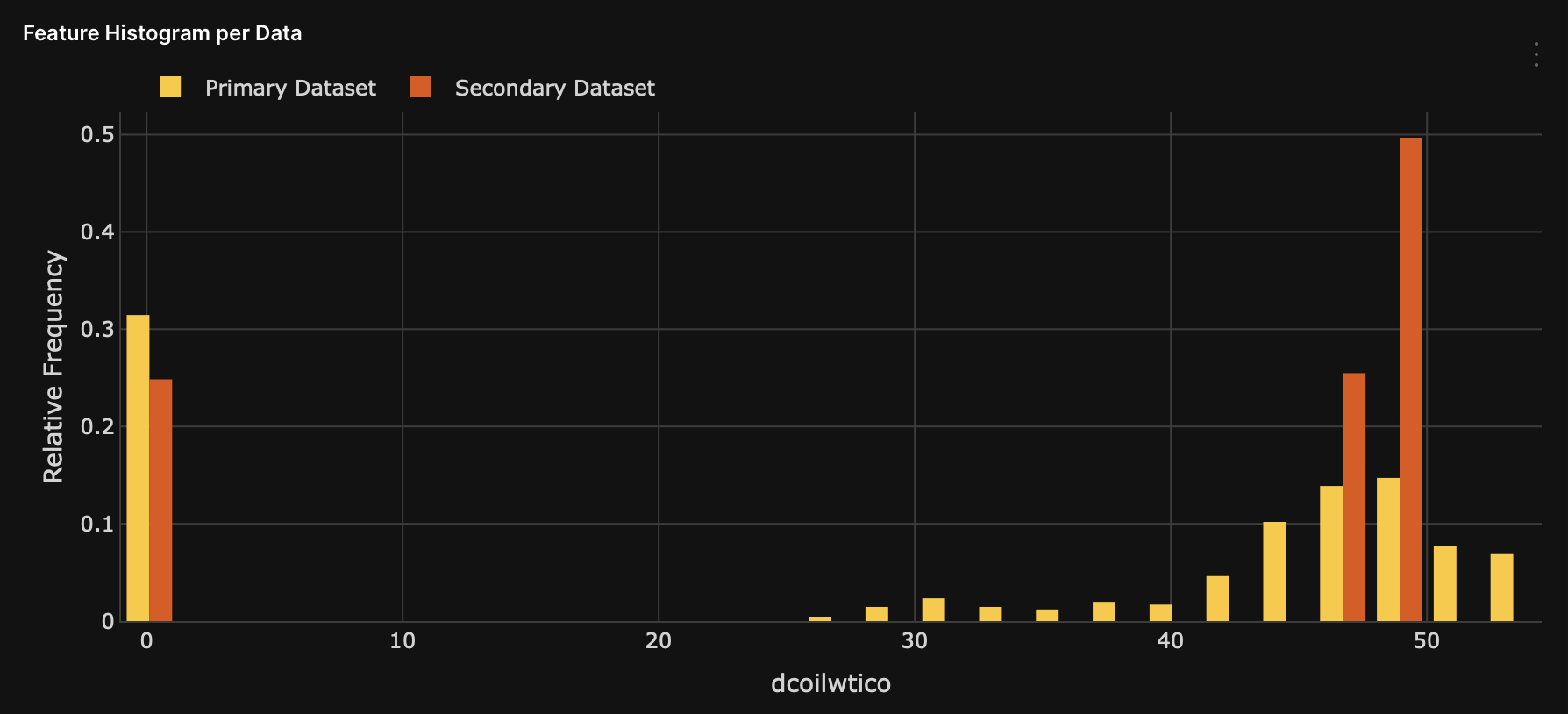
Histogram: Feature histogram per data
The Feature histogram per data histogram displays the selected feature on the Feature importance chart.
Graph: Feature missing ratios
The Feature missing ratios graph displays any missing ratio values of the selected feature in the Primary and Secondary Dataset. The selected feature refers to the feature (selected) on the Feature importance chart.
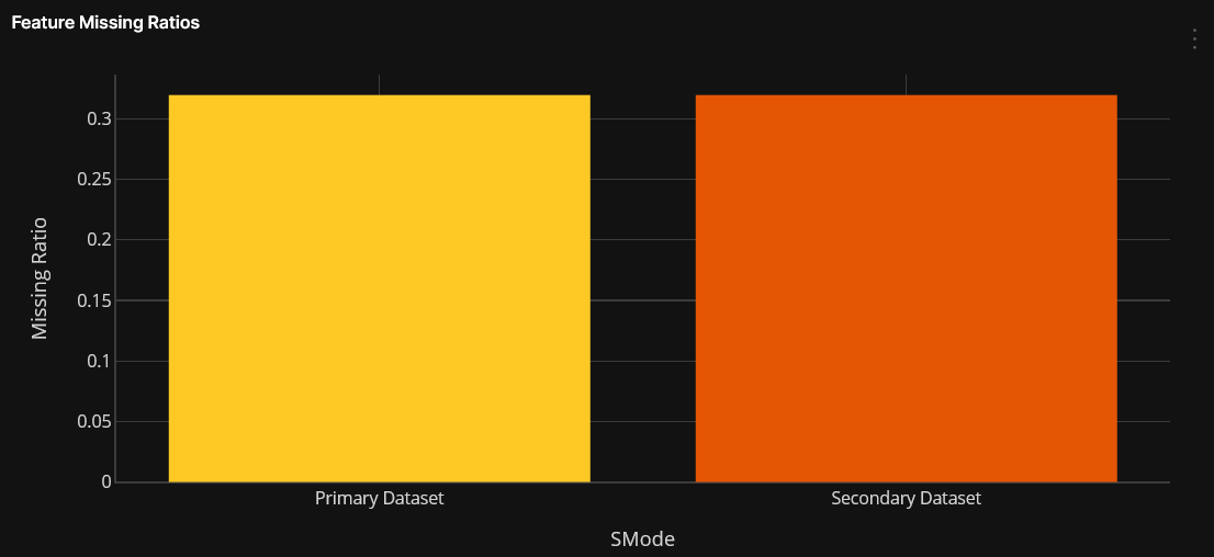
Table: Shapley
The Shapley table contains adversarial model results from a Shapley perspective. Each row in the table represents a row of the Secondary Dataset (being compared to the Primary Dataset). Rows are ordered from the highest to lowest predictive value. In other words, rows higher in the table represent the rows of the Primary Dataset most dissimilar to the Secondary Dataset.
H2O Model Validation in the Shapley table displays the top N highest (dissimilar) or lowest (similar) results (prediction values), where N=40.
- To display the top N highest (dissimilar) results, see Show dissimilar.
- To display the top N lowest (similar) results, see Show similar.
- To download the Shapley results of the test dataset, see Download Shapley values.
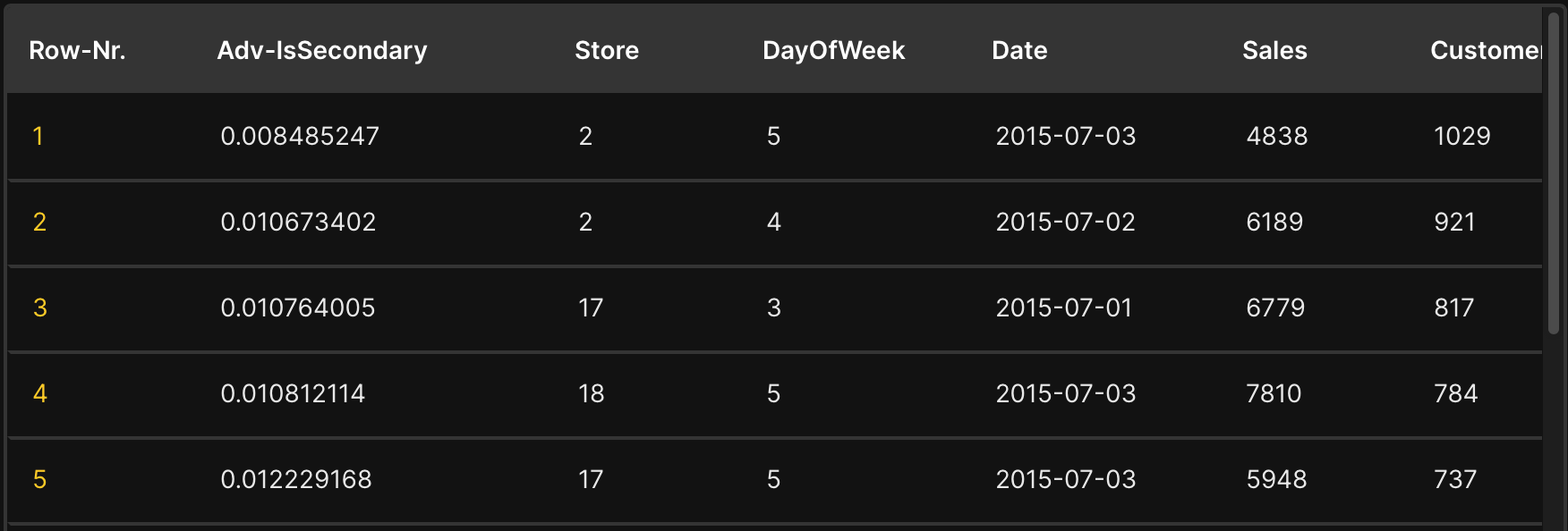
The first two columns of the Shapley table refer to the row's ID, and the target column, while the rest of the columns refer to the train columns of the model.
| Name | Description |
|---|---|
Row-Nr. | Row ID |
Adv-IsSecondary | Target column |
Clicking on one row ID displays a Global/local Shapley chart that highlights the top global and local top features increasing the average model predictions the most while driving the most dissimilarity between the datasets. To learn more, see Chart: Global/local Shapley.
Show similar
By default, rows in the Shapley table are ordered from highest to lowest predictive values. To switch the default order and view rows from lowest to highest predictive values, consider the following instructions:
- When viewing the Shapley table, select Similar.
Show dissimilar
To revert to the default order of the rows in the Shapley table, where test rows are ordered from highest to lowest predictive values, consider the following instructions:
- When viewing the Shapley table, select Dissimilar.
Download Shapley values
To download the Shapley values of the Secondary Dataset, consider the following instructions when viewing the Shapley table:
- Click Download Shapley values for the whole Secondary Dataset.
The .csv file contains adversarial model results from a Shapley perspective for the Secondary Dataset (reference dataset).
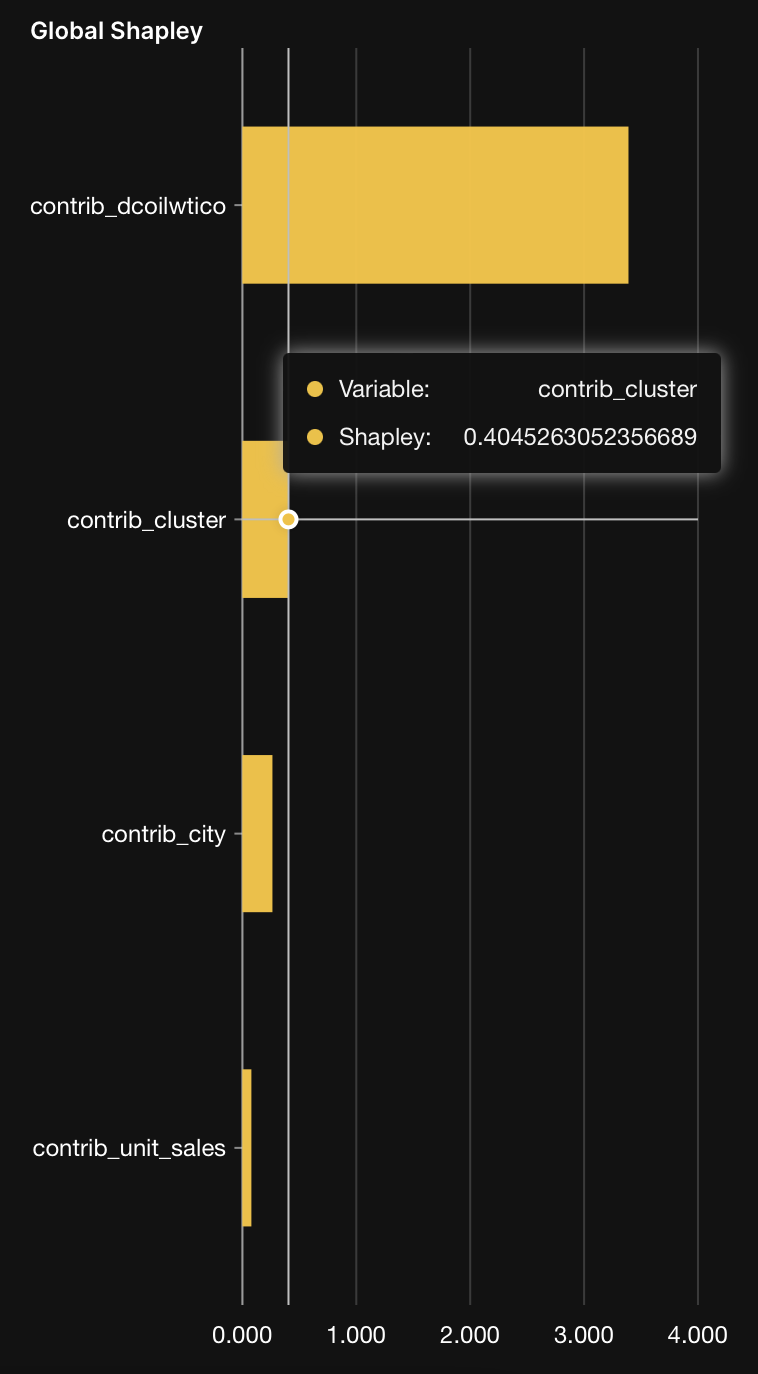
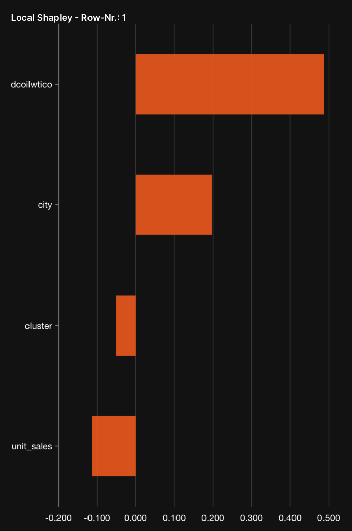
Chart: Global/local Shapley
The Global/local Shapley chart displays:
- The top global features increasing the average model predictions the most while driving the most dissimilarity between the datasets
- The top local features for a particular row that increase the average model prediction the most while driving the most dissimilarity between the datasets
- Submit and view feedback for this page
- Send feedback about H2O Model Validation to cloud-feedback@h2o.ai