Metrics: Calibration score
Overview
H2O Model Validation offers an array of metrics to understand a calibration score test. Below, each metric is described in turn.
Settings
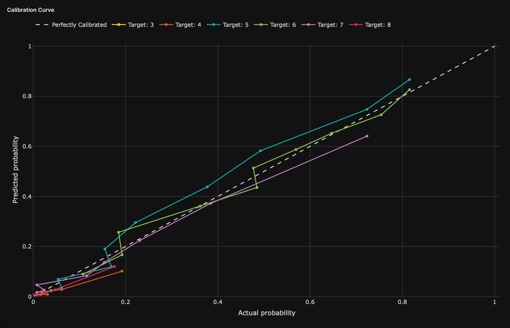
Calibration curve
The calibration curve graph displays the curve of realized event frequencies against the probabilities predicted by the model. Each point on the graph shows the values for a group of records binned by prediction ranges. The predicted probabilities order the points. Each curve represents the calibration of the target class or all target classes in the case of a multi-class model.
- X-axis: Actual probability values
- Y-axis: Predicted probability values
- Dashed diagonal line: Perfect calibration line
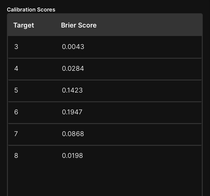
Calibration scores
The calibration scores table displays the Brier score of the target class or all target classes in the case of a multi-class model.
Feedback
- Submit and view feedback for this page
- Send feedback about H2O Model Validation to cloud-feedback@h2o.ai