Task 9: Diagnose model
In this task, we will create a new model diagnostic based on the successfully completed experiment from task 5.
- In the H2O Driverless AI navigation menu, click DIAGNOSTICS.
- On the Model Diagnostics page, click +DIAGNOSE MODEL.
- For Diagnosed experiment, select the experiment
tutorial-4bcreated in task 3. - For Test dataset, select the
UCI_Credit_card.csvdataset. - Click Launch diagnostics.note
You may need to refresh the Model Diagnostics page (by clicking Diagnostics in the navigation menu again) to view the new model diagnostic.
- Click the new model diagnostic in the Model diagnostics table to open it.
The new model diagnostic page has the following informaiton:
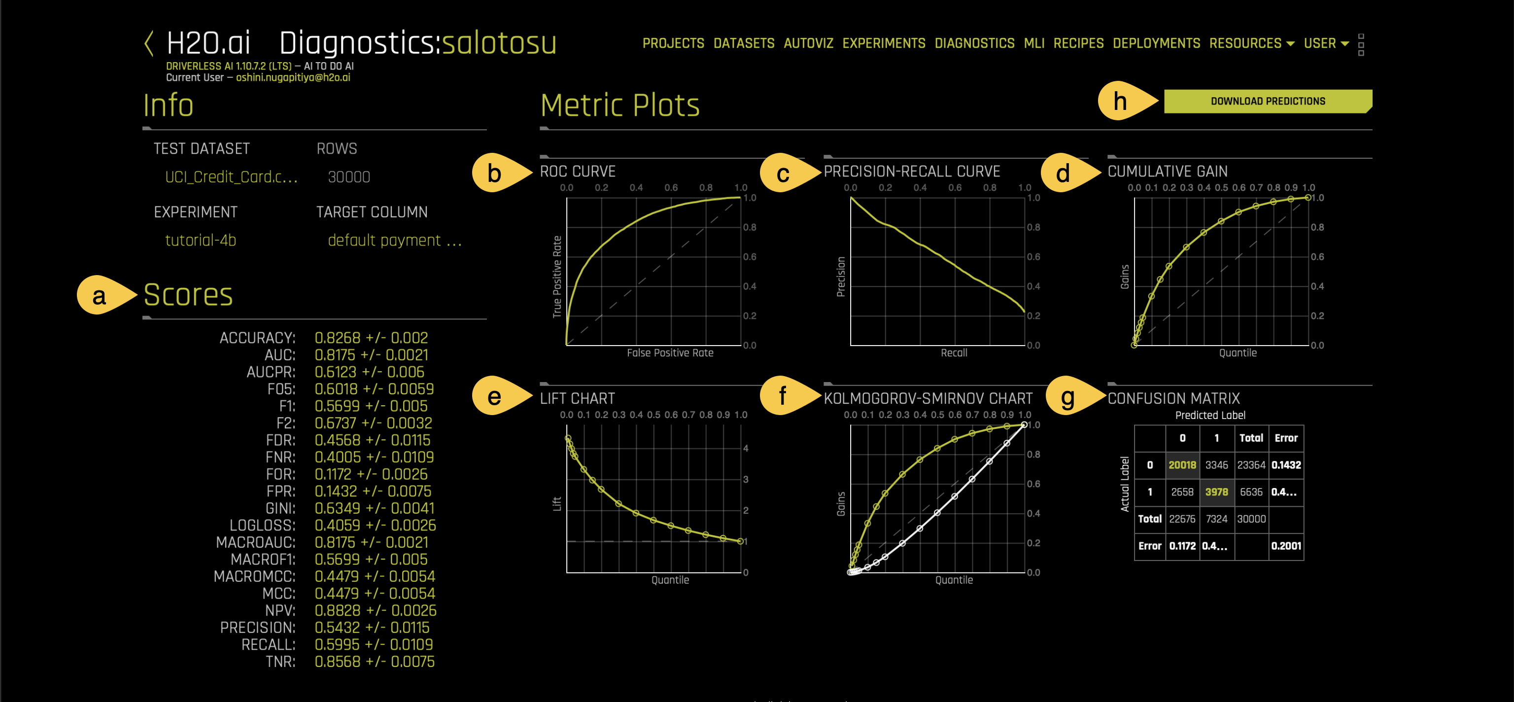
a. Scores: H2O Driverless AI calculates all available scores for the experiment. For the given model, it provides a comprehensive view of all possible scores relevant to a classification task.
For more information about diagnostics scores, see Scores.
Metric plots
The metric plots for this tutorial include the following graphs:
b. ROC Curve:
The ROC curve helps visualize the model's ability to distinguish between disputed and non-disputed complaints by plotting,
- True Positive Rate (TPR): How many disputed complaints were correctly identified.
- False Positive Rate (FPR): How many non-disputed complaints were incorrectly classified as disputed.
The curve shows how the TPR and FPR change at different thresholds.
For more information about the ROC curve, see Task 6: ER: ROC in Tutorial 1B.
c. Precision Recall Curve:
The Precision-Recall Curve is a graphical representation that illustrates the trade-off between precision and recall for different threshold settings in a classification model.
- Precision: The ratio of correctly predicted positive observations (TP) to the total predicted positives (TP+FP).
- Recall: The ratio of correctly predicted positive observations (TP) to all actual positives (TP+FN).
In the Precision Recall Curve, recall is plotted on the x-axis, and precision is plotted on the y-axis. Each point on the curve represents a different threshold and shows how precision and recall change as the threshold varies.
For more information about the Precision Recall Curve, see Task 7: ER: Prec-Recall in Tutorial 1B.
d. Cumulative gain:
A Cumulative Gain Plot helps visualize how effectively a classification model ranks true positive cases (e.g., disputed complaints) based on the predicted probabilities. It shows the proportion of actual positive cases identified within a given percentage of the dataset.
- Y-Axis (Gains): Represents the percentage of true positive cases captured.
- X-Axis (Quantile): Indicates portions of the dataset, sorted by the model's predicted probabilities.
For more information about the Cumulative gain chart, see Task 8: ER: Gains in Tutorial 1B.
e. Lift chart:
A Lift chart visually assesses model performance. Lift is a measure of the effectiveness of a predictive model calculated as the ratio between the results obtained with and without the predictive model.
- Y-Axis (Lift): Shows the ratio of the model's performance to that of random selection.
- X-Axis (Quantile): Represents portions of the dataset, sorted by the model's predicted probabilities.
For more information about the Lift chart, see Task 9: ER: LIFT in Tutorial 1B.
f. Kolmogorov-Smirnov chart:
A Kolmogorov-Smirnov chart evaluates how well classification models distinguish between positives (e.g., disputed complaints) and negatives (non-disputed complaints) in validation or test data.
For more information about the Kolmogorov-Smirnov chart chart, see Task 10: Kolmogorov-Smirnov chart in Tutorial 1B.
g. Confusion Matrix:
A Confusion Matrix is a table that summarizes the predictions of a classification model by comparing them to the actual outcomes. It shows how well the model distinguishes between the positive class (e.g., disputed complaints) and the negative class (non-disputed complaints).
The matrix consists of four key components:
- True Positives (TP): Cases where the model correctly predicts a dispute.
- True Negatives (TN): Cases where the model correctly predicts no dispute.
- False Positives (FP): Cases where the model incorrectly predicts a dispute.
- False Negatives (FN): Cases where the model fails to predict a dispute.
For more information about the Kolmogorov-Smirnov chart chart, see Confusion matrix in Tutorial 1B.
h. Download predictions: Click Download predictions to download the diagnostic predictions as a CSV file.
Now that you’ve learned how to create a new model diagnostic based on the successfully completed experiment, in Task 9, you’ll learn how to deploy the generated NLP model with H2O MLOps.
- Submit and view feedback for this page
- Send feedback about H2O Driverless AI | Tutorials to cloud-feedback@h2o.ai